
Universal Vanities
Client
Lowe's
Year
2023
Tag
Industrial Design
Duration
3 months


Client
Lowe's
Year
2023
Tag
Industrial Design
Duration
3 months


The project itself :
This project focused on designing a universal bathroom vanity collection for Lowe’s that balances accessibility, aesthetics, and retail constraints. The work explored how design decisions could expand inclusive offerings across multiple price points and brand tiers.
Many bathroom vanities on the market either overlook accessibility considerations or treat them as visually limiting. Lowe’s required a solution that addressed universal design needs while remaining visually appealing, brand-appropriate, and scalable across a mass-market retail environment.
The goal was to create a cohesive vanity system that improves accessibility without sacrificing style, manufacturability, or cost targets. The collection needed to integrate seamlessly into Lowe’s existing assortment while filling key gaps across price point and aesthetic categories.
Industrial Design Intern at Lowe’s, leading the end-to-end design of a universal vanity concept from research through refined CAD and final visualizations.
Market and customer research
Concept sketching and form development
CAD modeling and refinement
CMF selection and visualization
iterating on designs,
making high-fidelity prototype
All about the user :
Research focused on understanding how accessibility is currently addressed within the commercial vanity market and where gaps exist across price, style, and retail availability. By combining customer insights, competitive market analysis, and Lowe’s internal assortment review, key opportunities were identified to deliver accessible vanity solutions that are both affordable and visually appealing.
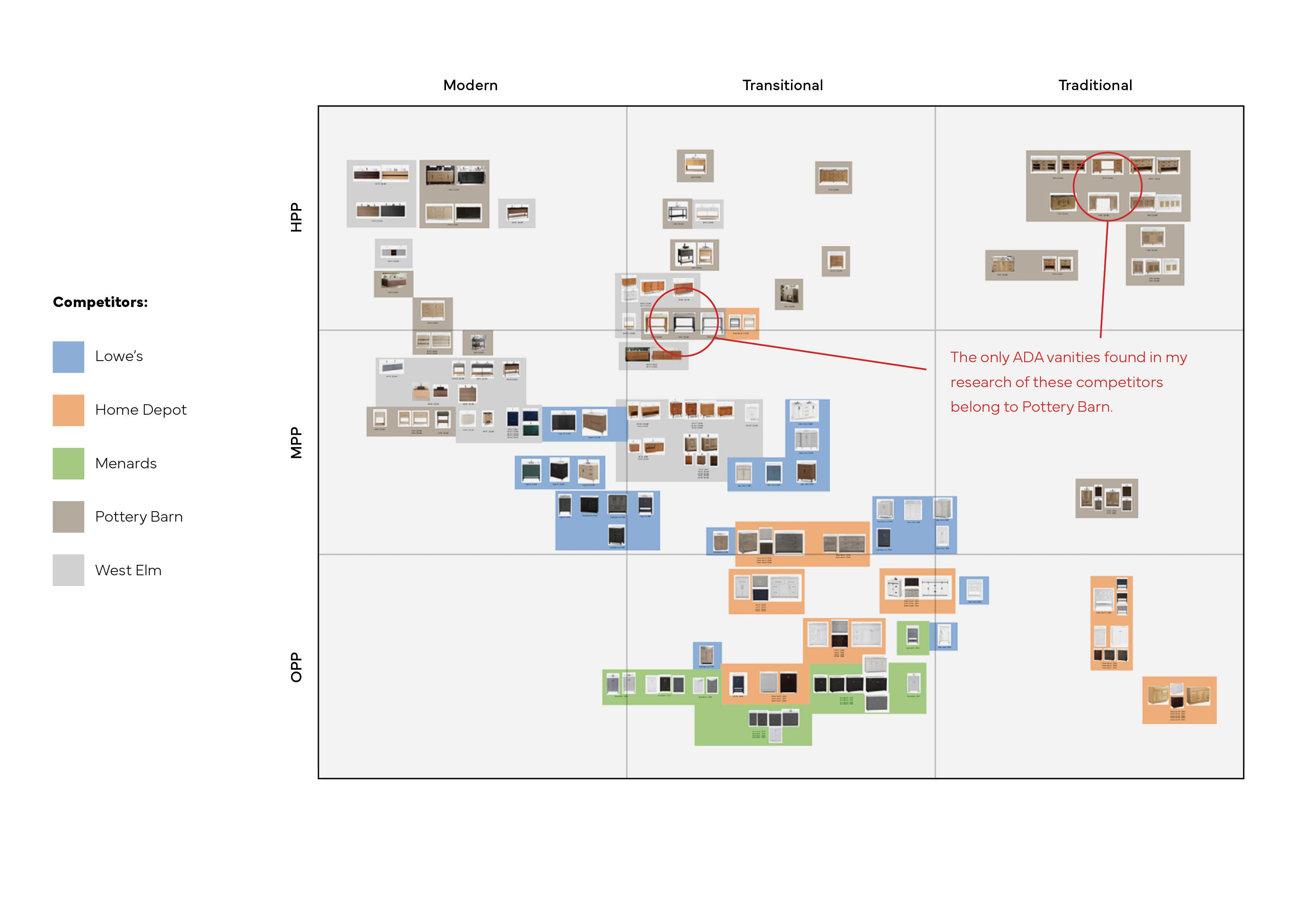
Very few commercial retailers offer ADA vanities as a product.
A vast majority of accessibility goods and services result in a clinical aesthetic.
The ADA vanities that are commercially sold and have style are way over-priced.
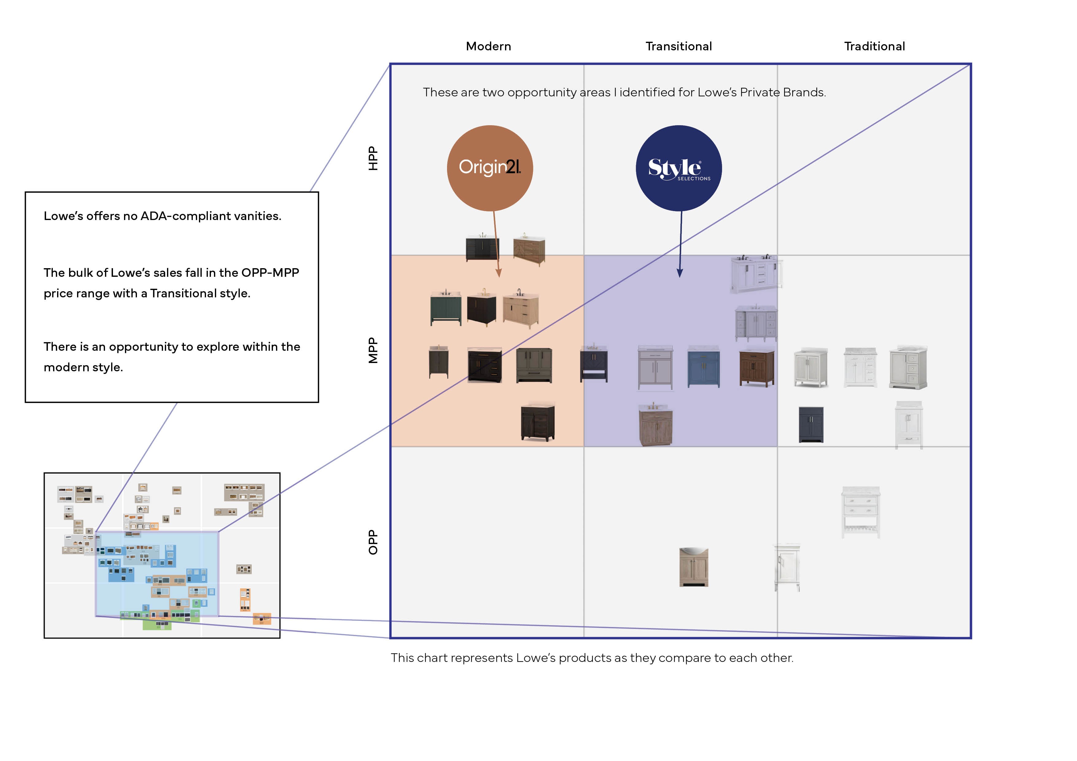
Lowe's currently offers no ADA-compliant vanities.
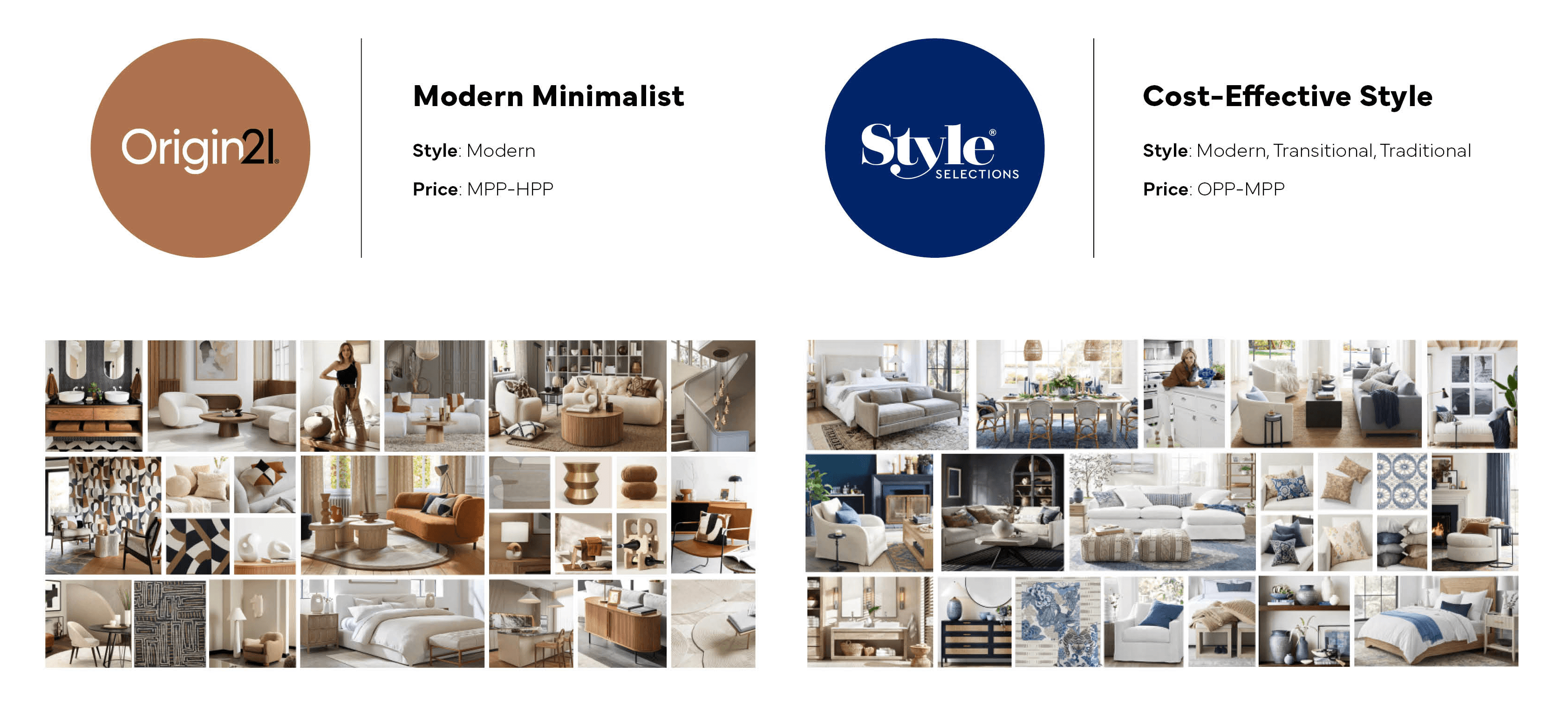
The bulk of Lowe's vanity sales fall in the OPP-MPP price range with a Transitional style.
There is an opportunity to explore within the modern style.
This chart represents all available vanities between Lowe’s and its competitors. The products are all mapped out according to their style and price point. The red circles highlight the only ADA vanities found within these competitors.
After analyzing where Lowe’s competitors stack up, I then looked just at Lowe’s current assortment of vanities to pull out insights that would drive my designs. This again had Lowe's vanities mapped out according to their style and price point.
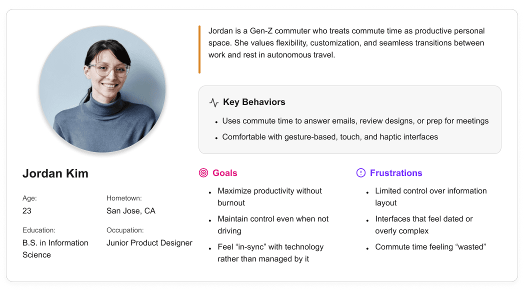
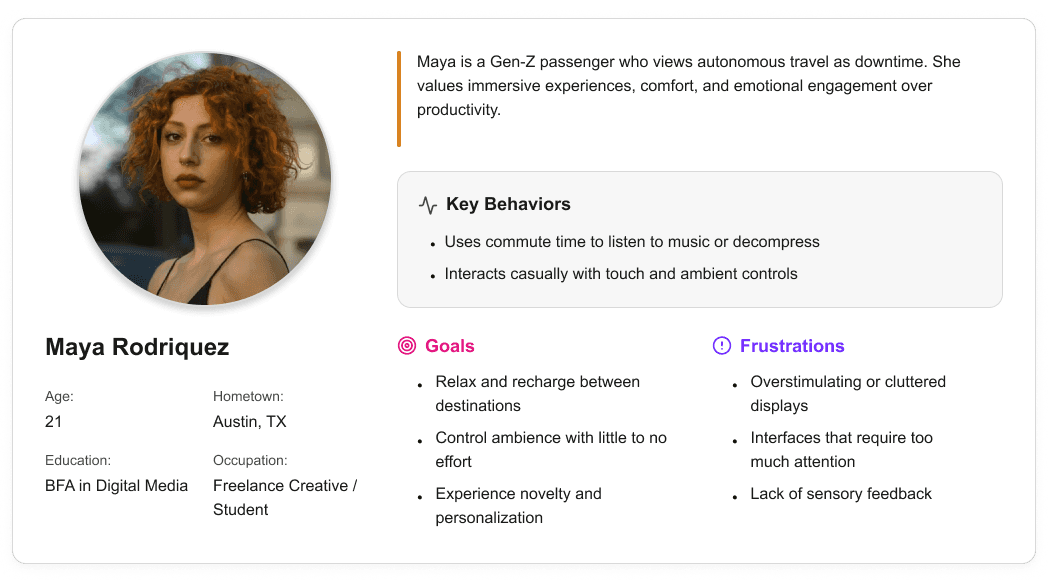
User personas were created to represent distinct Gen-Z passenger behaviors and expectations within a fully autonomous vehicle. These personas helped guide experience decisions by balancing productivity-focused and rest-focused use cases throughout the interior and HMI system.

It is the series of experiences Carlos has as he achieve a specific goal. It was built on the his experience.
I developed a user journey map of Carlos's experience with the app to highlight potential pain points and identify areas for improvement.
After figuring out our user group, we created a survey for Gen-Z commuters to help draw out insights that might lead to design opportunities. This survey was equipped with two different types of questions:
Current driving questions
Future thinking, Level 5 questions
It is the series of experiences Carlos has as he achieve a specific goal. It was built on the his experience.
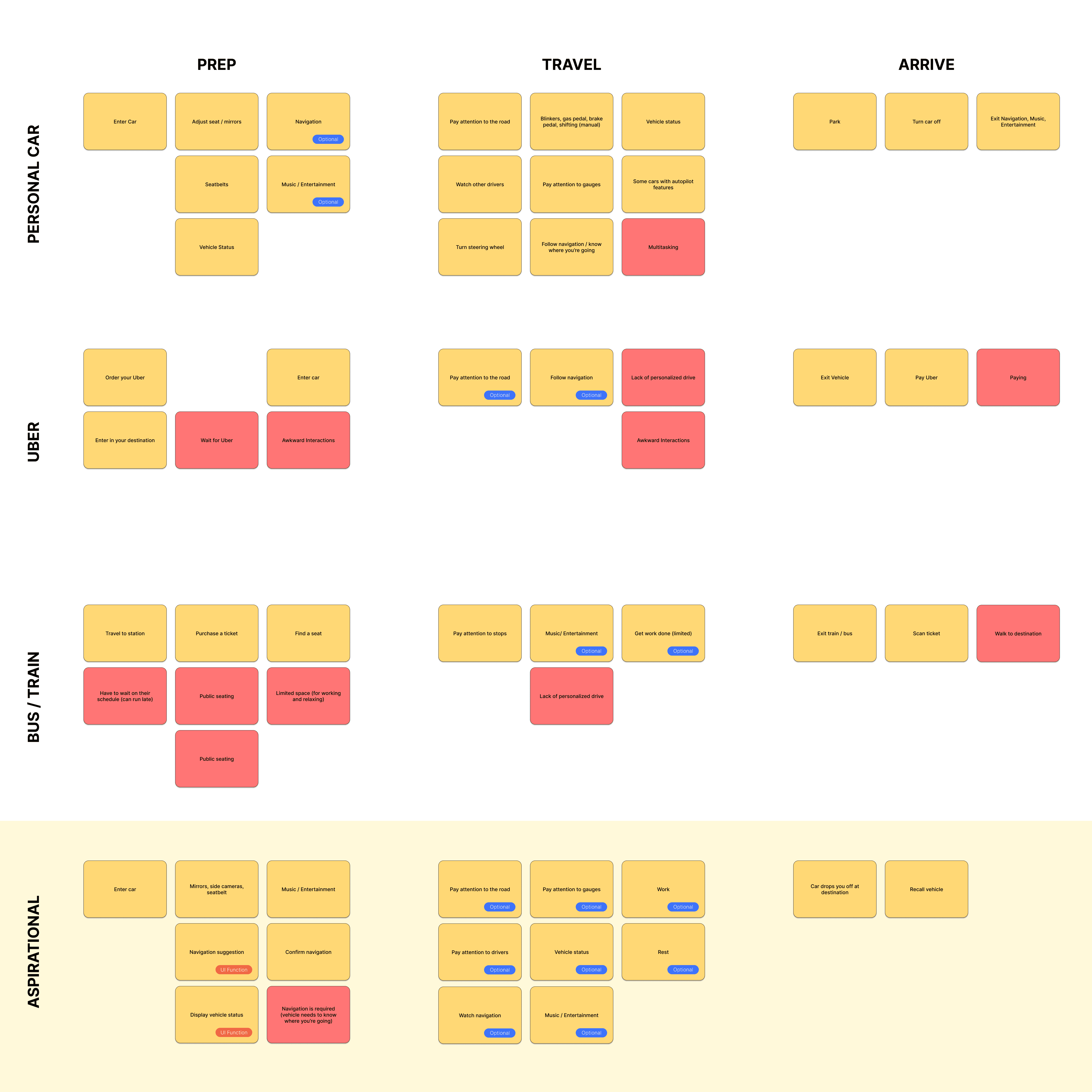
We compared the typical journey and actions performed for three different modes of transportation and even pointed out some pain points for each. A personal car requires the user’s attention for the entirety of getting from point A to B, and is even required to do a good bit of multitasking at times. However, this is their personal vehicle and is private to them. An uber and bus are similar in that the user has no driving tasks to worry about, but it is no longer a personalized experience; they are in a public space.
A fully autonomous vehicle can give you the best of both worlds. You can have your own personal space while the car does all the driving for you.
The question then becomes: What do you do with the time you spend riding in this vehicle?
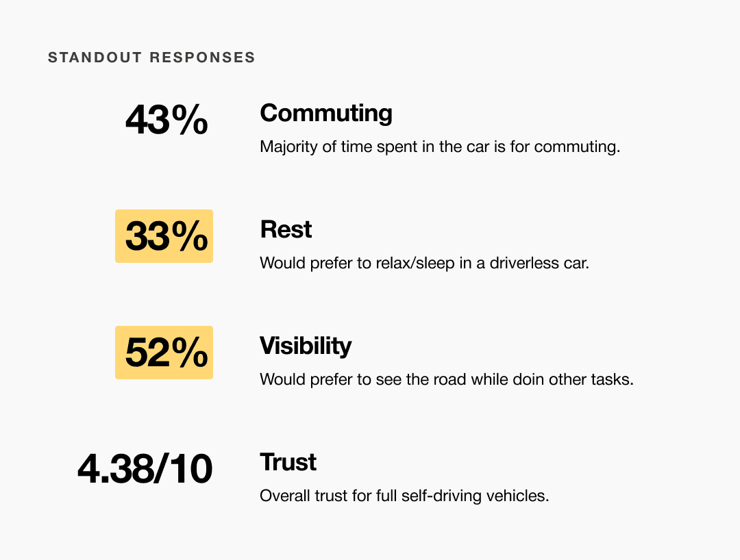
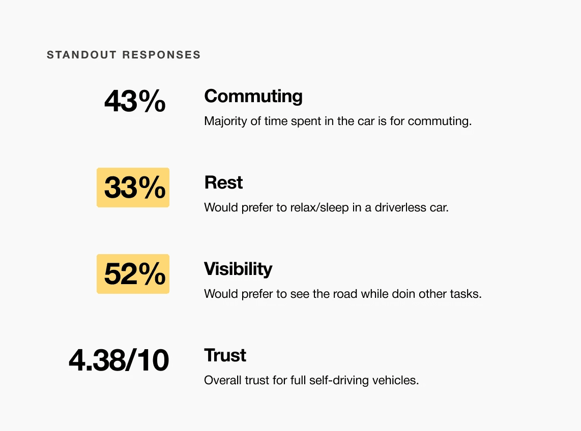
A slight majority of surveyors would like to rest in a driverless car, but getting additional work done was a close second.
Visibility to the road is important to surveyors, so the HUD should not clutter their view.
Commute time often feels underutilized or disconnected from passengers’ goals
It is the series of experiences Carlos has as he achieve a specific goal. It was built on the his experience.
For aging-in-place customers shopping at Lowe’s, these two vanity collections deliver accessible design that balances function, style, and affordability. Designed for different aesthetic preferences and price tiers within Lowe’s private brands, the collections expand access to ADA-aware vanities without the clinical appearance or premium pricing common in the market.
Choose a good movie in a cinema theatre nearby and select seats in an app in a fast and clear way

It is the series of experiences Carlos has as he achieve a specific goal. It was built on the his experience.
Aging customers are more likely than those with a disability to choose Lowe’s for various products and services. This data validates Lowe’s target customer for accessible goods being the aging in place customer. A vast majority of these projects start in the bathroom since this is a space many consider vulnerable.
Choose a good movie in a cinema theatre nearby and select seats in an app in a fast and clear way

The project schematically :
Concept development focused on translating research insights into two distinct vanity collections aligned with Lowe’s private brands. Early exploration emphasized form, proportion, accessibility considerations, and brand expression through moodboards, sketches, and iterative CAD studies.
It is the series of experiences Carlos has as he achieve a specific goal. It was built on the his experience.
I developed a user journey map of Carlos's experience with the app to highlight potential pain points and identify areas for improvement.
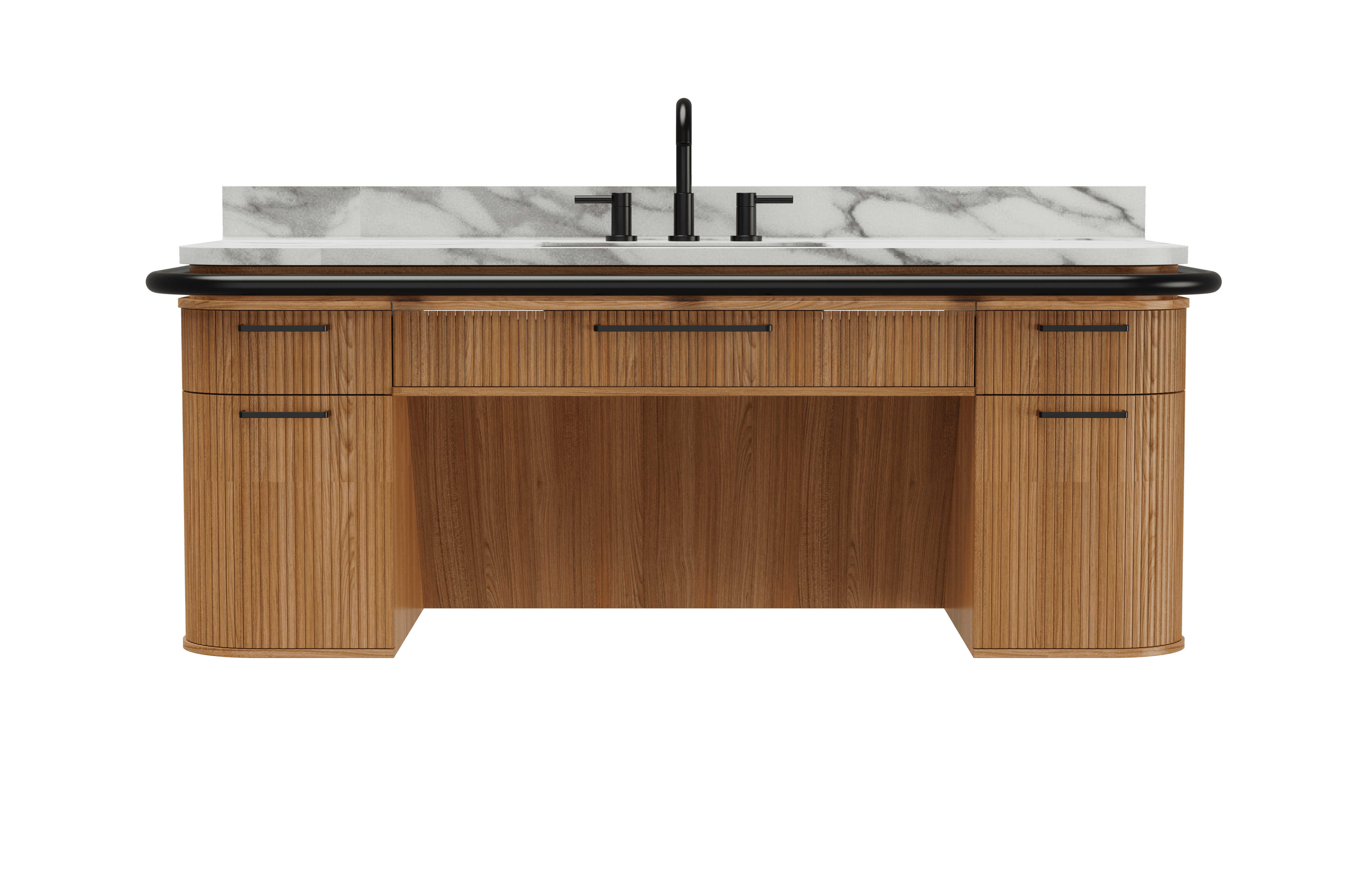
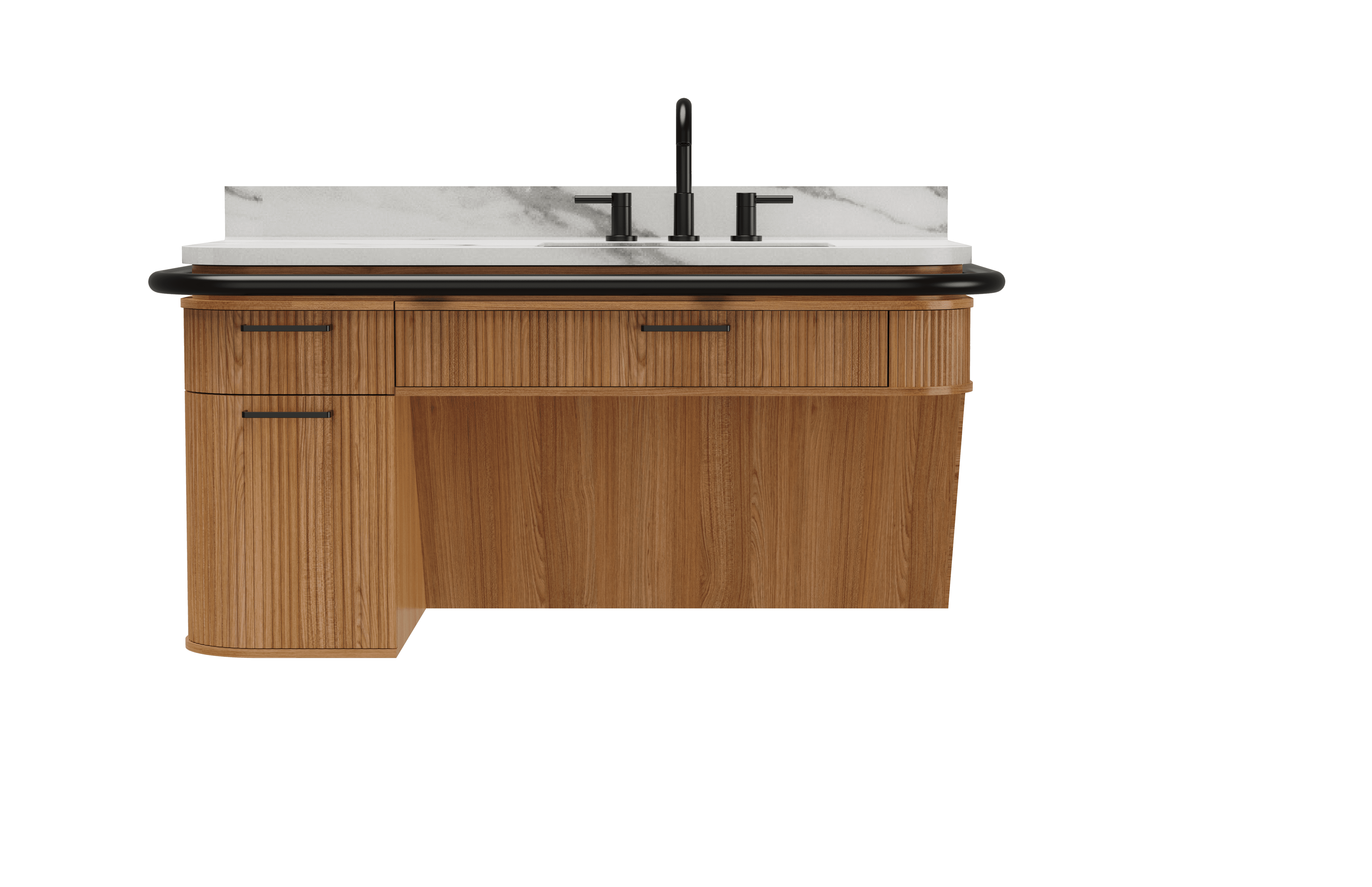
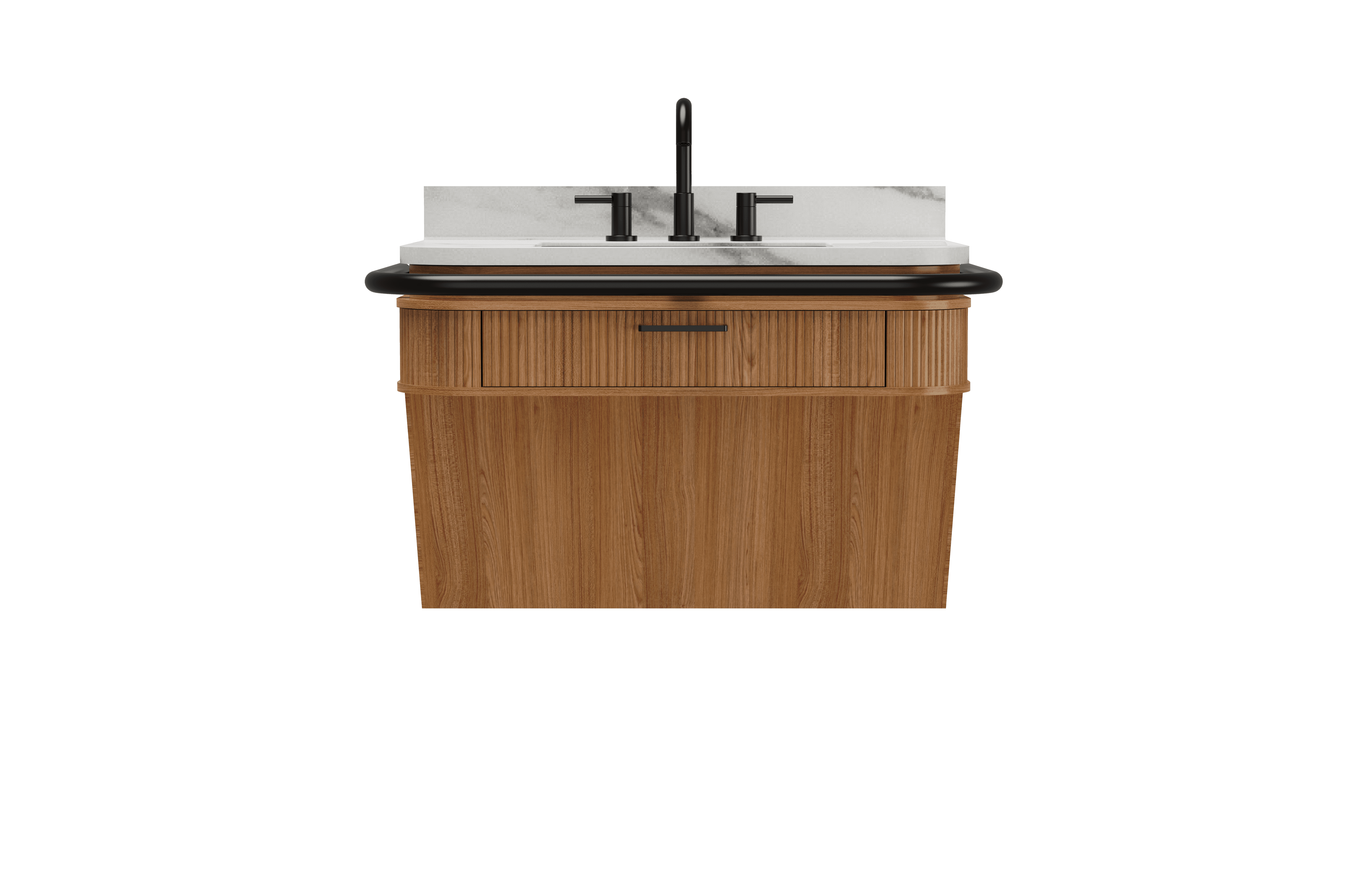
Origin 21 explores a modern, minimalist vanity collection positioned within the mid-to-high price range. The direction emphasizes clean geometry, refined materials, and subtle detailing to deliver an accessible design that feels elevated without appearing clinical or overly utilitarian.
Style Selections focuses on a cost-effective vanity collection designed for the opening-to-mid price tiers. The aesthetic prioritizes simplicity, approachability, and efficient use of materials, offering accessible design that remains visually neutral and attainable for a broad customer base.
The series of hand-drawing frames that visually describe and explore a user's experience with a product.
I began with drawing storyboards to focus on just the most important parts of a user’s experience with the app. It's a story that was told through the panels, revealed it two different way

Big picture storyboard, which focuses on the user experience. It's about how people will use the Voo's app during their day and it will be useful.

Close-up storyboard focuses on the app instead of on the user experiencing that product. Shows what happens on each screen of the app.
Refined sketches were developed by combining the strongest elements from earlier concepts into two focused directions, one for each brand. This stage emphasized clearer form language, proportion, and feature integration while aligning each design more closely with its respective price tier and brand identity.

We were able to determine three zone of legibility when testing text elements on the HUD. From here we started creating an information hierarchy based on these zones to identify what should be displayed where.
When testing, users reported eye fatigue when there were large blocks of bright colors on the HUD. We pivoted to muted/ transparent elements in later designs.
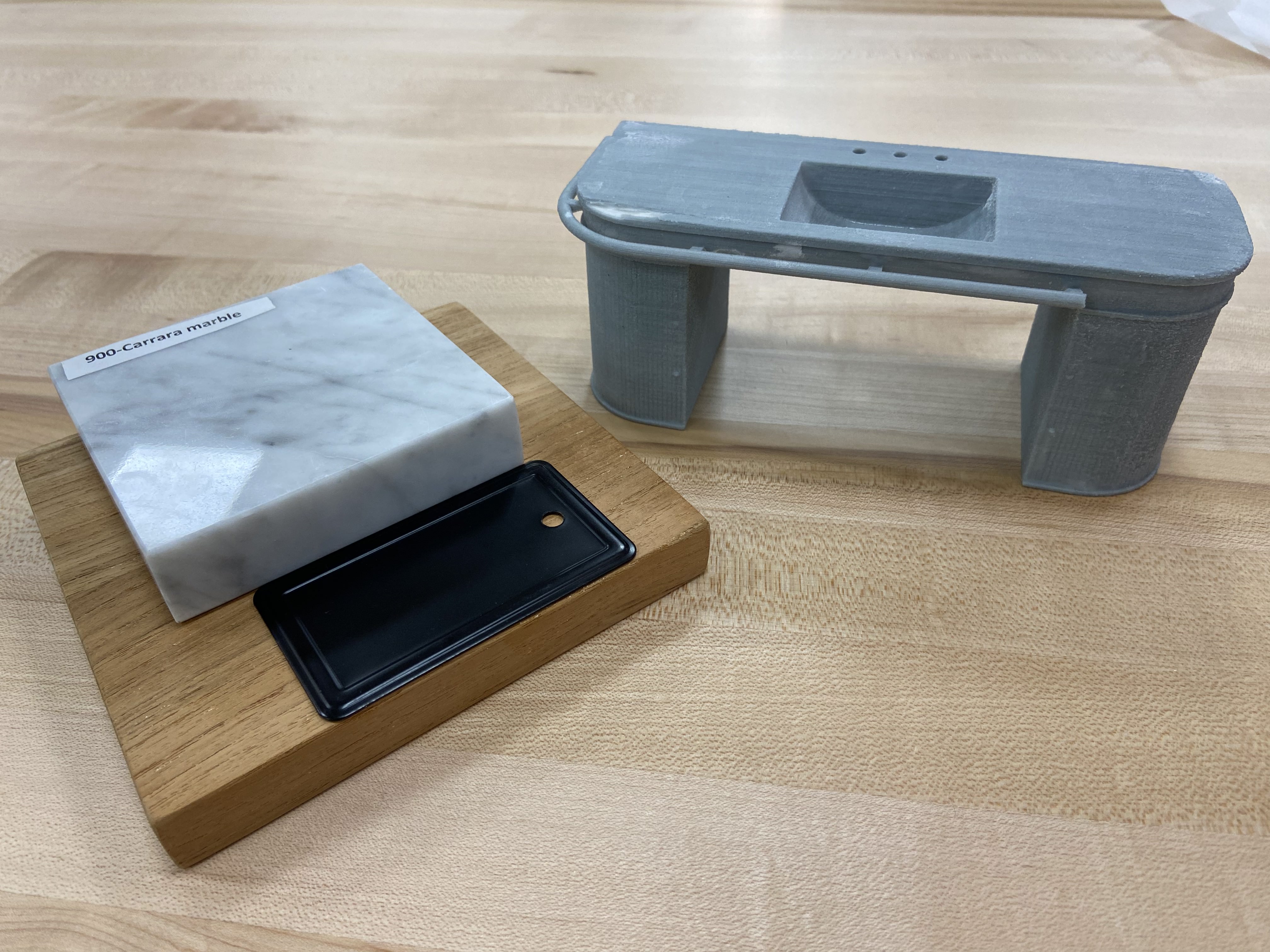
Prototyping was carried out via full scale low-fi models as well as 3D printing mini models. This helped build my understanding correct proportions and structural integrity.


These are a high fidelity design that represents a final product
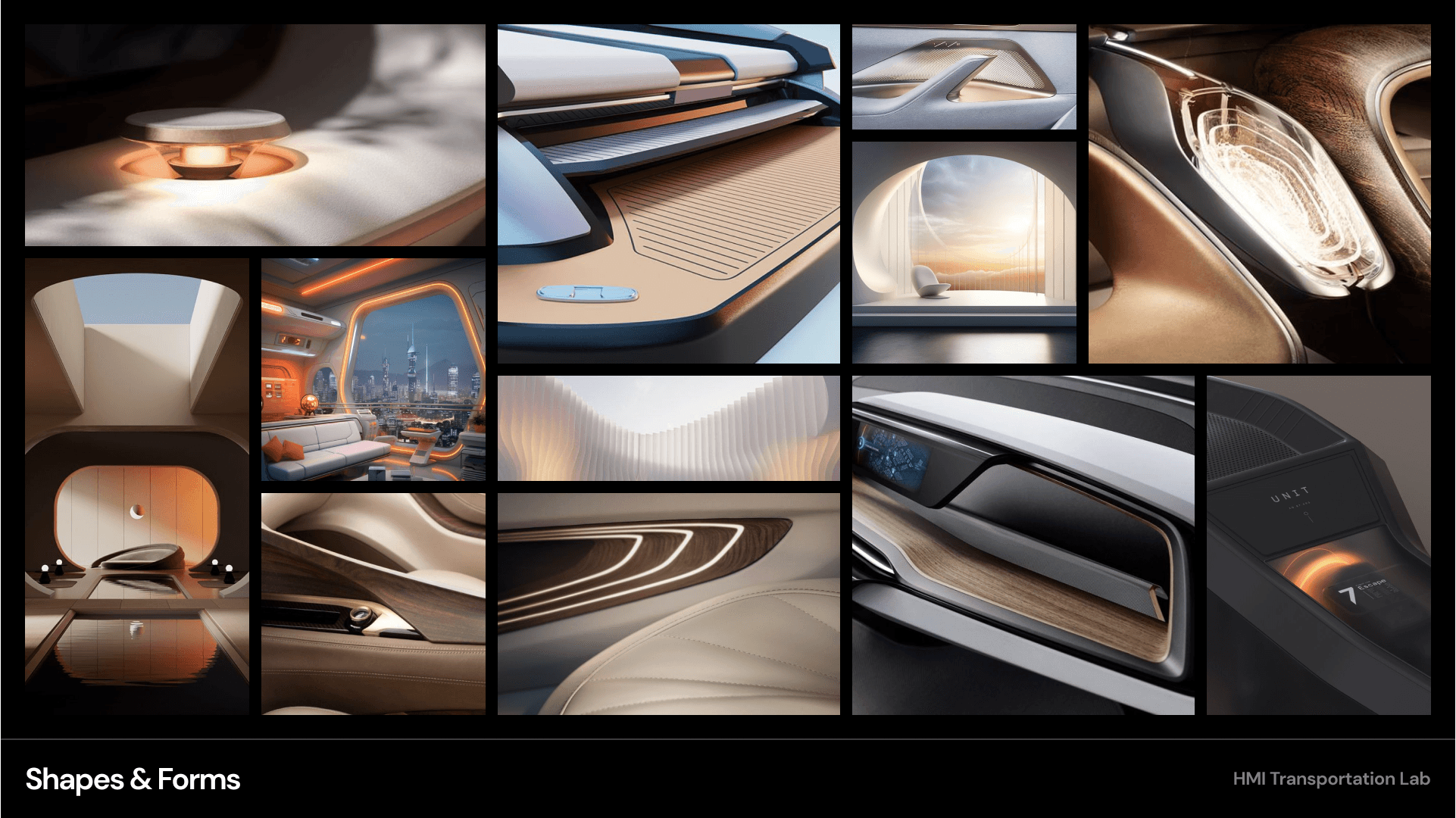
Moodboards were used to establish a retro-futuristic aesthetic blended with a sense of tranquil luxury. This visual direction helped guide material choices, lighting tone, and the overall emotional character of the interior.


These are a high fidelity design that represents a final product
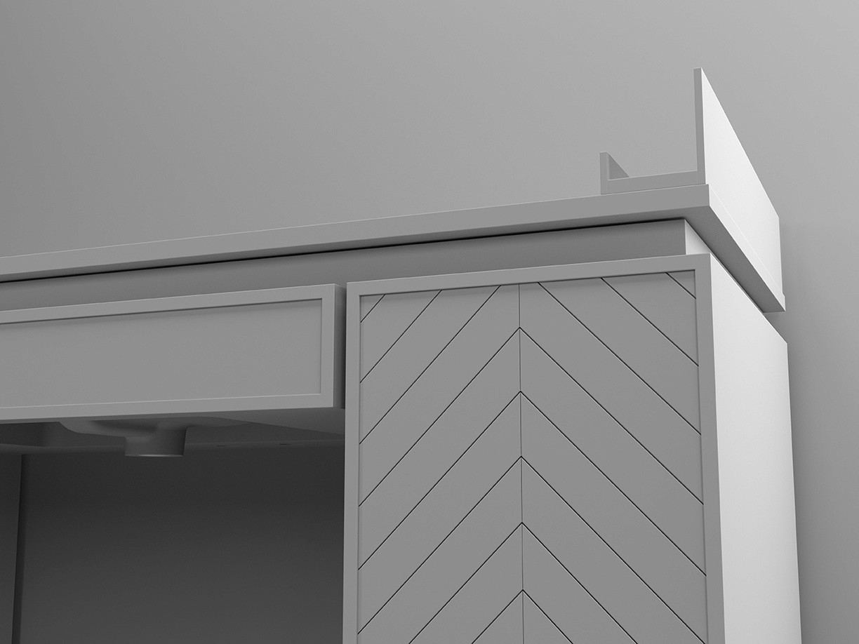
Early CAD models helped refine overall form, proportions, and structural relationships while translating sketch concepts into three-dimensional geometry.

These are a high fidelity design that represents a final product
Each collection includes 60", 48", and 36" vanity options to support a range of bathroom sizes.
HUD concepts were evaluated in context using a transparent OLED display within a simulated driving environment. This setup allowed visibility, hierarchy, and legibility of text-based interactions to be assessed during representative passenger scenarios.
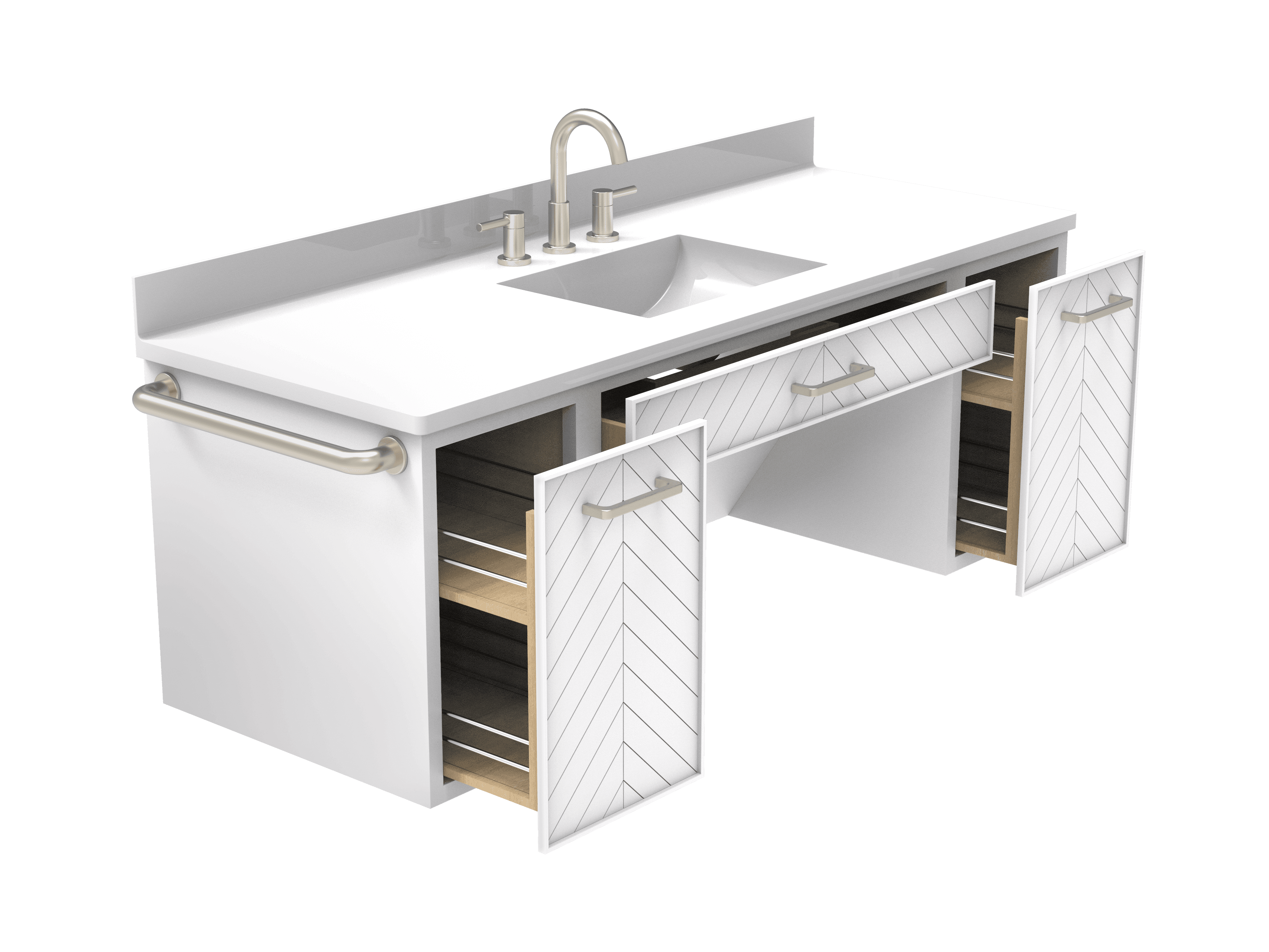
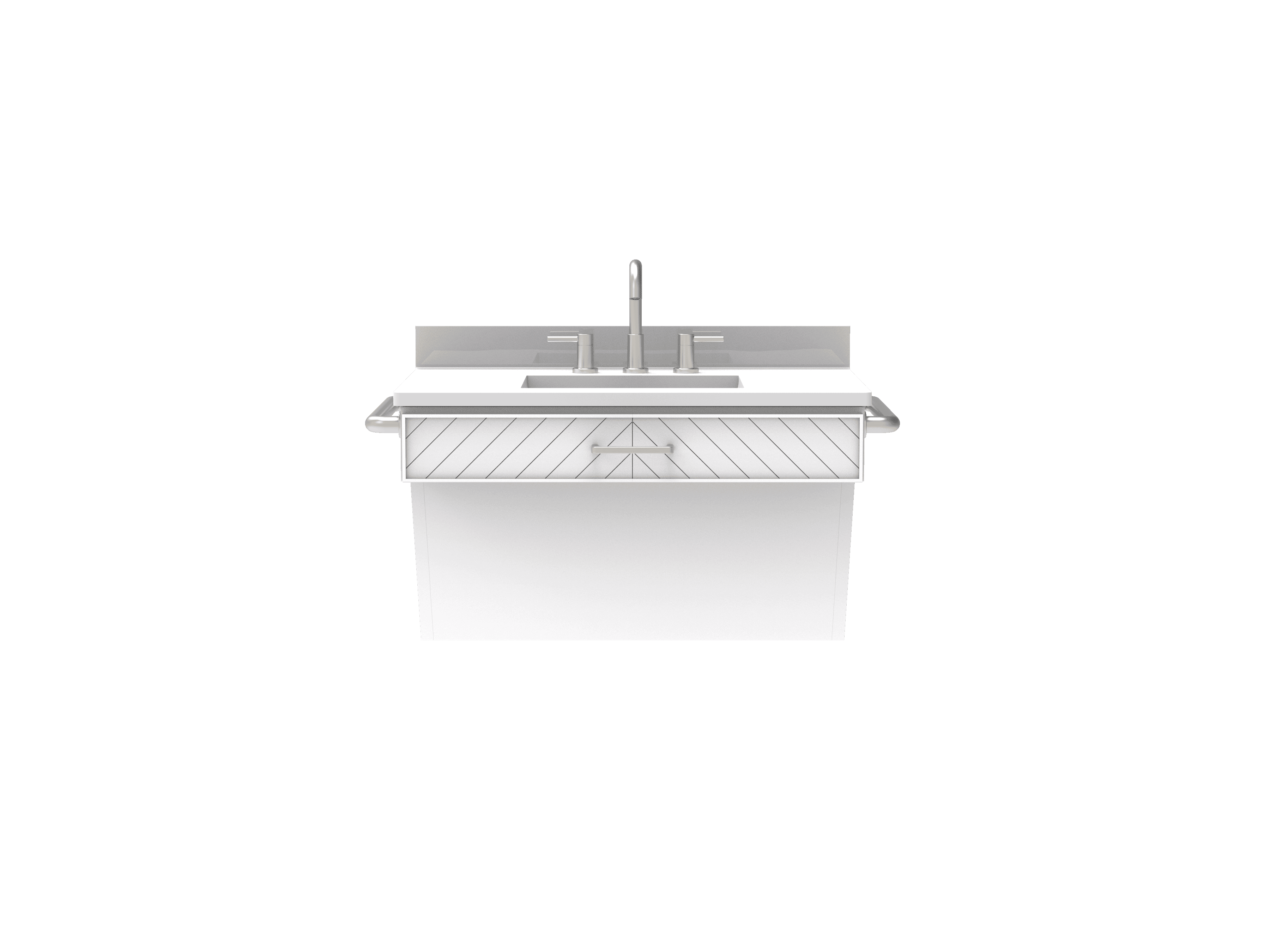
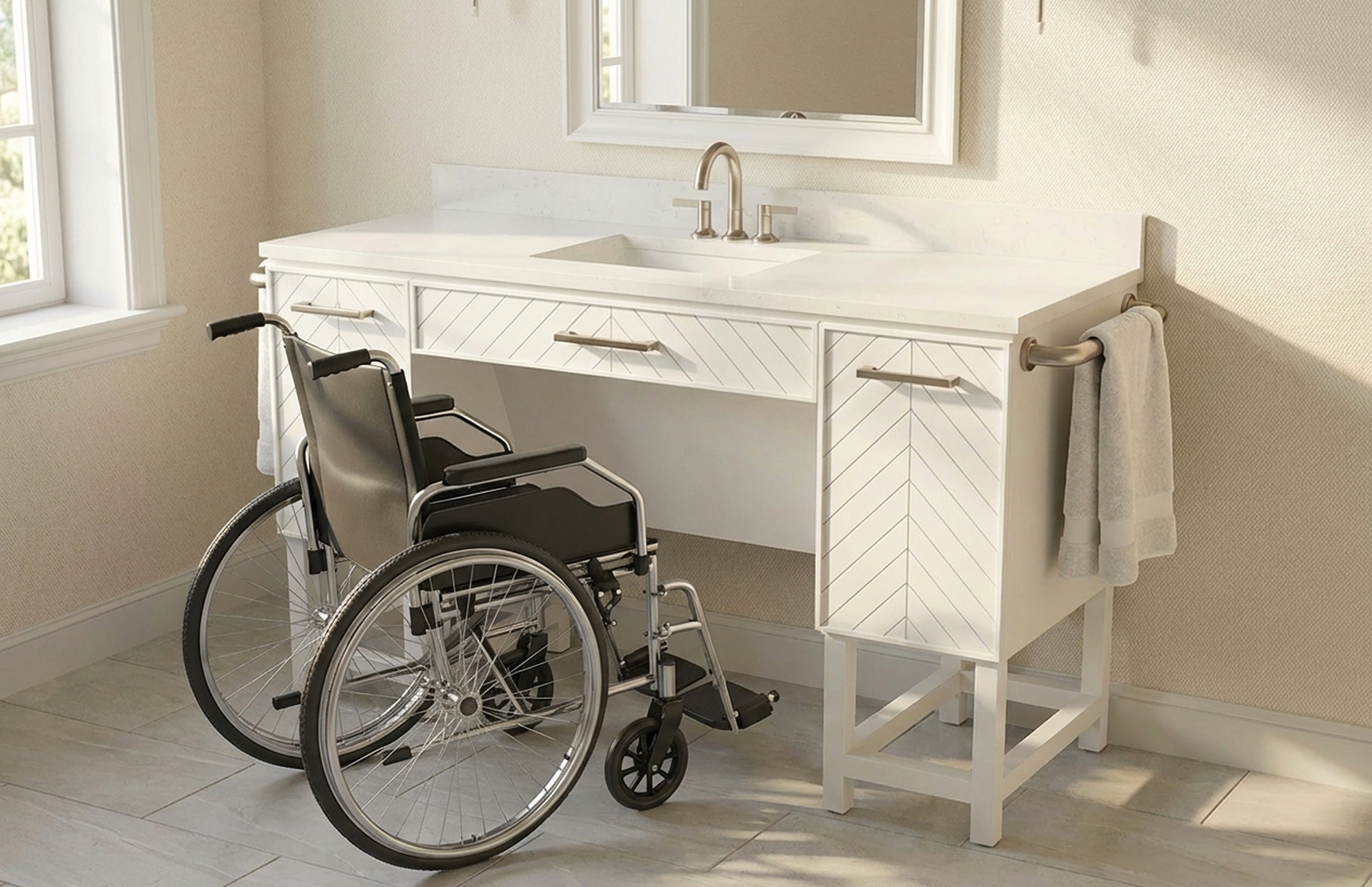
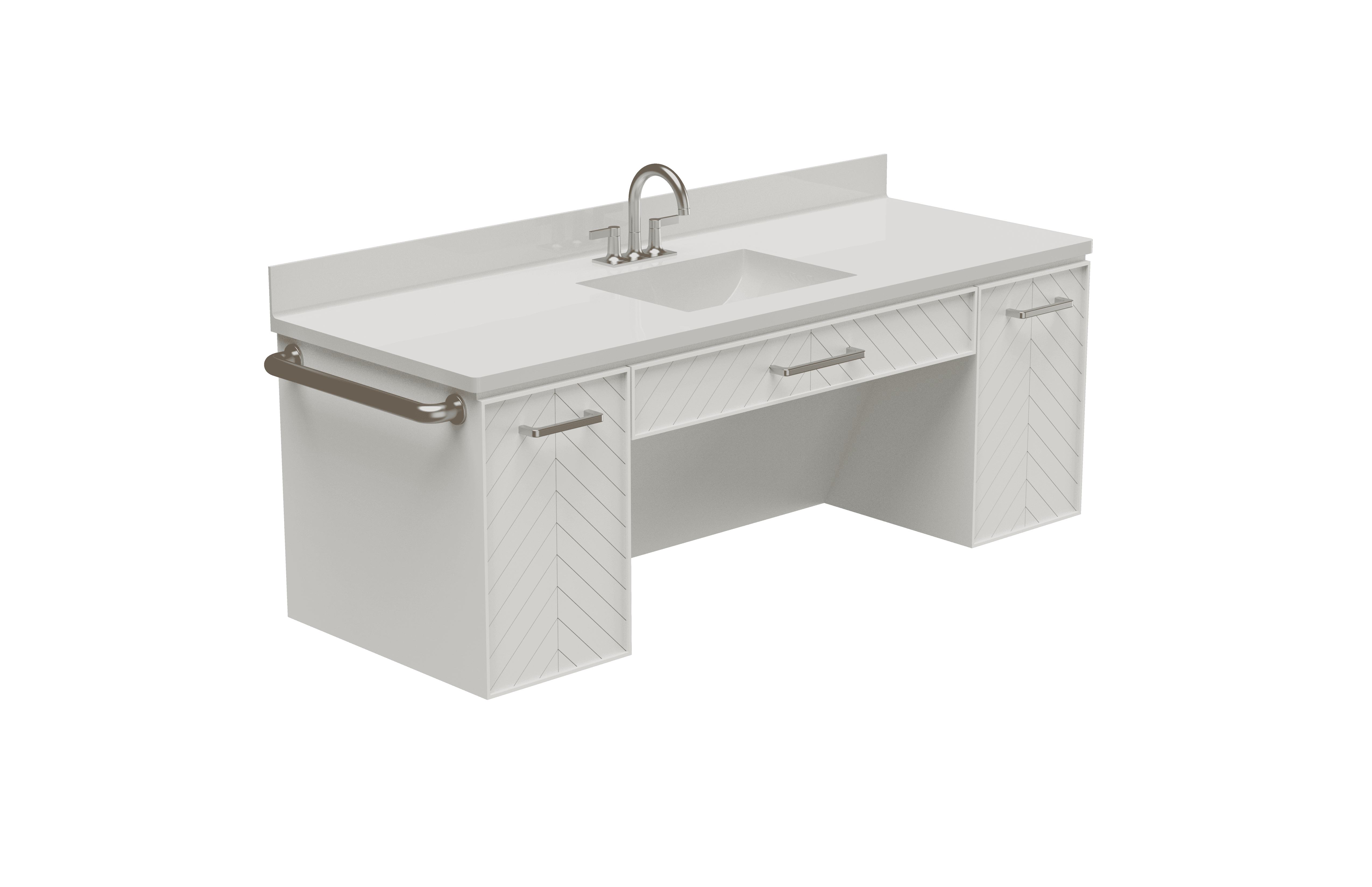
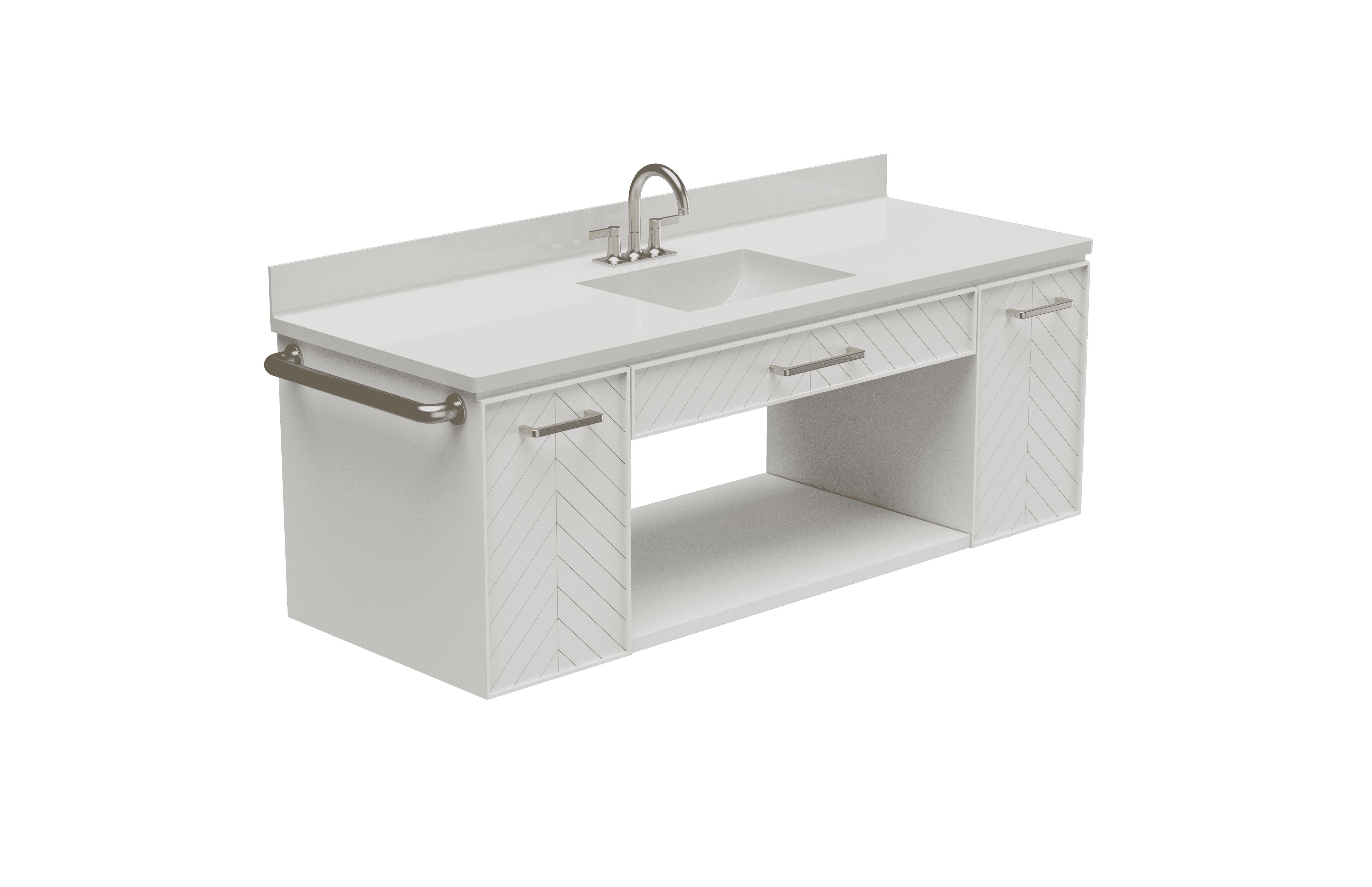
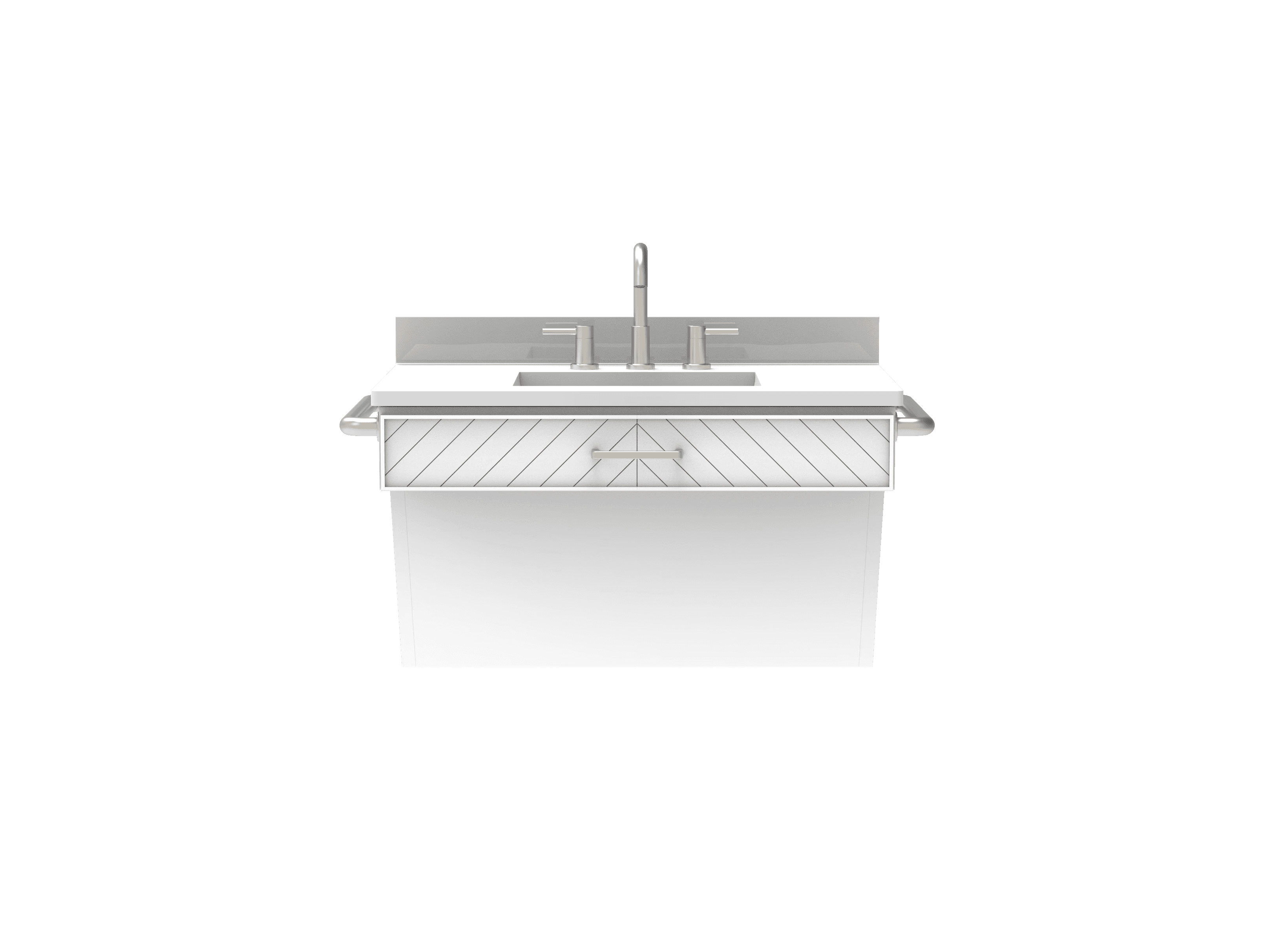
The Style Selections collection emphasizes simplicity and cost efficiency through a clean, cohesive palette. A pure white engineered stone countertop and backsplash establish durability and visual consistency, while white painted wood is used across the exterior, drawers, chevron detailing, vanity frame, plumbing cover, and legs. Brushed nickel hardware and grab bars introduce subtle contrast without increasing complexity or cost.

Each collection includes 60", 48", and 36" vanity options to support a range of bathroom sizes.


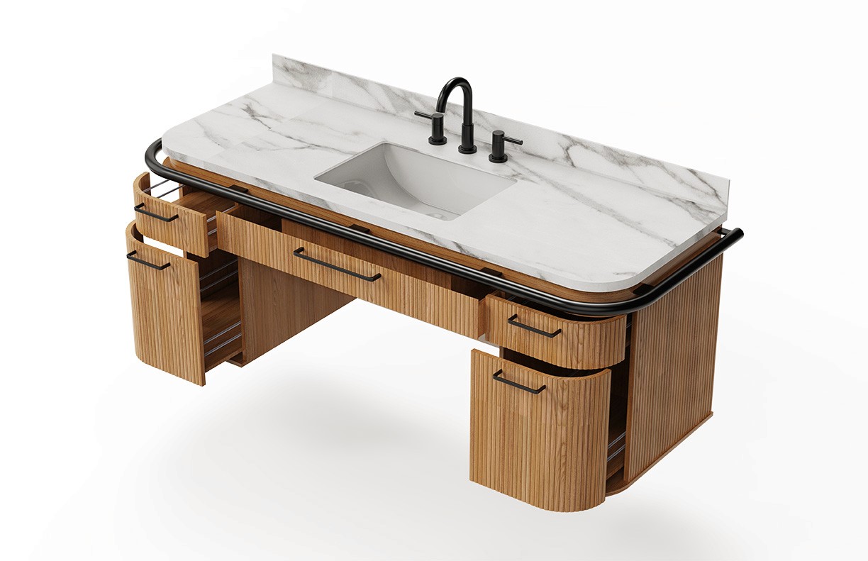
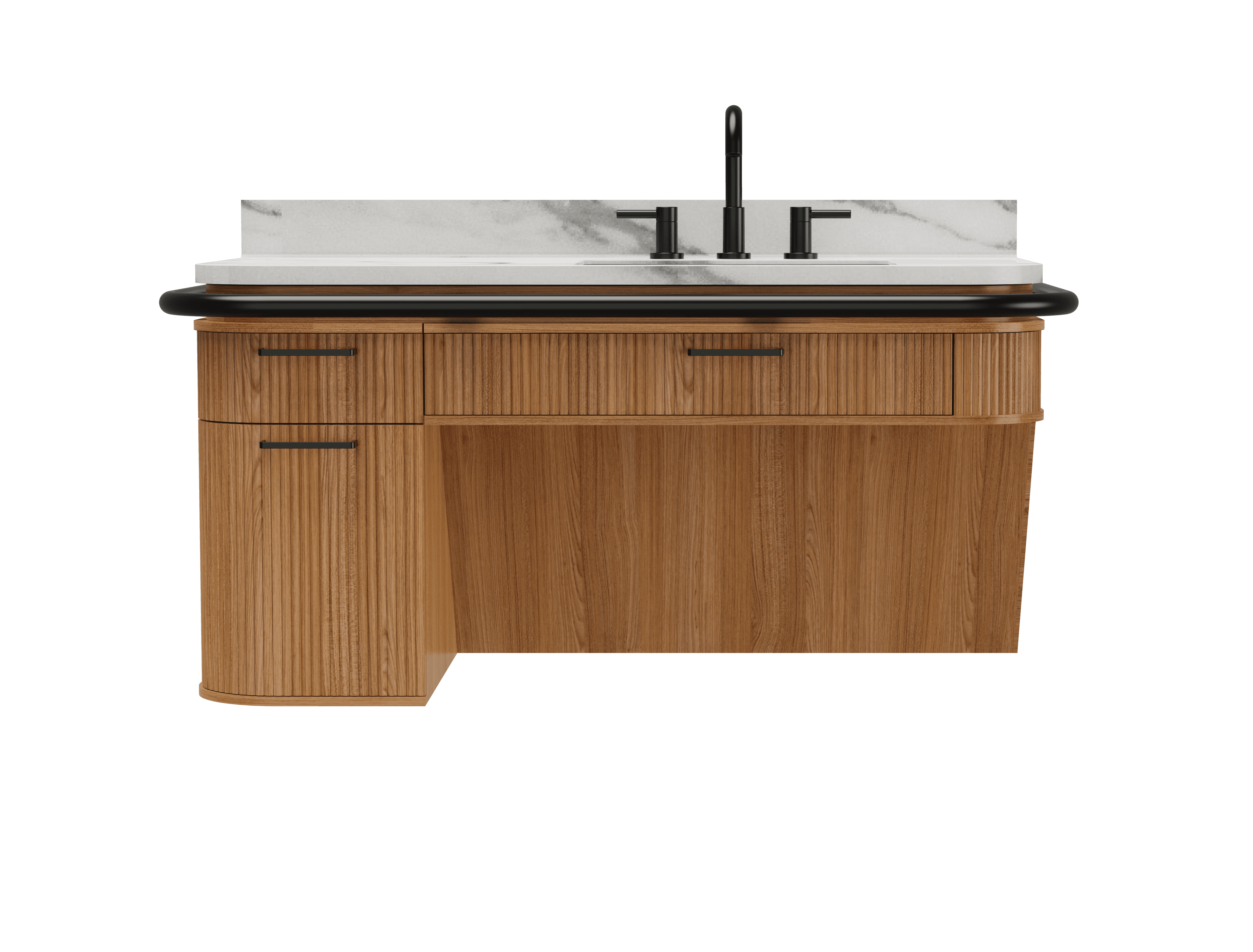
The Origin 21 collection pairs premium materials with restrained contrast to achieve a modern, minimalist aesthetic. Carrara marble was selected for the countertop and backsplash to elevate the overall look, while natural oak adds warmth across the exterior, drawers, vanity frame, drawer interior, and plumbing cover. Finally, matte black accents were used for handles, grab bars, and the vanity legs to provide visual contrast and reinforce a refined, modern character.

It's a structured scheme that outlines the pages and content hierarchy of the app.
I used these models in combination with material swatches to create the look and feel of each vanity for their respective brands.
Apps like your calendar and email lean heavily into the realm of work.
Almost all social media leans into the rest category.
It's a structured scheme that outlines the pages and content hierarchy of the app.
Next step: creating the application map. My goal here was to make strategic information architecture decisions that would improve overall app navigation. The structure I chose was designed to make things simple and easy.

It's a structured scheme that outlines the pages and content hierarchy of the app.
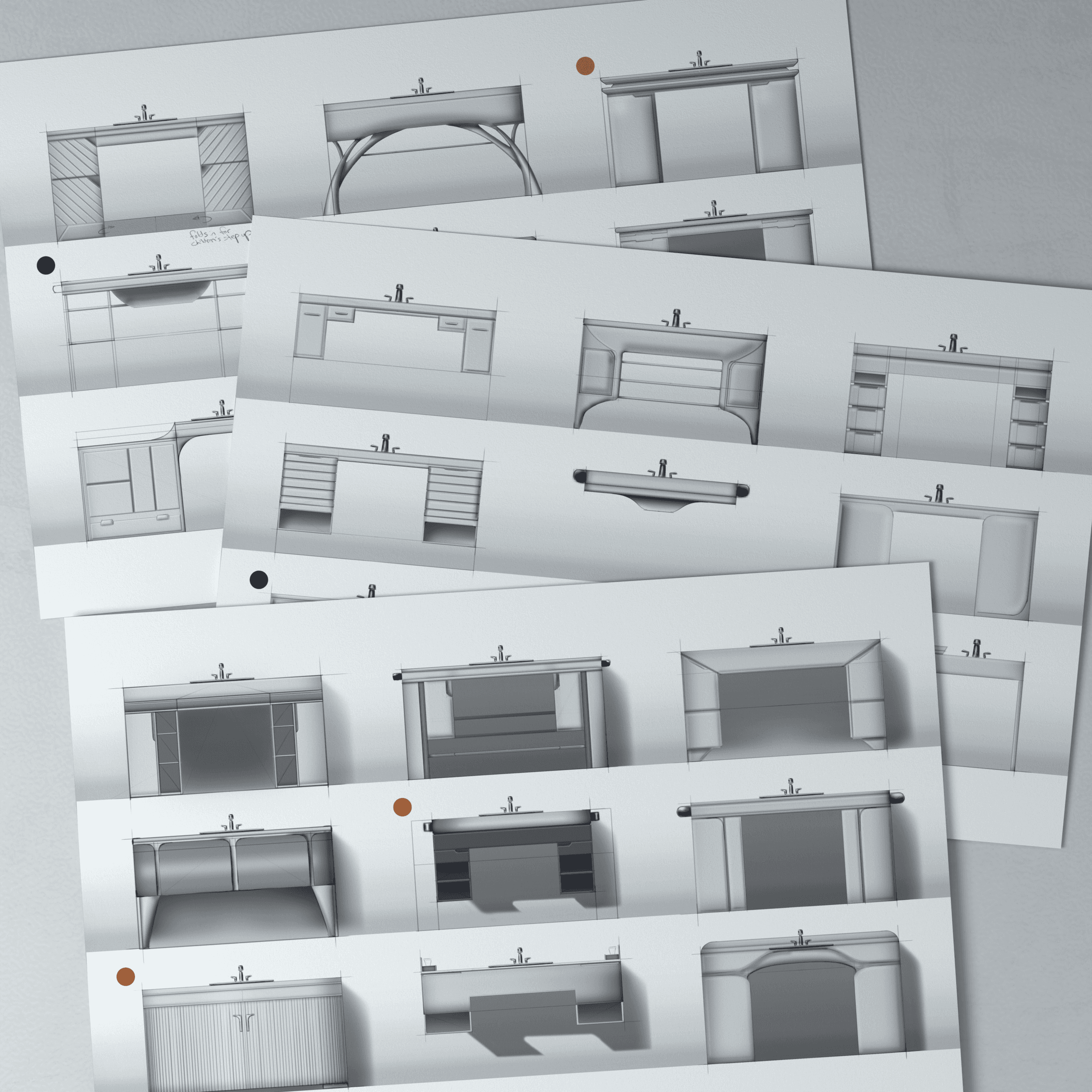
Early sketches were used to explore a wide range of vanity forms, styles, and themes across both collections. This phase focused on testing proportions, storage layouts, and visual language while considering accessibility requirements and retail constraints.
They initially oriented on the basic structure of the homepage and highlight the intended function of each element.
Here I drew five different versions of how structure of information on a homepage might look like. Then I reviewed all the versions and combined them in the refined one.
The goal was to explore different ideas with wireframes.

More "clear" version of wireframes in a digital form. Also all the important pages are added
in it.
On this step I used the Figma design tool to create digital wireframes of all the pages. Then I bonded all of them into the clear and smooth structure.
The goal is to show how all the pages and things interact with each other.

This is an examination of users and their needs, which adds realistic context to the design process.
First I conducted unmoderated usability studies with a few participants: they had to answer different questions about the app and share their observations while using the initial low-fi prototype. After getting the data, I analyzed it and synthesized the information obtained. Finally, I found themes and came up with several insights.
The goal was to identify pain points that the user experiences with the app designs so the issues can be fixed before the final product launches.
In the beginning, before choosing a city and theater, it would be great to look through the whole app and learn everything about it.
There are no movie search - it's necessary to add it on the movies list page.
If user wants to change his account, he should be able to log out or delete it completely.
The clear version :
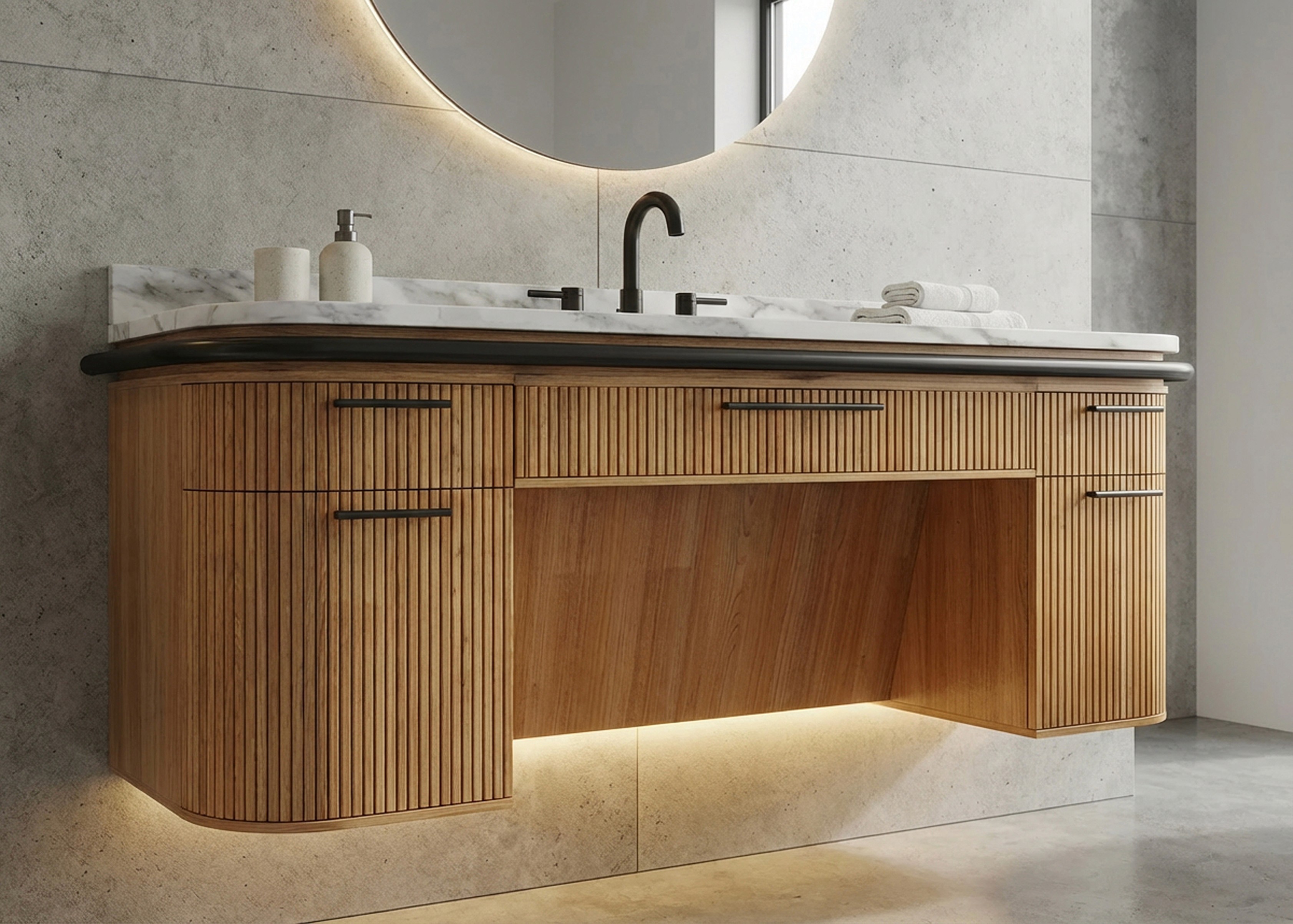
The refinement phase focused on turning the selected designs into realistic, market-ready concepts. This includes high fidelity renders and in-context views to evaluate materials and how each vanity fits within a bathroom setting.
It's a structured scheme that outlines the pages and content hierarchy of the app.
The Origin 21 vanity is shown within a residential bathroom setting to evaluate proportion, material contrast, and overall presence. The visualization highlights the collection’s modern, minimalist character and how it anchors the space without feeling clinical or overdesigned.
Bathroom environments were generated to visualize the vanities in context.
The Style Selections vanity is visualized in a bathroom environment to assess scale, simplicity, and mass-market appeal. This visualization emphasizes neutral styling, simple form, and seamless integration into a bathroom layout.
Bathroom environments were generated to visualize the vanities in context.
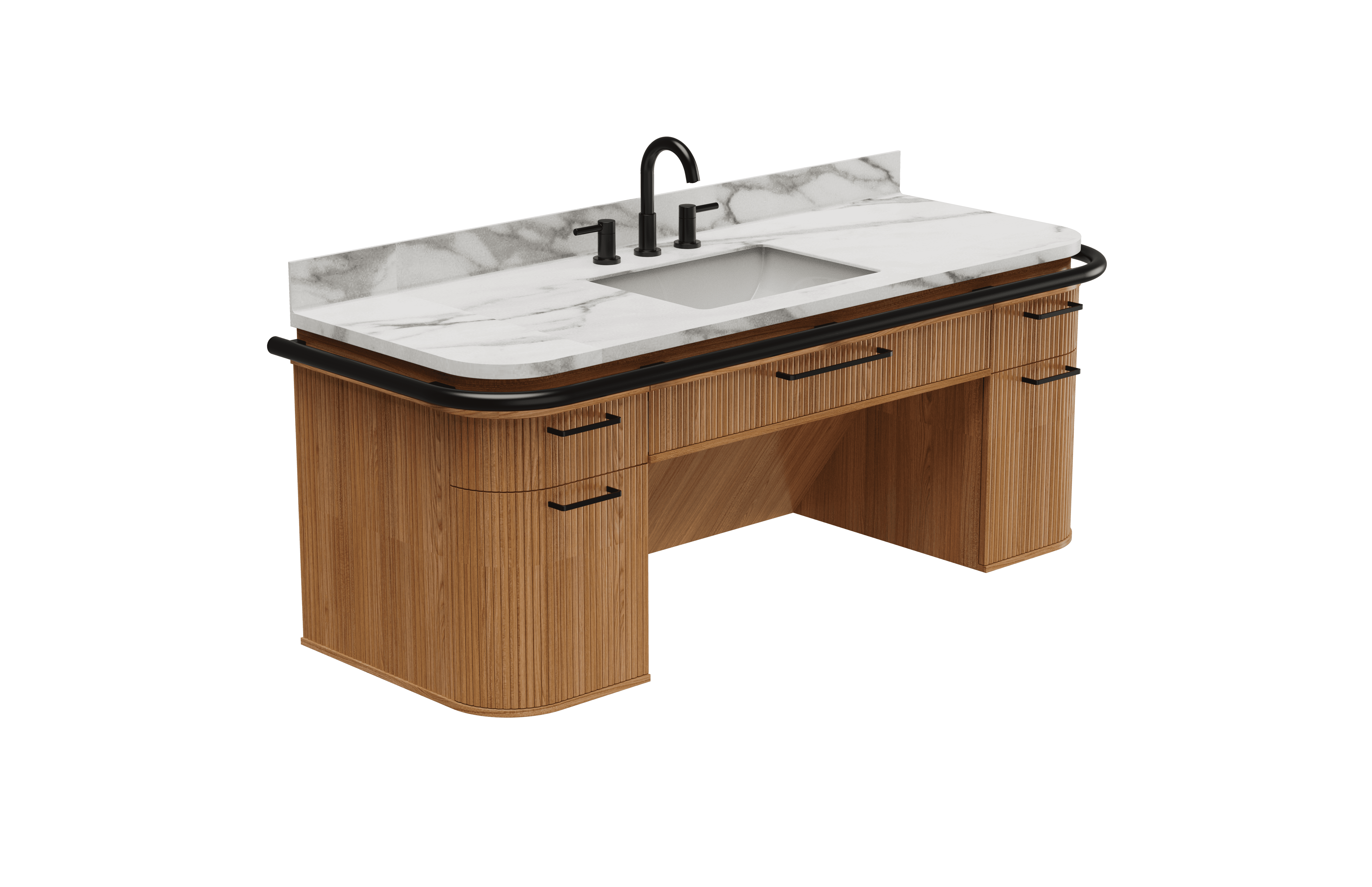
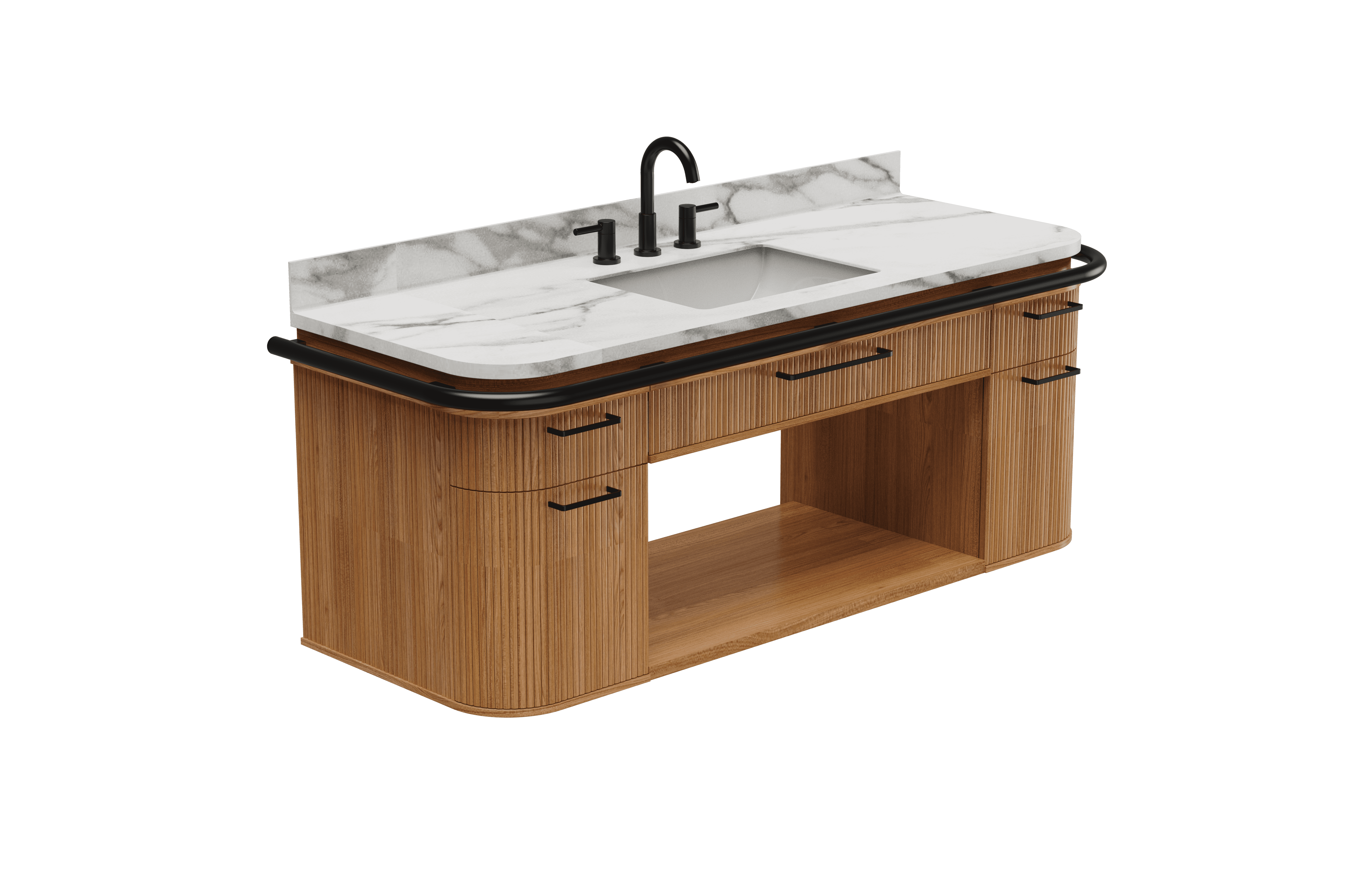
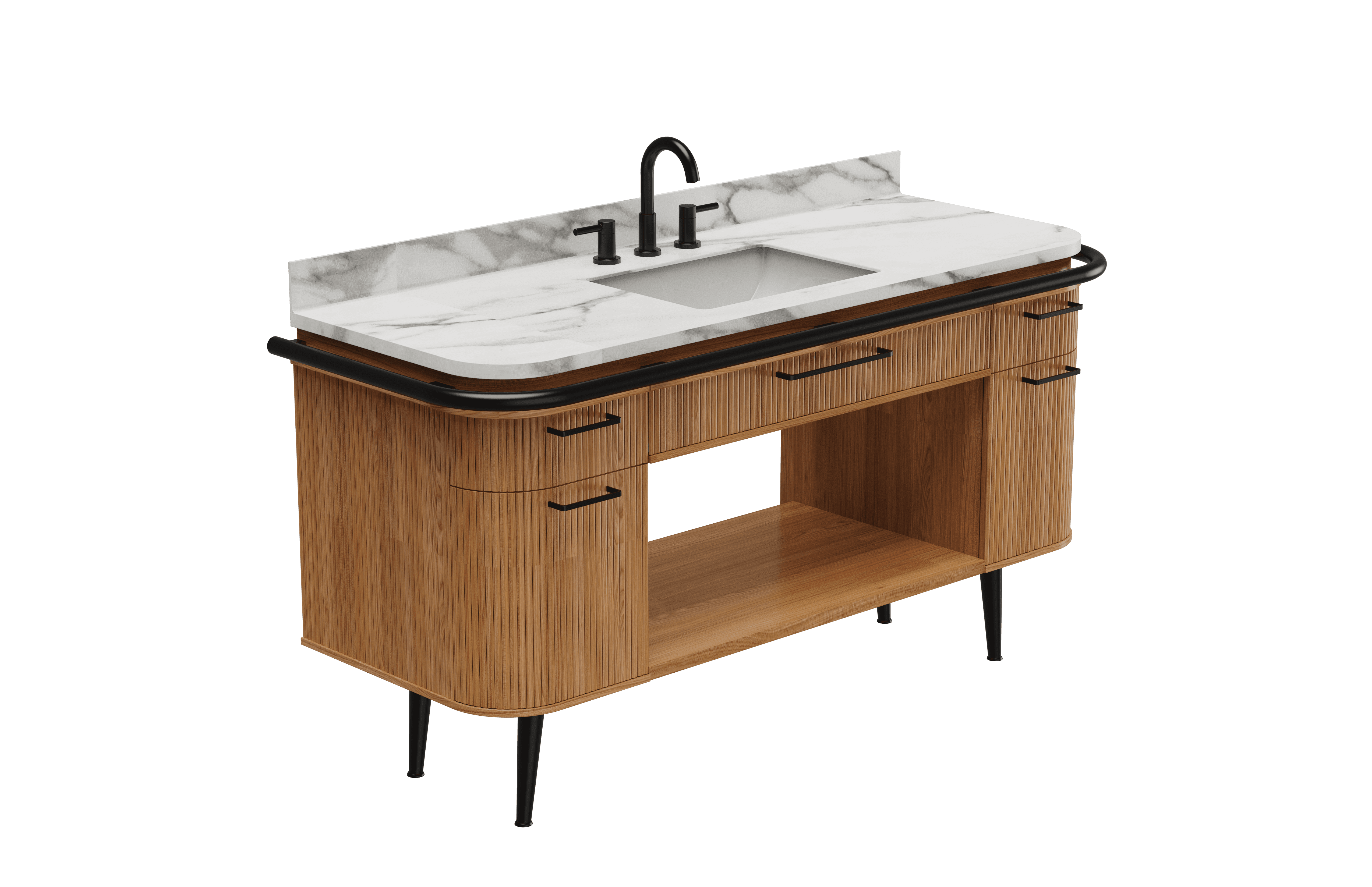
After finishing my final vanity designs, I created some variations to account for different living preferences. The main idea behind these universally designed vanities is that they can live inside anyone’s home and benefit those who need the additional features while also not hindering those who don’t need those features.


These are a high fidelity design that represents a final product
After finishing my final vanity designs, I created some variations to account for different living preferences. The main idea behind these universally designed vanities is that they can live inside anyone’s home and benefit those who need the additional features while also not hindering those who don’t need those features.

We were able to determine three zone of legibility when testing text elements on the HUD. From here we started creating an information hierarchy based on these zones to identify what should be displayed where.
When testing, users reported eye fatigue when there were large blocks of bright colors on the HUD. We pivoted to muted/ transparent elements in later designs.

These are a high fidelity design that represents a final product
I created all the app pages mockups, incorporating the right design elements such as typography, color, and iconography. I also included captivating and visually appealing images, and developed all the necessary components and elements.
The goal was to demonstrate the final Voo's app in as much detail as possible.


It's the detailed, interactive version of designs that closely match the look and feel of the final product.
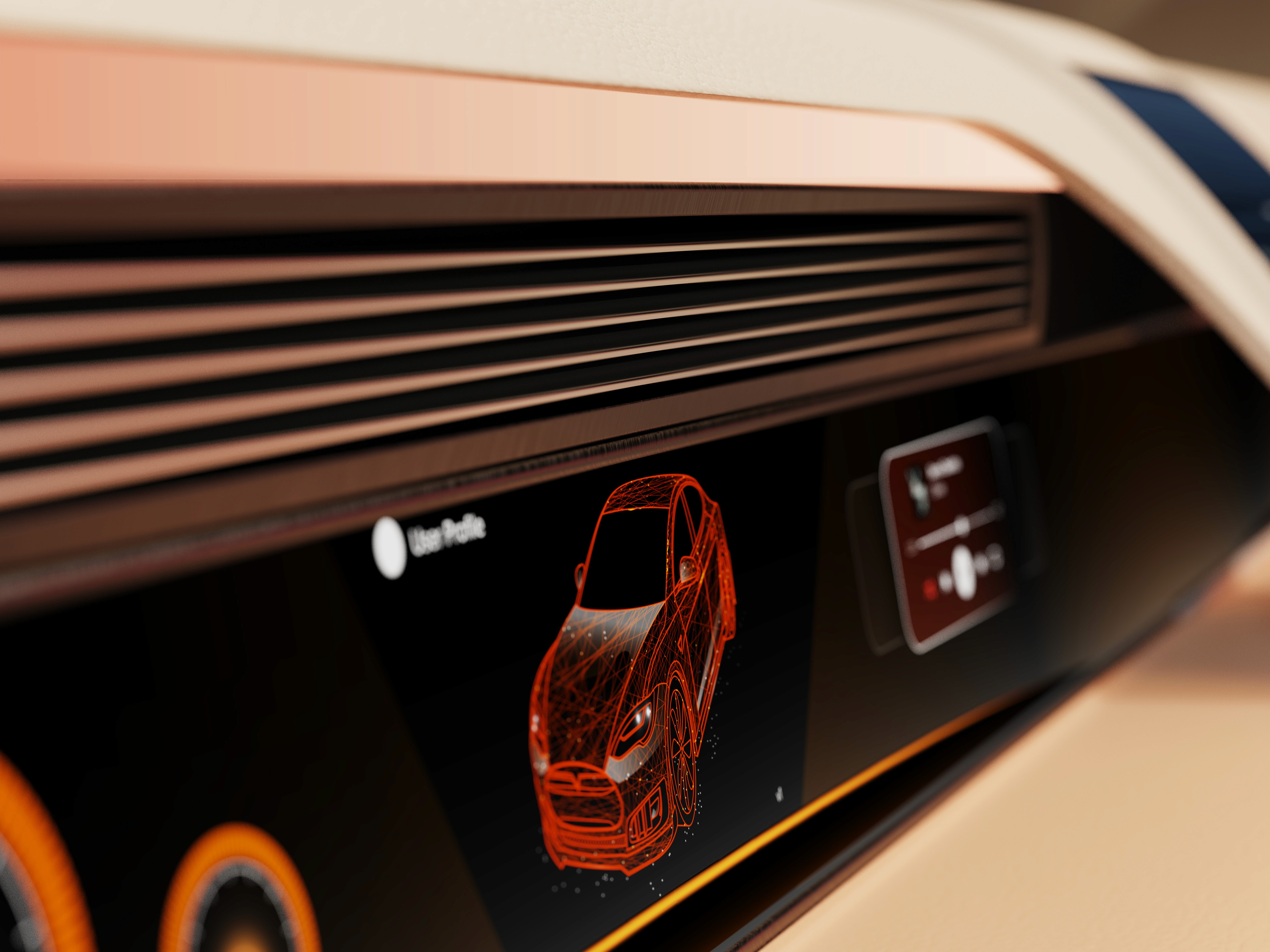
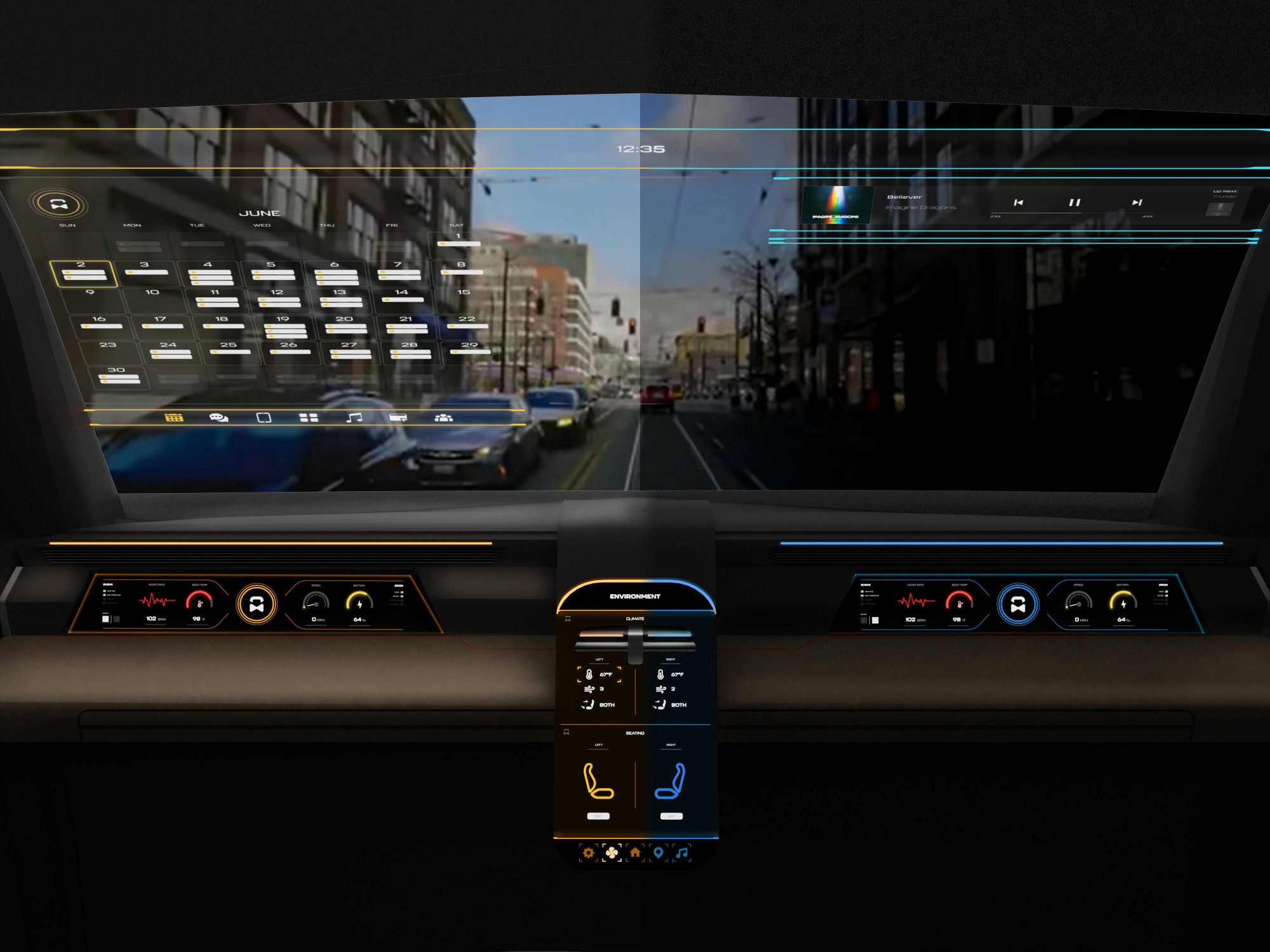
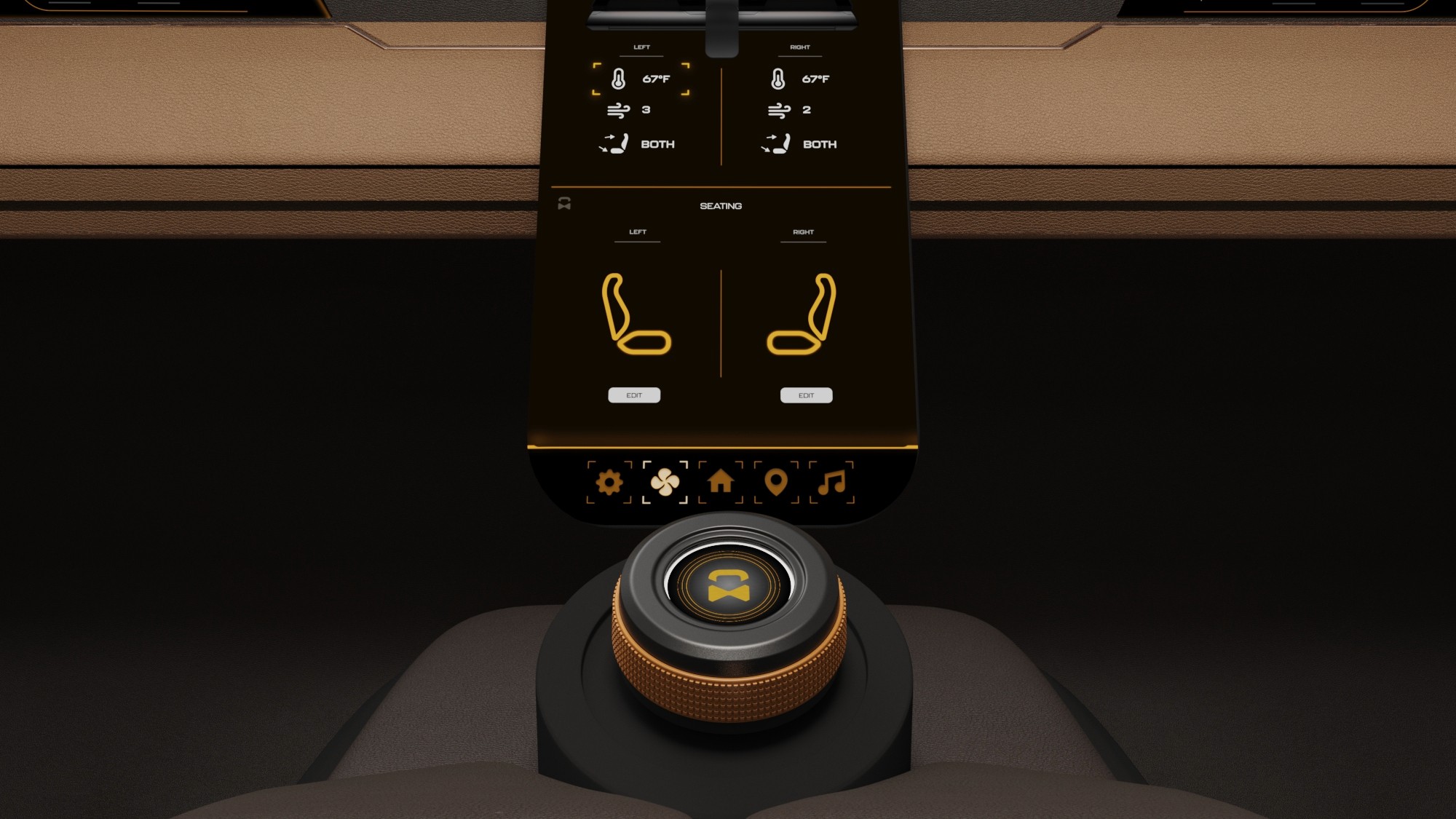
The center stack display and auxiliary displays carry most of the information related to the vehicle itself. They work in tandem with the HUD since the information being displayed on the HUD will either be work or social/ entertainment related.
All of these screens were fully built out in Figma.
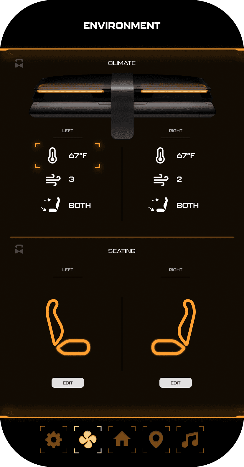
HUD and UI Settings
Environment Settings
Home (General Vehicle Settings)
Map Settings
Multimedia Settings
It's the detailed, interactive version of designs that closely match the look and feel of the final product.
I turned my mockups into a prototype that's ready for testing, using gestures and motion, which can help enrich the user experience and increase the usability of the app.

City and cinema theater selection
Movies slideshow
List of movies + search option
Separate movie page, adding to favourites
Show selection: date and time, hall and seats
Adding selected seats
Calendar with results filtering
Menu and its sections
The project schematically :
The final result is two accessible vanity collections designed to fit naturally within Lowe’s private brands and existing assortment. The designs balance accessibility, affordability, and visual appeal, showing that universal design can work at a mass-market scale.

It's a structured scheme that outlines the pages and content hierarchy of the app.
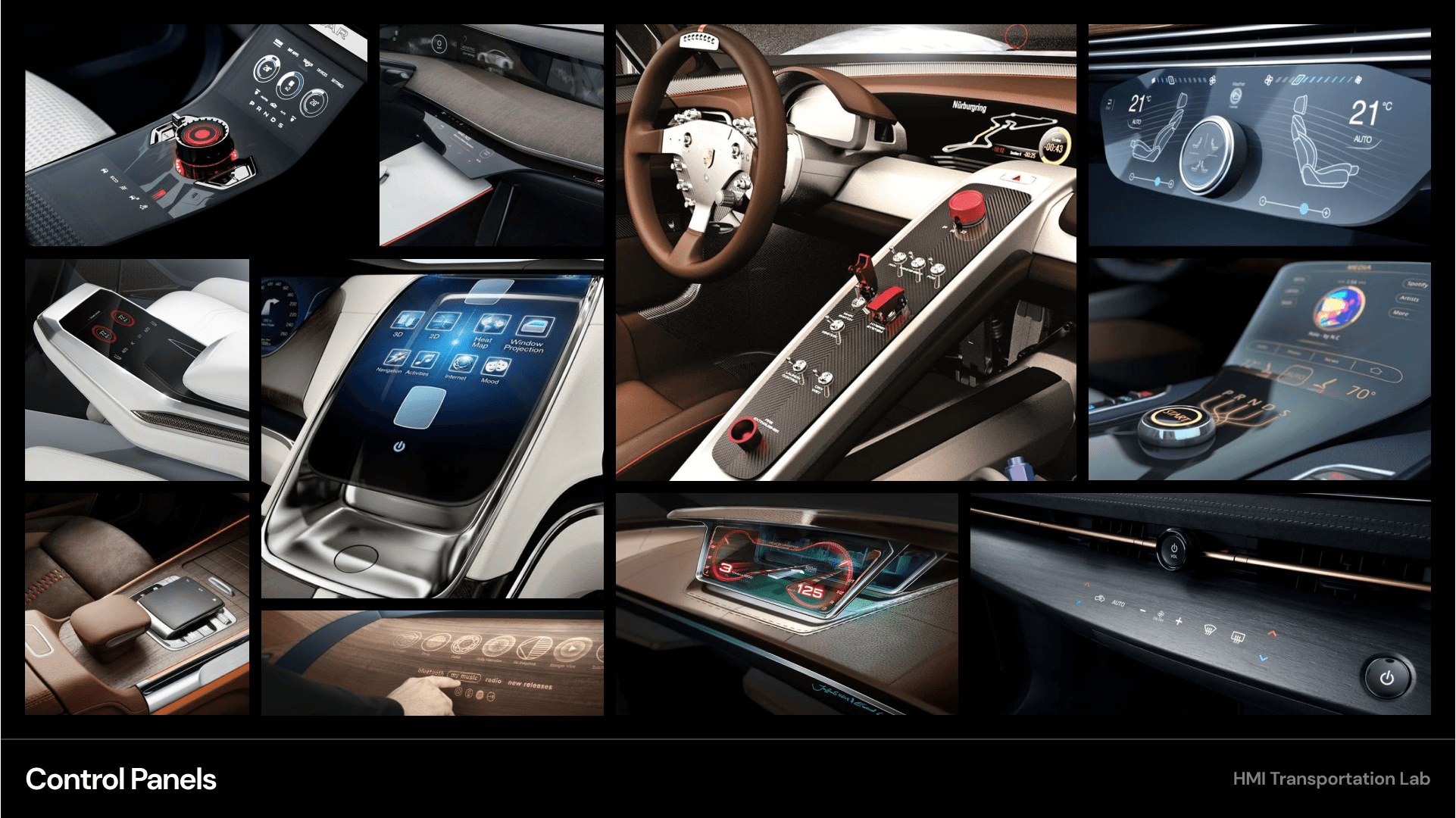
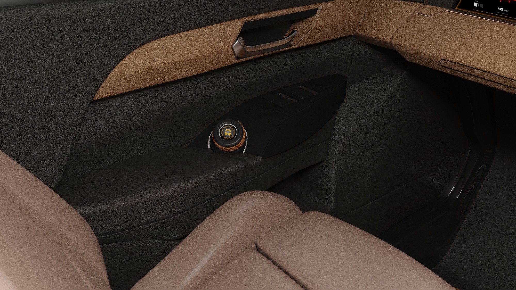
The new and improved haptic knob was built completely in-house and allowed us to customize the force feedback of the knob based on certain scenarios. This means as a user steps through the UI experience, the knob can be programmed to feel different at each step of the UI.
It's a structured scheme that outlines the pages and content hierarchy of the app.
The final HUD has work (orange) and rest (blue) modes to account for whether the user is actively or passively engaging with the UI. This split perspective shows a difference in information density between the two different modes on the HUD
We were able to determine three zone of legibility when testing text elements on the HUD. From here we started creating an information hierarchy based on these zones to identify what should be displayed where.
When testing, users reported eye fatigue when there were large blocks of bright colors on the HUD. We pivoted to muted/ transparent elements in later designs.

Accessibility does not need to be treated as a specialty product or a visual compromise.
The two collections address a clear gap in Lowe’s assortment by introducing ADA-aware vanities across multiple price points and styles. The work positions accessibility as an integrated design feature rather than a niche or premium offering.
This project reinforced the importance of designing within real commercial constraints, including brand strategy, cost targets, and assortment planning. I also learned how market research can directly shape form, materials, and product configuration decisions.
Further development would focus on preparing the collections for broader retail and production consideration.
Build full-scale physical prototypes with a supplier to validate materials and accessibility details
Refine designs with manufacturing and cost optimization in mind
Client
Lowe's
Year
2023
Tag
Industrial Design
Duration
3 months
The project itself :
This project focused on designing a universal bathroom vanity collection for Lowe’s that balances accessibility, aesthetics, and retail constraints. The work explored how design decisions could expand inclusive offerings across multiple price points and brand tiers.
Many bathroom vanities on the market either overlook accessibility considerations or treat them as visually limiting. Lowe’s required a solution that addressed universal design needs while remaining visually appealing, brand-appropriate, and scalable across a mass-market retail environment.
The goal was to create a cohesive vanity system that improves accessibility without sacrificing style, manufacturability, or cost targets. The collection needed to integrate seamlessly into Lowe’s existing assortment while filling key gaps across price point and aesthetic categories.
Industrial Design Intern at Lowe’s, leading the end-to-end design of a universal vanity concept from research through refined CAD and final visualizations.
Market and customer research
Concept sketching and form development
CAD modeling and refinement
CMF selection and visualization
iterating on designs,
making high-fidelity prototype
All about the user :
Research focused on understanding how accessibility is currently addressed within the commercial vanity market and where gaps exist across price, style, and retail availability. By combining customer insights, competitive market analysis, and Lowe’s internal assortment review, key opportunities were identified to deliver accessible vanity solutions that are both affordable and visually appealing.
Very few commercial retailers offer ADA vanities as a product.
A vast majority of accessibility goods and services result in a clinical aesthetic.
The ADA vanities that are commercially sold and have style are way over-priced.
A slight majority of surveyors would like to rest in a driverless car, but getting additional work done was a close second.
Visibility to the road is important to surveyors, so the HUD should not clutter their view.
Commute time often feels underutilized or disconnected from passengers’ goals
This chart represents all available vanities between Lowe’s and its competitors. The products are all mapped out according to their style and price point. The red circles highlight the only ADA vanities found within these competitors.
After analyzing where Lowe’s competitors stack up, I then looked just at Lowe’s current assortment of vanities to pull out insights that would drive my designs. This again had Lowe's vanities mapped out according to their style and price point.
User personas were created to represent distinct Gen-Z passenger behaviors and expectations within a fully autonomous vehicle. These personas helped guide experience decisions by balancing productivity-focused and rest-focused use cases throughout the interior and HMI system.
After figuring out our user group, we created a survey for Gen-Z commuters to help draw out insights that might lead to design opportunities. This survey was equipped with two different types of questions:
Current driving questions
Future thinking, Level 5 questions
51% of Americans ages 18-29 say they would ride in a driverless vehicle if they had the opportunity. So, now we can narrow our user group further to Gen-Z commuters.
Lowe's currently offers no ADA-compliant vanities.
The bulk of Lowe's vanity sales fall in the OPP-MPP price range with a Transitional style.
There is an opportunity to explore within the modern style.
It is the series of experiences Carlos has as he achieve a specific goal. It was built on the his experience.
We compared the typical journey and actions performed for three different modes of transportation and even pointed out some pain points for each. A personal car requires the user’s attention for the entirety of getting from point A to B, and is even required to do a good bit of multitasking at times. However, this is their personal vehicle and is private to them. An uber and bus are similar in that the user has no driving tasks to worry about, but it is no longer a personalized experience; they are in a public space.
A fully autonomous vehicle can give you the best of both worlds. You can have your own personal space while the car does all the driving for you.
The question then becomes: What do you do with the time you spend riding in this vehicle?
In the beginning, before choosing a city and theater, it would be great to look through the whole app and learn everything about it.
There are no movie search - it's necessary to add it on the movies list page.
If user wants to change his account, he should be able to log out or delete it completely.
This is an examination of users and their needs, which adds realistic context to the design process.
First I conducted unmoderated usability studies with a few participants: they had to answer different questions about the app and share their observations while using the initial low-fi prototype. After getting the data, I analyzed it and synthesized the information obtained. Finally, I found themes and came up with several insights.
The goal was to identify pain points that the user experiences with the app designs so the issues can be fixed before the final product launches.
A slight majority of surveyors would like to rest in a driverless car, but getting additional work done was a close second.
Visibility to the road is important to surveyors, so the HUD should not clutter their view.
If user wants to change his account, he should be able to log out or delete it completely.
It is the series of experiences Carlos has as he achieve a specific goal. It was built on the his experience.
For aging-in-place customers shopping at Lowe’s, these two vanity collections deliver accessible design that balances function, style, and affordability. Designed for different aesthetic preferences and price tiers within Lowe’s private brands, the collections expand access to ADA-aware vanities without the clinical appearance or premium pricing common in the market.
A fully autonomous vehicle can give you the best of both worlds. You can have your own personal space while the car does all the driving for you.
The question then becomes: What do you do with the time you spend riding in this vehicle?
Aging customers are more likely than those with a disability to choose Lowe’s for various products and services. This data validates Lowe’s target customer for accessible goods being the aging in place customer. A vast majority of these projects start in the bathroom since this is a space many consider vulnerable.
I developed a user journey map of Carlos's experience with the app to highlight potential pain points and identify areas for improvement.
Choose a good movie in a cinema theatre nearby and select seats in an app in a fast and clear way
The project schematically :
Concept development focused on translating research insights into two distinct vanity collections aligned with Lowe’s private brands. Early exploration emphasized form, proportion, accessibility considerations, and brand expression through moodboards, sketches, and iterative CAD studies.
At the start of our research, we listed out possible stakeholders and mapped them out based on their importance and influence to the project and relative to themselves. We made sure to note where the vulnerable populations would be, but since this project is so closely tied with the experience on the interior of the vehicle, we stayed focused on just the driver and our sponsor.
I developed a user journey map of Carlos's experience with the app to highlight potential pain points and identify areas for improvement.
Origin 21 explores a modern, minimalist vanity collection positioned within the mid-to-high price range. The direction emphasizes clean geometry, refined materials, and subtle detailing to deliver an accessible design that feels elevated without appearing clinical or overly utilitarian.
Style Selections focuses on a cost-effective vanity collection designed for the opening-to-mid price tiers. The aesthetic prioritizes simplicity, approachability, and efficient use of materials, offering accessible design that remains visually neutral and attainable for a broad customer base.

These are a high fidelity design that represents a final product
Moodboards were used to establish a retro-futuristic aesthetic blended with a sense of tranquil luxury. This visual direction helped guide material choices, lighting tone, and the overall emotional character of the interior.
We were able to determine three zone of legibility when testing text elements on the HUD. From here we started creating an information hierarchy based on these zones to identify what should be displayed where.
When testing, users reported eye fatigue when there were large blocks of bright colors on the HUD. We pivoted to muted/ transparent elements in later designs.
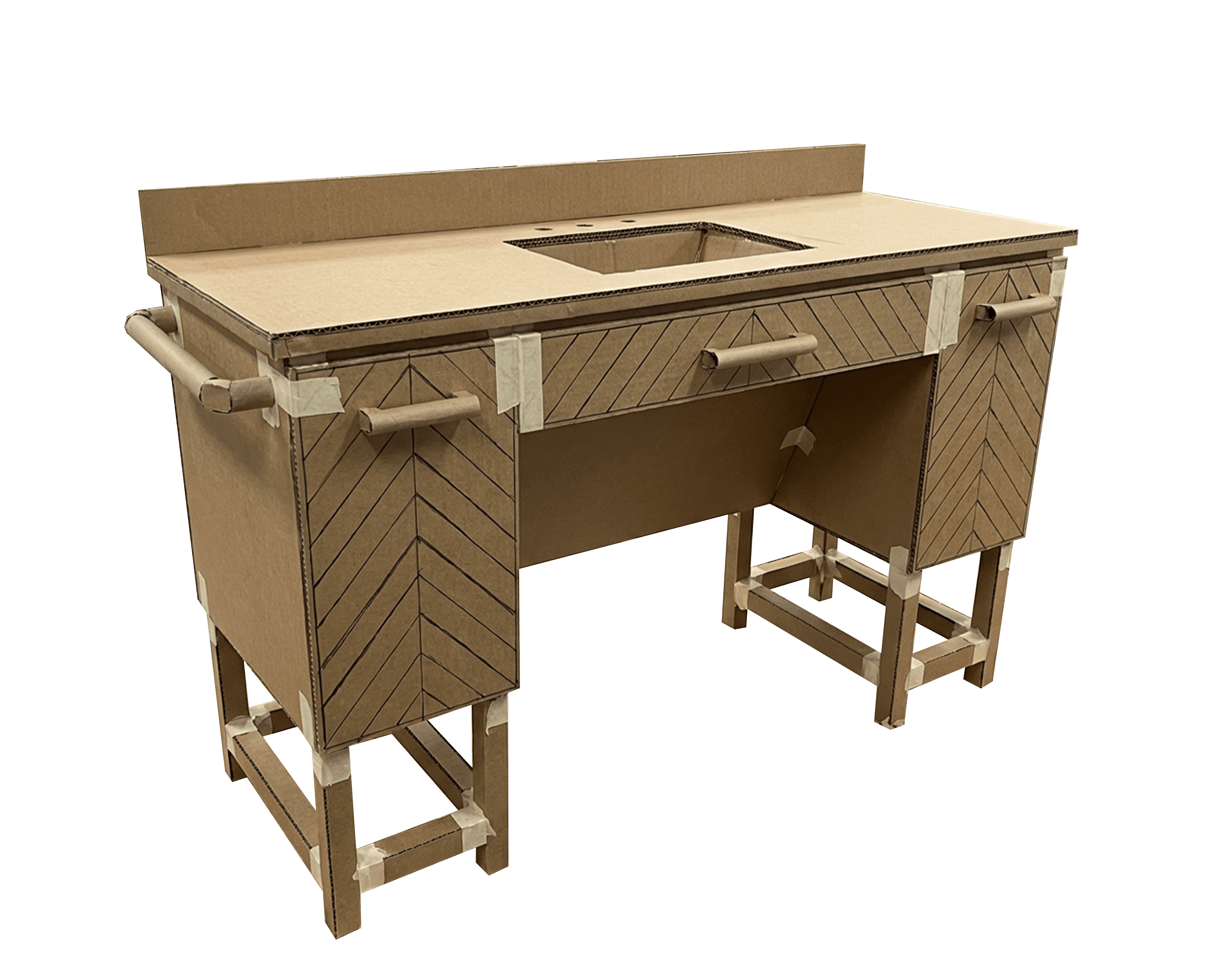
Prototyping was carried out via full scale low-fi models as well as 3D printing mini models. This helped build my understanding correct proportions and structural integrity.
Refined sketches were developed by combining the strongest elements from earlier concepts into two focused directions, one for each brand. This stage emphasized clearer form language, proportion, and feature integration while aligning each design more closely with its respective price tier and brand identity.
These are a high fidelity design that represents a final product
Early CAD models helped refine overall form, proportions, and structural relationships while translating sketch concepts into three-dimensional geometry.
The series of hand-drawing frames that visually describe and explore a user's experience with a product.
I began with drawing storyboards to focus on just the most important parts of a user’s experience with the app. It's a story that was told through the panels, revealed it two different way
Big picture storyboard, which focuses on the user experience. It's about how people will use the Voo's app during their day and it will be useful.
Close-up storyboard focuses on the app instead of on the user experiencing that product. Shows what happens on each screen of the app.
HUD concepts were evaluated in context using a transparent OLED display within a simulated driving environment. This setup allowed visibility, hierarchy, and legibility of text-based interactions to be assessed during representative passenger scenarios.
HUD concepts were evaluated in context using a transparent OLED display within a simulated driving environment. This setup allowed visibility, hierarchy, and legibility of text-based interactions to be assessed during representative passenger scenarios.
The Origin 21 collection pairs premium materials with restrained contrast to achieve a modern, minimalist aesthetic. Carrara marble was selected for the countertop and backsplash to elevate the overall look, while natural oak adds warmth across the exterior, drawers, vanity frame, drawer interior, and plumbing cover. Finally, matte black accents were used for handles, grab bars, and the vanity legs to provide visual contrast and reinforce a refined, modern character.
Each collection includes 60", 48", and 36" vanity options to support a range of bathroom sizes.
The Style Selections collection emphasizes simplicity and cost efficiency through a clean, cohesive palette. A pure white engineered stone countertop and backsplash establish durability and visual consistency, while white painted wood is used across the exterior, drawers, chevron detailing, vanity frame, plumbing cover, and legs. Brushed nickel hardware and grab bars introduce subtle contrast without increasing complexity or cost.
These are a high fidelity design that represents a final product
Each collection includes 60", 48", and 36" vanity options to support a range of bathroom sizes.

I used these models in combination with material swatches to create the look and feel of each vanity for their respective brands.
It's a structured scheme that outlines the pages and content hierarchy of the app.
Next step: creating the application map. My goal here was to make strategic information architecture decisions that would improve overall app navigation. The structure I chose was designed to make things simple and easy.
It's a structured scheme that outlines the pages and content hierarchy of the app.
Early sketches were used to explore a wide range of vanity forms, styles, and themes across both collections. This phase focused on testing proportions, storage layouts, and visual language while considering accessibility requirements and retail constraints.
They initially oriented on the basic structure of the homepage and highlight the intended function of each element.
Here I drew five different versions of how structure of information on a homepage might look like. Then I reviewed all the versions and combined them in the refined one.
The goal was to explore different ideas with wireframes.
More "clear" version of wireframes in a digital form. Also all the important pages are added
in it.
On this step I used the Figma design tool to create digital wireframes of all the pages. Then I bonded all of them into the clear and smooth structure.
The goal is to show how all the pages and things interact with each other.
This is an examination of users and their needs, which adds realistic context to the design process.
First I conducted unmoderated usability studies with a few participants: they had to answer different questions about the app and share their observations while using the initial low-fi prototype. After getting the data, I analyzed it and synthesized the information obtained. Finally, I found themes and came up with several insights.
The goal was to identify pain points that the user experiences with the app designs so the issues can be fixed before the final product launches.
In the beginning, before choosing a city and theater, it would be great to look through the whole app and learn everything about it.
There are no movie search - it's necessary to add it on the movies list page.
If user wants to change his account, he should be able to log out or delete it completely.
The clear version :
The refinement phase focused on turning the selected designs into realistic, market-ready concepts. This includes high fidelity renders and in-context views to evaluate materials and how each vanity fits within a bathroom setting.
It's a structured scheme that outlines the pages and content hierarchy of the app.
The Origin 21 vanity is shown within a residential bathroom setting to evaluate proportion, material contrast, and overall presence. The visualization highlights the collection’s modern, minimalist character and how it anchors the space without feeling clinical or overdesigned.
Bathroom environments were generated to visualize the vanities in context.
The Style Selections vanity is visualized in a bathroom environment to assess scale, simplicity, and mass-market appeal. This visualization emphasizes neutral styling, simple form, and seamless integration into a bathroom layout.
Bathroom environments were generated to visualize the vanities in context.
After finishing my final vanity designs, I created some variations to account for different living preferences. The main idea behind these universally designed vanities is that they can live inside anyone’s home and benefit those who need the additional features while also not hindering those who don’t need those features.
These are a high fidelity design that represents a final product
After finishing my final vanity designs, I created some variations to account for different living preferences. The main idea behind these universally designed vanities is that they can live inside anyone’s home and benefit those who need the additional features while also not hindering those who don’t need those features.
We were able to determine three zone of legibility when testing text elements on the HUD. From here we started creating an information hierarchy based on these zones to identify what should be displayed where.
These are a high fidelity design that represents a final product
I created all the app pages mockups, incorporating the right design elements such as typography, color, and iconography. I also included captivating and visually appealing images, and developed all the necessary components and elements.
The goal was to demonstrate the final Voo's app in as much detail as possible.
It's the detailed, interactive version of designs that closely match the look and feel of the final product.
I turned my mockups into a prototype that's ready for testing, using gestures and motion, which can help enrich the user experience and increase the usability of the app.
City and cinema theater selection
Movies slideshow
List of movies + search option
Separate movie page, adding to favourites
Show selection: date and time, hall and seats
Adding selected seats
Calendar with results filtering
Menu and its sections
It's the detailed, interactive version of designs that closely match the look and feel of the final product.
The center stack display and auxiliary displays carry most of the information related to the vehicle itself. They work in tandem with the HUD since the information being displayed on the HUD will either be work or social/ entertainment related.
All of these screens were fully built out in Figma.
HUD and UI Settings
Environment Settings
Home (General Vehicle Settings)
Map Settings
Multimedia Settings
The project schematically :
The final result is two accessible vanity collections designed to fit naturally within Lowe’s private brands and existing assortment. The designs balance accessibility, affordability, and visual appeal, showing that universal design can work at a mass-market scale.
It's a structured scheme that outlines the pages and content hierarchy of the app.
The new and improved haptic knob was built completely in-house and allowed us to customize the force feedback of the knob based on certain scenarios. This means as a user steps through the UI experience, the knob can be programmed to feel different at each step of the UI.
It's a structured scheme that outlines the pages and content hierarchy of the app.
The final HUD has work (orange) and rest (blue) modes to account for whether the user is actively or passively engaging with the UI. This split perspective shows a difference in information density between the two different modes on the HUD
We were able to determine three zone of legibility when testing text elements on the HUD. From here we started creating an information hierarchy based on these zones to identify what should be displayed where.
Accessibility does not need to be treated as a specialty product or a visual compromise.
The two collections address a clear gap in Lowe’s assortment by introducing ADA-aware vanities across multiple price points and styles. The work positions accessibility as an integrated design feature rather than a niche or premium offering.
This project reinforced the importance of designing within real commercial constraints, including brand strategy, cost targets, and assortment planning. I also learned how market research can directly shape form, materials, and product configuration decisions.
Further development would focus on preparing the collections for broader retail and production consideration.
Build full-scale physical prototypes with a supplier to validate materials and accessibility details
Refine designs with manufacturing and cost optimization in mind
Client
Lowe's
Year
2023
Tag
Industrial Design
Duration
3 months
This project focused on designing a universal bathroom vanity collection for Lowe’s that balances accessibility, aesthetics, and retail constraints. The work explored how design decisions could expand inclusive offerings across multiple price points and brand tiers.
Many bathroom vanities on the market either overlook accessibility considerations or treat them as visually limiting. Lowe’s required a solution that addressed universal design needs while remaining visually appealing, brand-appropriate, and scalable across a mass-market retail environment.
The goal was to create a cohesive vanity system that improves accessibility without sacrificing style, manufacturability, or cost targets. The collection needed to integrate seamlessly into Lowe’s existing assortment while filling key gaps across price point and aesthetic categories.
Industrial Design Intern at Lowe’s, leading the end-to-end design of a universal vanity concept from research through refined CAD and final visualizations.
Market and customer research
Concept sketching and form development
CAD modeling and refinement
CMF selection and visualization
Research focused on understanding how accessibility is currently addressed within the commercial vanity market and where gaps exist across price, style, and retail availability. By combining customer insights, competitive market analysis, and Lowe’s internal assortment review, key opportunities were identified to deliver accessible vanity solutions that are both affordable and visually appealing.
Very few commercial retailers offer ADA vanities as a product.
A vast majority of accessibility goods and services result in a clinical aesthetic.
The ADA vanities that are commercially sold and have style are way over-priced.
Aging customers are more likely than those with a disability to choose Lowe’s for various products and services. This data validates Lowe’s target customer for accessible goods being the aging in place customer. A vast majority of these projects start in the bathroom since this is a space many consider vulnerable.
This chart represents all available vanities between Lowe’s and its competitors. The products are all mapped out according to their style and price point. The red circles highlight the only ADA vanities found within these competitors.
After analyzing where Lowe’s competitors stack up, I then looked just at Lowe’s current assortment of vanities to pull out insights that would drive my designs. This again had Lowe's vanities mapped out according to their style and price point.
Lowe's currently offers no ADA-compliant vanities.
The bulk of Lowe's vanity sales fall in the OPP-MPP price range with a Transitional style.
There is an opportunity to explore within the modern style.
For aging-in-place customers shopping at Lowe’s, these two vanity collections deliver accessible design that balances function, style, and affordability. Designed for different aesthetic preferences and price tiers within Lowe’s private brands, the collections expand access to ADA-aware vanities without the clinical appearance or premium pricing common in the market.
Concept development focused on translating research insights into two distinct vanity collections aligned with Lowe’s private brands. Early exploration emphasized form, proportion, accessibility considerations, and brand expression through moodboards, sketches, and iterative CAD studies.
Origin 21 explores a modern, minimalist vanity collection positioned within the mid-to-high price range. The direction emphasizes clean geometry, refined materials, and subtle detailing to deliver an accessible design that feels elevated without appearing clinical or overly utilitarian.
Style Selections focuses on a cost-effective vanity collection designed for the opening-to-mid price tiers. The aesthetic prioritizes simplicity, approachability, and efficient use of materials, offering accessible design that remains visually neutral and attainable for a broad customer base.

Early sketches were used to explore a wide range of vanity forms, styles, and themes across both collections. This phase focused on testing proportions, storage layouts, and visual language while considering accessibility requirements and retail constraints.
Refined sketches were developed by combining the strongest elements from earlier concepts into two focused directions, one for each brand. This stage emphasized clearer form language, proportion, and feature integration while aligning each design more closely with its respective price tier and brand identity.
Early CAD models helped refine overall form, proportions, and structural relationships while translating sketch concepts into three-dimensional geometry.
Prototyping was carried out via full scale low-fi models as well as 3D printing mini models. This helped build my understanding correct proportions and structural integrity.
I used these models in combination with material swatches to create the look and feel of each vanity for their respective brands.
The Origin 21 collection pairs premium materials with restrained contrast to achieve a modern, minimalist aesthetic. Carrara marble was selected for the countertop and backsplash to elevate the overall look, while natural oak adds warmth across the exterior, drawers, vanity frame, drawer interior, and plumbing cover. Finally, matte black accents were used for handles, grab bars, and the vanity legs to provide visual contrast and reinforce a refined, modern character.
Each collection includes 60", 48", and 36" vanity options to support a range of bathroom sizes.
The Style Selections collection emphasizes simplicity and cost efficiency through a clean, cohesive palette. A pure white engineered stone countertop and backsplash establish durability and visual consistency, while white painted wood is used across the exterior, drawers, chevron detailing, vanity frame, plumbing cover, and legs. Brushed nickel hardware and grab bars introduce subtle contrast without increasing complexity or cost.
Each collection includes 60", 48", and 36" vanity options to support a range of bathroom sizes.


The refinement phase focused on turning the selected designs into realistic, market-ready concepts. This includes high fidelity renders and in-context views to evaluate materials and how each vanity fits within a bathroom setting.
The Origin 21 vanity is shown within a residential bathroom setting to evaluate proportion, material contrast, and overall presence. The visualization highlights the collection’s modern, minimalist character and how it anchors the space without feeling clinical or overdesigned.
Bathroom environments were generated to visualize the vanities in context.
After finishing my final vanity designs, I created some variations to account for different living preferences. The main idea behind these universally designed vanities is that they can live inside anyone’s home and benefit those who need the additional features while also not hindering those who don’t need those features.
The Style Selections vanity is visualized in a bathroom environment to assess scale, simplicity, and mass-market appeal. This visualization emphasizes neutral styling, simple form, and seamless integration into a bathroom layout.
Bathroom environments were generated to visualize the vanities in context.
After finishing my final vanity designs, I created some variations to account for different living preferences. The main idea behind these universally designed vanities is that they can live inside anyone’s home and benefit those who need the additional features while also not hindering those who don’t need those features.
The final result is two accessible vanity collections designed to fit naturally within Lowe’s private brands and existing assortment. The designs balance accessibility, affordability, and visual appeal, showing that universal design can work at a mass-market scale.
Accessibility does not need to be treated as a specialty product or a visual compromise.
The two collections address a clear gap in Lowe’s assortment by introducing ADA-aware vanities across multiple price points and styles. The work positions accessibility as an integrated design feature rather than a niche or premium offering.
This project reinforced the importance of designing within real commercial constraints, including brand strategy, cost targets, and assortment planning. I also learned how market research can directly shape form, materials, and product configuration decisions.
Further development would focus on preparing the collections for broader retail and production consideration.
Build full-scale physical prototypes with a supplier to validate materials and accessibility details
Refine designs with manufacturing and cost optimization in mind