
Infotainment Platform
Client
HATCI
Year
2025
Tag
Automotive
Duration
12 months


Client
HATCI
Year
2025
Tag
Automotive
Duration
12 months


The project itself :
This project focused on creating a high-fidelity physical and digital dashboard environment to support future infotainment and HMI development workflows. By rebuilding a scanned production interior into an accurate digital twin and pairing it with a physical simulator, the system enables immersive, spatially correct evaluation of interface concepts in context.
Current HMI development workflows are fragmented across tools, teams, and platforms, leading to inefficiencies, misalignment, and siloed decision-making. There is a need for a unified, spatially accurate system that supports real-time collaboration and consistent evaluation across design and development disciplines.
The goal was to establish a shared physical and digital reference environment that improves accuracy, collaboration, and iteration speed during infotainment development. The system prioritizes fidelity, alignment to production vehicle geometry, and seamless integration between physical hardware and virtual evaluation.
An HMI-focused industrial designer, responsible for creating the physical and digital dashboard models used to support immersive evaluation and collaboration.
Interior scanning and data preparation
Autodesk Alias surfacing
Part engineering for 3D printing and prototyping
Driving simulator integration
iterating on designs,
making high-fidelity prototype
All about the user :
Research for this project focused on understanding inefficiencies within current infotainment development workflows and the limitations of existing evaluation methods. Rather than studying end users, the work examined how designers and developers interact with tools, data, and physical vehicle context during interface development.
Infotainment concepts are often reviewed without accurate physical context, leading to late-stage rework
Disconnected tools and workflows slow collaboration between designers, developers, and engineers
Limited immersive evaluation makes it difficult to assess spatial relationships, reach, and visibility early in development
Establish a shared physical and digital dashboard reference to support cross-disciplinary collaboration
Enable earlier evaluation of infotainment concepts within accurate spatial context
Reduce iteration time by minimizing translation loss between design, development, and testing
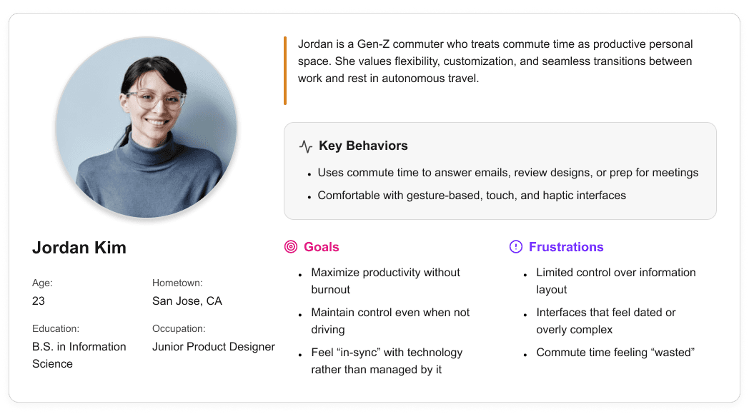
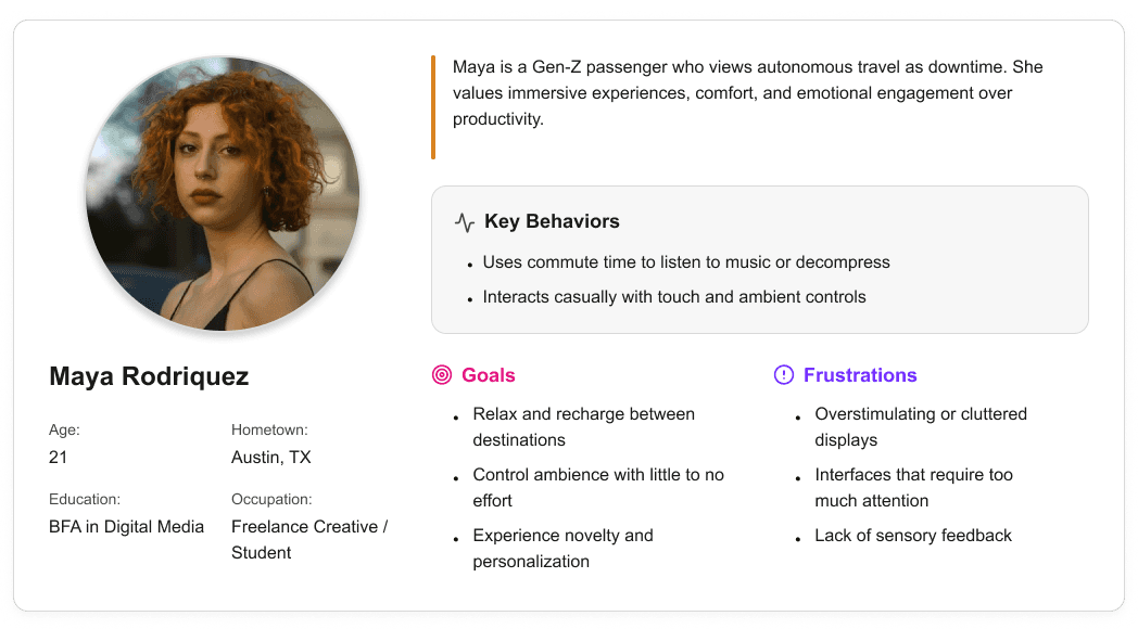
User personas were created to represent distinct Gen-Z passenger behaviors and expectations within a fully autonomous vehicle. These personas helped guide experience decisions by balancing productivity-focused and rest-focused use cases throughout the interior and HMI system.

It is the series of experiences Carlos has as he achieve a specific goal. It was built on the his experience.
Existing infotainment development workflows are spread across disconnected tools and disciplines, creating friction during iteration and review. Interface concepts are often evaluated without accurate physical context, making it difficult to assess spatial relationships, reach, and visibility early in the process. As a result, feedback cycles slow down and misalignment between teams can persist until later stages of development.
A spatially accurate reference environment to evaluate layout, scale, and visual hierarchy in context
Clear alignment between digital interface behavior and physical hardware constraints
It is the series of experiences Carlos has as he achieve a specific goal. It was built on the his experience.
I developed a user journey map of Carlos's experience with the app to highlight potential pain points and identify areas for improvement.
After figuring out our user group, we created a survey for Gen-Z commuters to help draw out insights that might lead to design opportunities. This survey was equipped with two different types of questions:
Current driving questions
Future thinking, Level 5 questions
It is the series of experiences Carlos has as he achieve a specific goal. It was built on the his experience.
We compared the typical journey and actions performed for three different modes of transportation and even pointed out some pain points for each. A personal car requires the user’s attention for the entirety of getting from point A to B, and is even required to do a good bit of multitasking at times. However, this is their personal vehicle and is private to them. An uber and bus are similar in that the user has no driving tasks to worry about, but it is no longer a personalized experience; they are in a public space.
A fully autonomous vehicle can give you the best of both worlds. You can have your own personal space while the car does all the driving for you.
The question then becomes: What do you do with the time you spend riding in this vehicle?
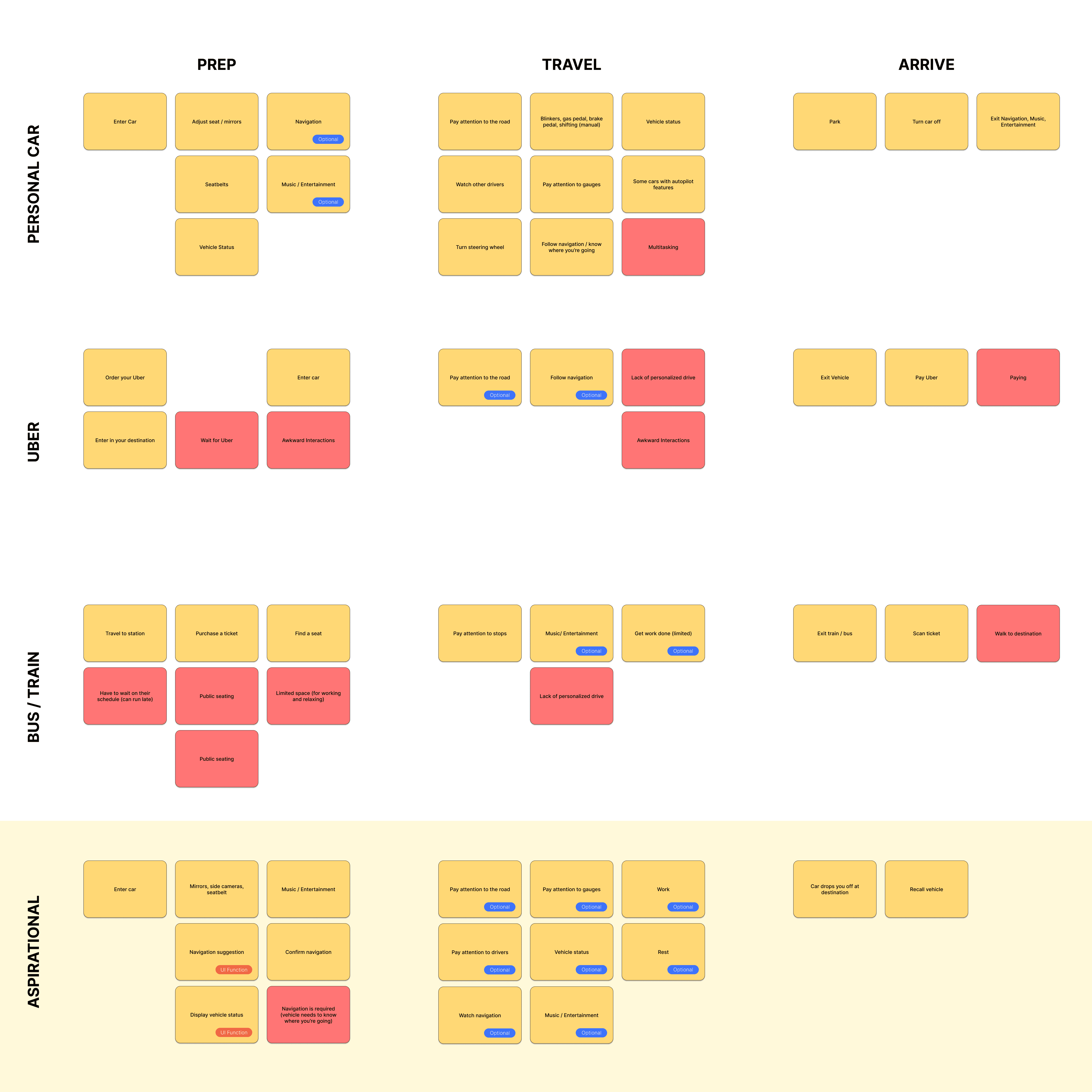
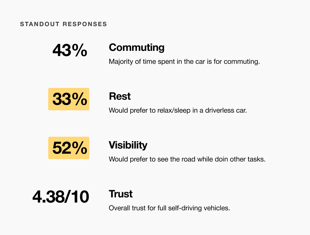
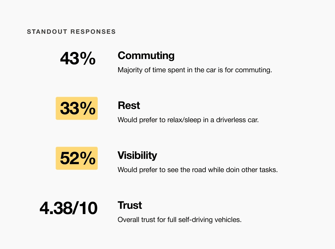
A slight majority of surveyors would like to rest in a driverless car, but getting additional work done was a close second.
Visibility to the road is important to surveyors, so the HUD should not clutter their view.
Commute time often feels underutilized or disconnected from passengers’ goals
It is the series of experiences Carlos has as he achieve a specific goal. It was built on the his experience.
For Hyundai designers and developers, this infotainment platform provides a mixed-reality environment for evaluating interface concepts in context. It reduces translation loss between disciplines by supporting immersive, context-aware collaboration during early development.
Choose a good movie in a cinema theatre nearby and select seats in an app in a fast and clear way

It is the series of experiences Carlos has as he achieve a specific goal. It was built on the his experience.
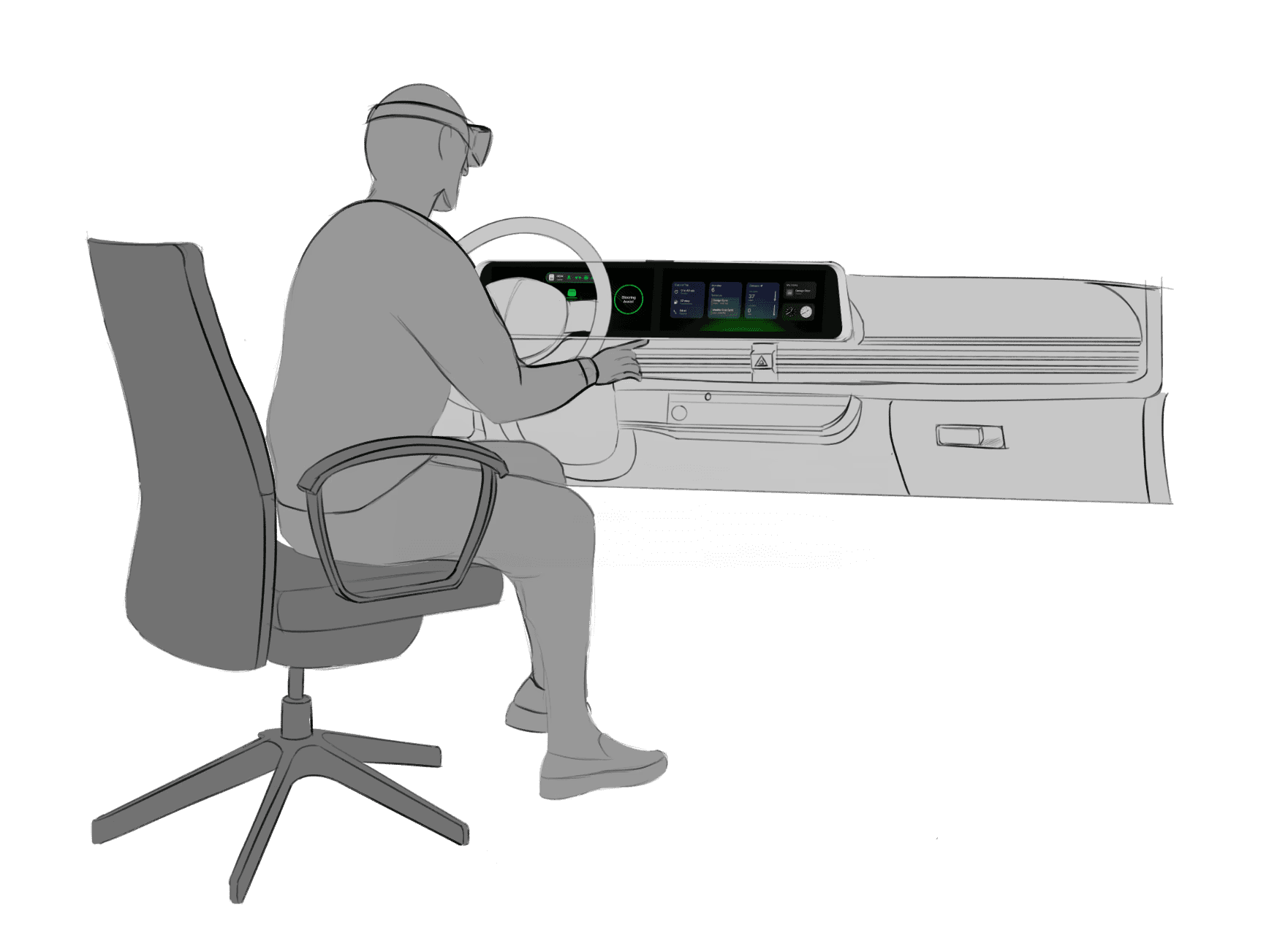
Accurate alignment between physical and digital environments was critical to the success of this system. Scan data required careful reconstruction to preserve production vehicle proportions while meeting fabrication and simulator constraints. Considerations such as driver eye point, seating position, reach zones, and mounting tolerances informed how the digital model was engineered and how physical components were integrated, reinforcing the need for a tightly coupled physical and digital reference.
Choose a good movie in a cinema theatre nearby and select seats in an app in a fast and clear way
The project schematically :
Concept development focused on translating workflow insights into a high-fidelity physical and digital dashboard environment. This phase emphasized accuracy, alignment, and build feasibility through interior scanning, digital reconstruction, and preparation for physical prototyping within a simulator context.
The series of hand-drawing frames that visually describe and explore a user's experience with a product.
I began with drawing storyboards to focus on just the most important parts of a user’s experience with the app. It's a story that was told through the panels, revealed it two different way

Big picture storyboard, which focuses on the user experience. It's about how people will use the Voo's app during their day and it will be useful.

Close-up storyboard focuses on the app instead of on the user experiencing that product. Shows what happens on each screen of the app.
We were able to determine three zone of legibility when testing text elements on the HUD. From here we started creating an information hierarchy based on these zones to identify what should be displayed where.
When testing, users reported eye fatigue when there were large blocks of bright colors on the HUD. We pivoted to muted/ transparent elements in later designs.
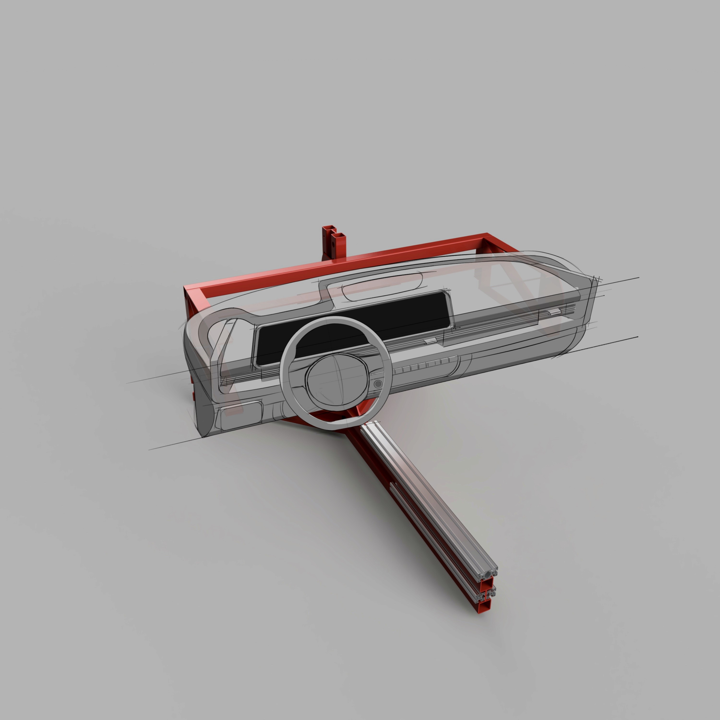
We have captured the exact measurements of the 80/20 frame and recreated it in 3D to allow us to build on top of this model with any future dashboards we wish to construct on the buck. This sketch overlay shows how the Ioniq 6 interior will theoretically be built via 3D prints and assembled to fit on the existing buck.

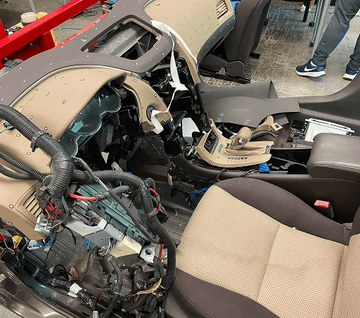
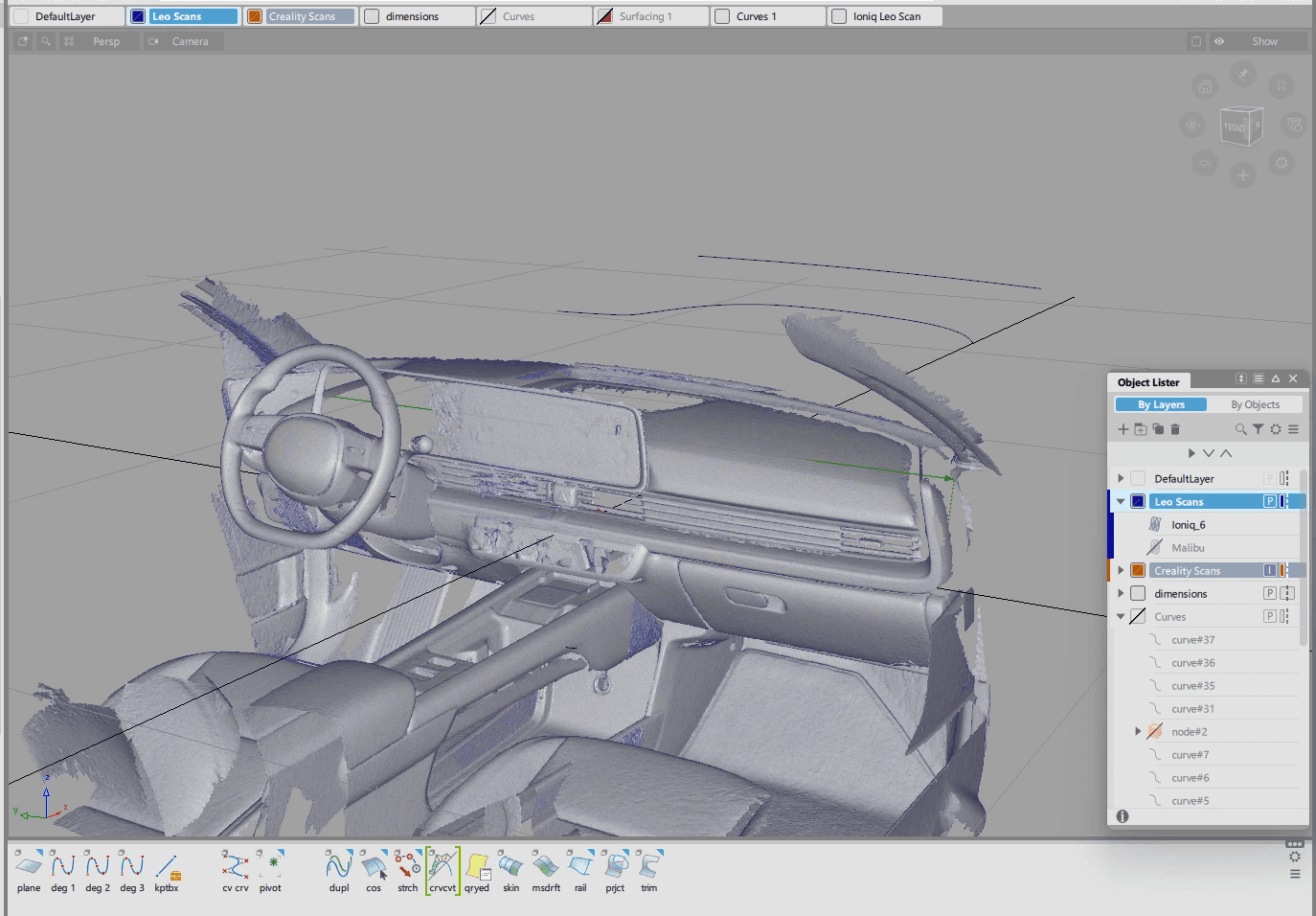
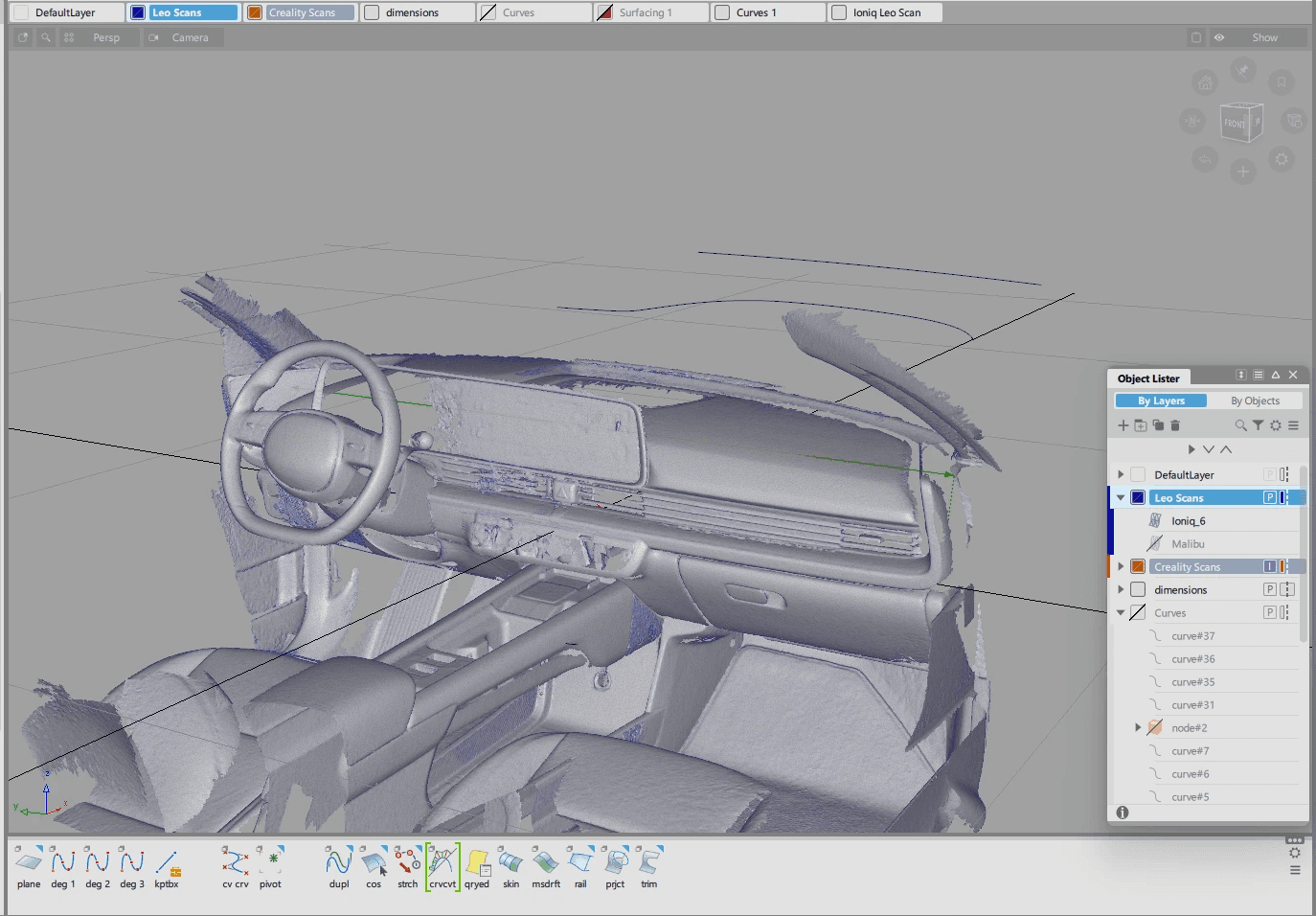
After capturing the interior data of the Ioniq 6 with the Artec Leo 3D scanner, this mesh data became the digital reference that the team would use for the dashboard and all surrounding geometry to work from. The scan captured accurate proportions and spatial relationships, giving us the baseline needed for downstream modeling.
These are a high fidelity design that represents a final product
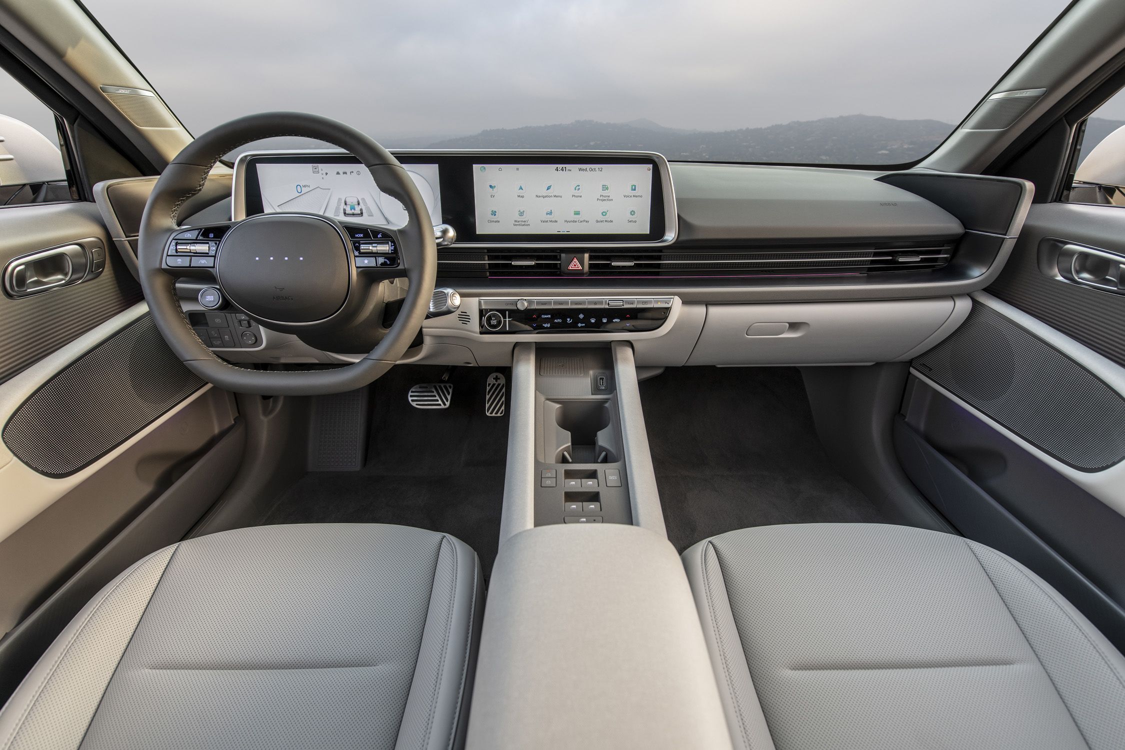
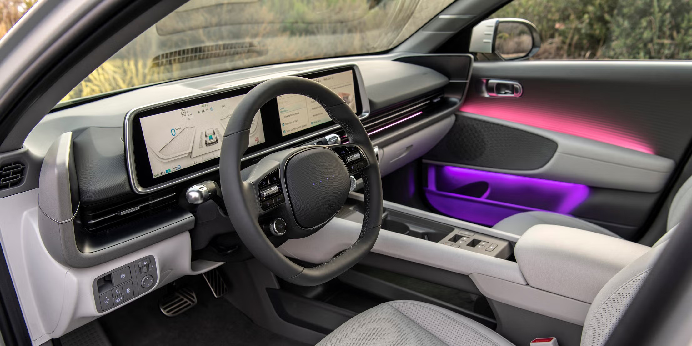
At the start of the project, the team identified the 2023 Hyundai Ioniq 6 at the target platform to test this mixed reality experience.


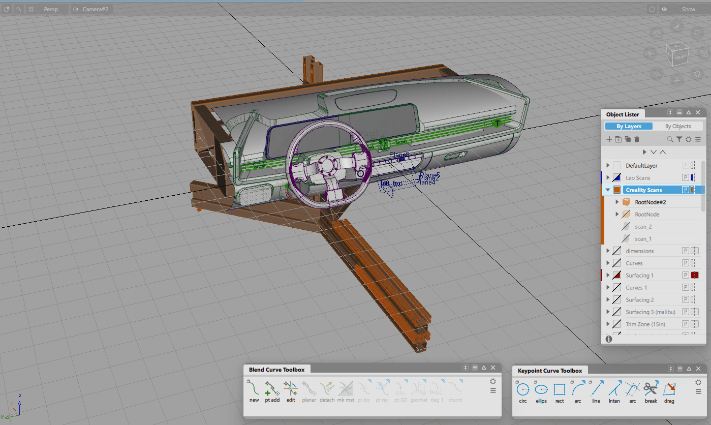
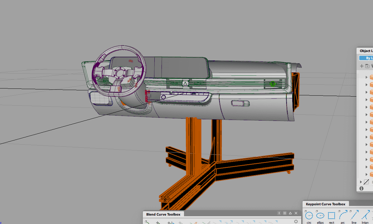
After placing the 3D scan into Autodesk Alias, we using the point data of the scan to guide the resurfacing of the Ioniq 6 interior. This shows the rebuilt surfaces in Alias.
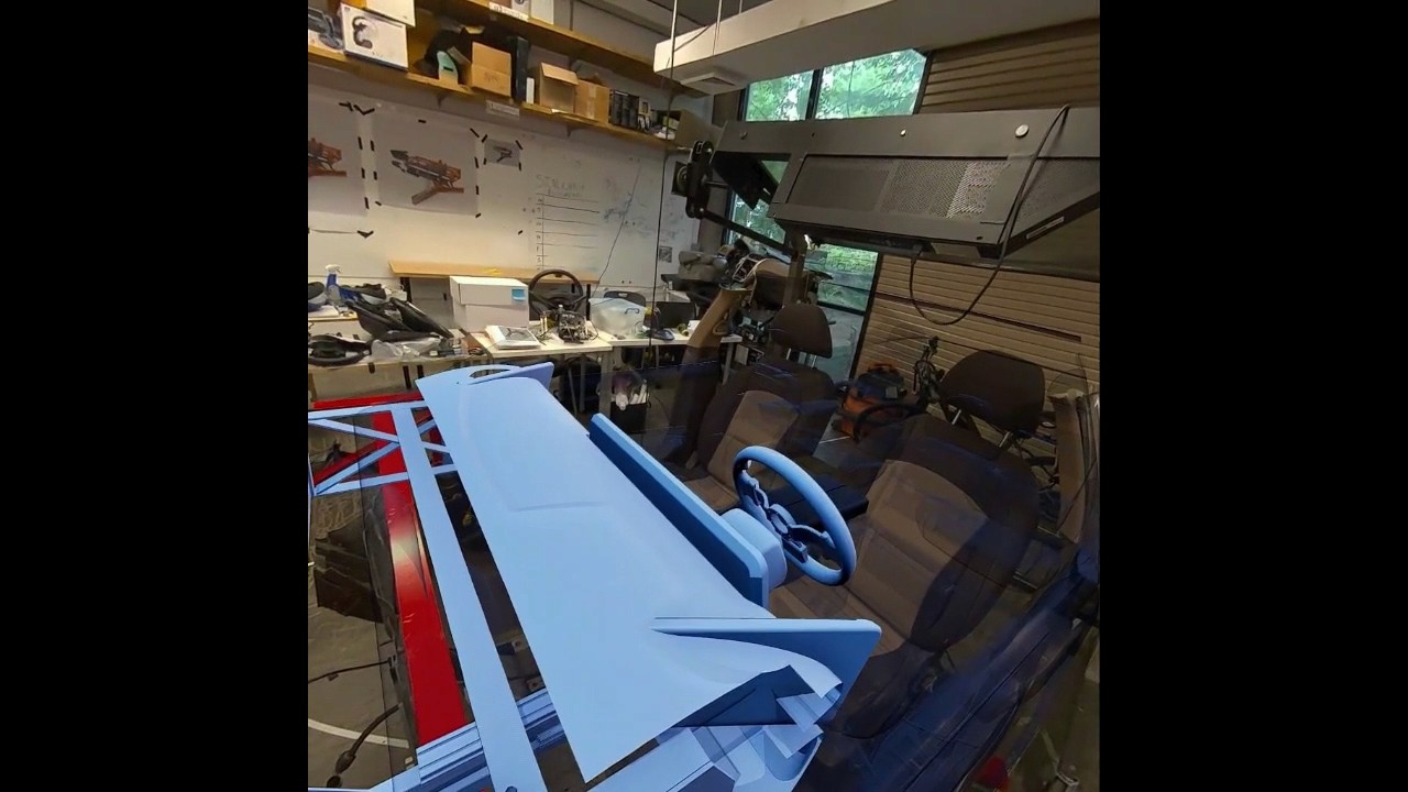
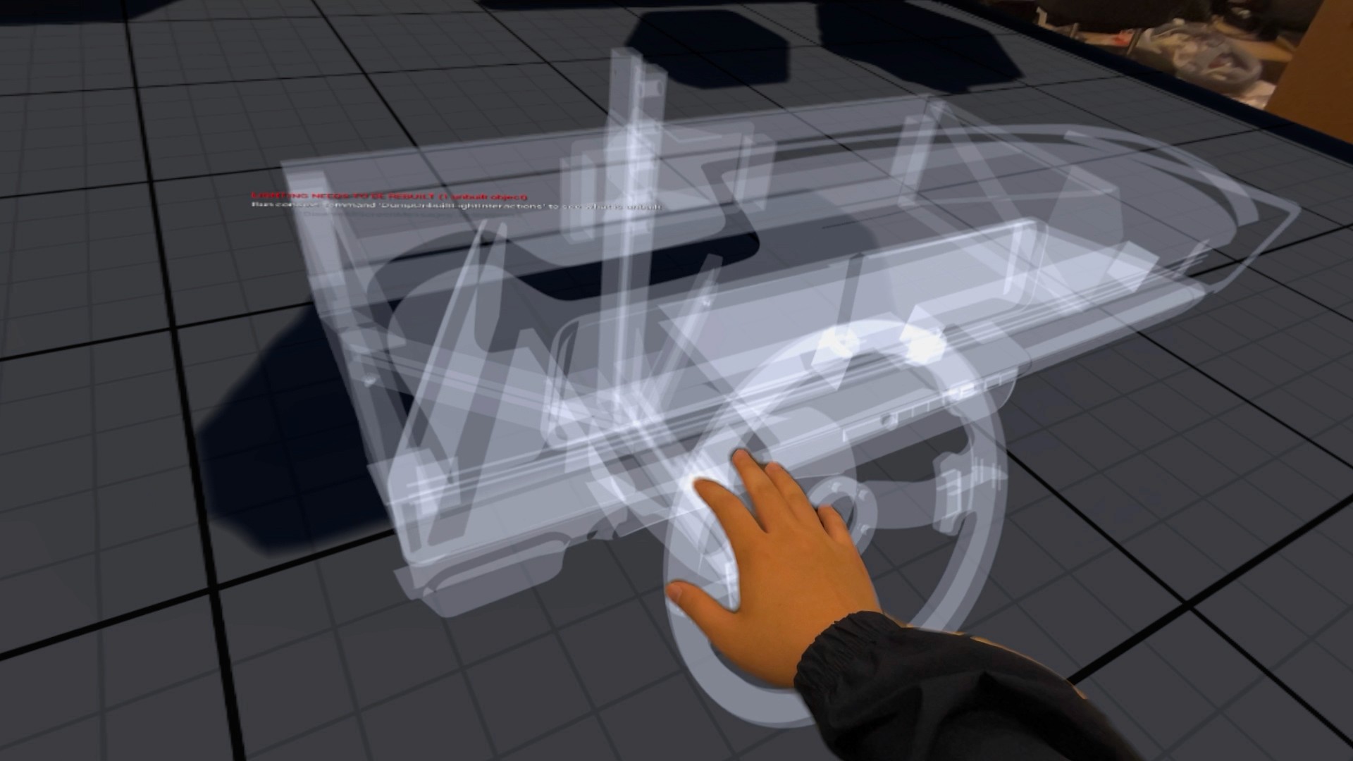
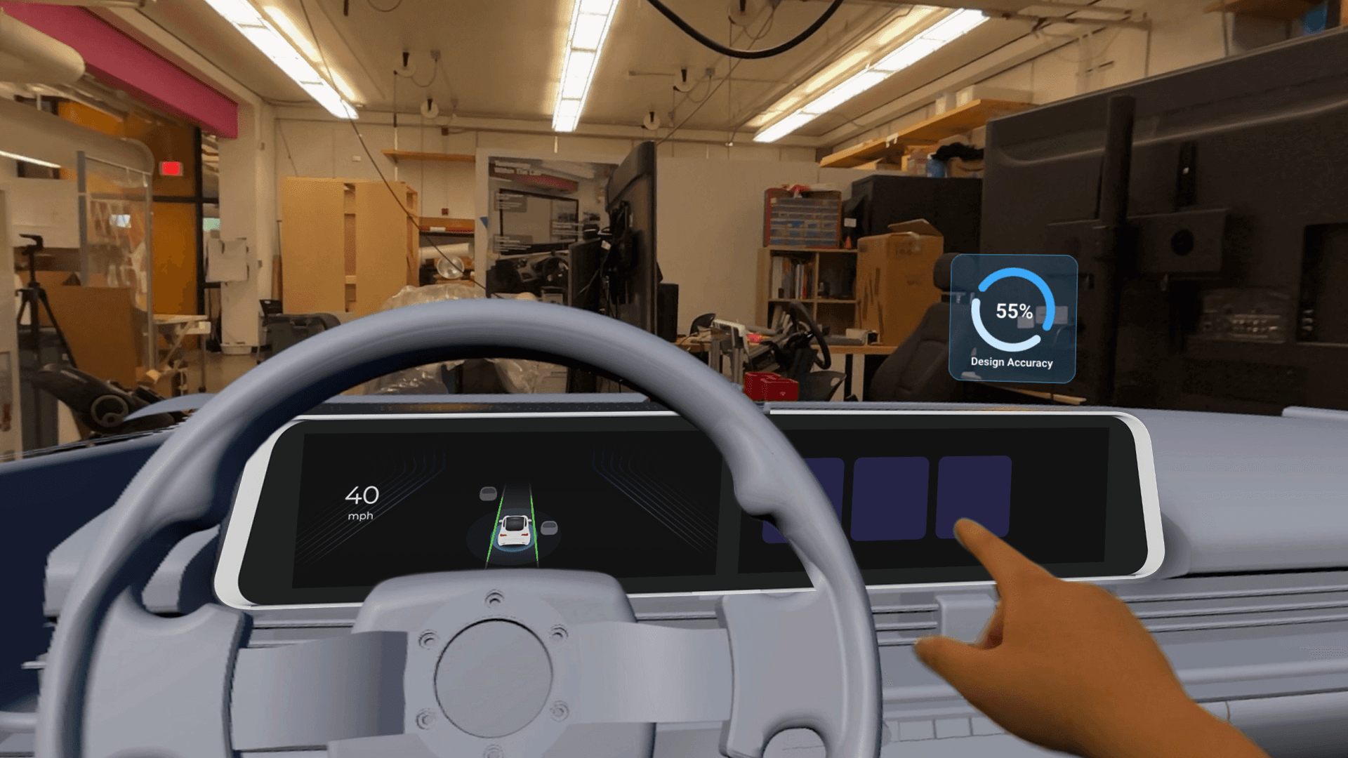
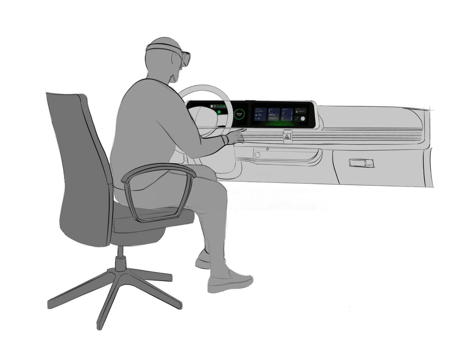
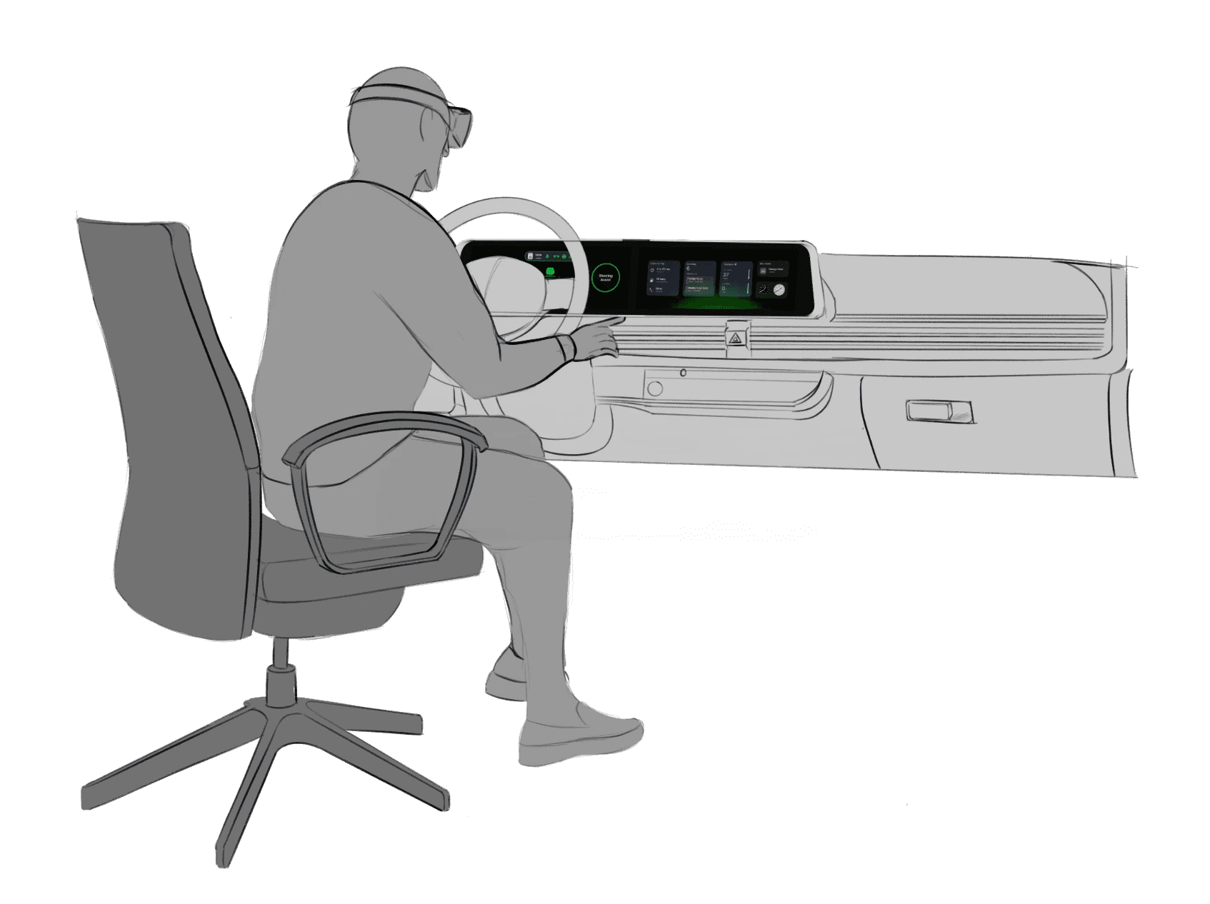
The virtual development environment was created to support the design, testing, and evaluation of spatial interfaces while maintaining alignment with a physical interior dash model. This environment enables the simultaneous use of 3D content, interactive screens, and external development tools, allowing rapid iteration and comparison across platforms. By combining virtual and physical elements, the system serves as a mixed-reality testbed for evaluating usability, interaction methods, and system behavior in an automotive HMI context across different user groups.
These are a high fidelity design that represents a final product
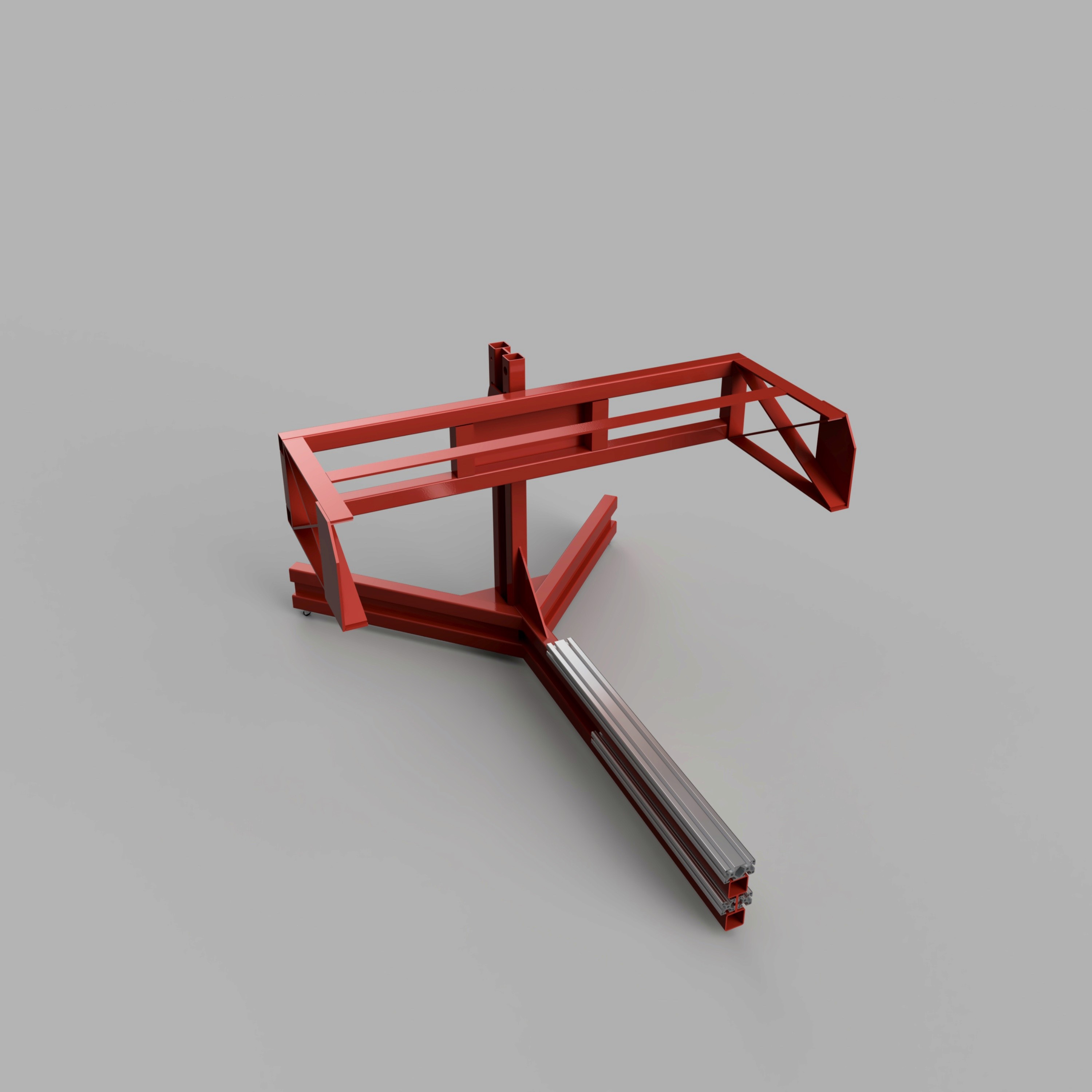
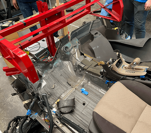
To provide a realistic mounting environment, we repurposed the existing 80/20 buck from our previous Chevy Malibu driving simulator. We started by detaching the main dashboard body from the floorboard. Next, we cleaned up any wiring, connectors, or any small components still in the way. The final result is a clean frame with space to attach custom dashboard components.
These are a high fidelity design that represents a final product
It's a structured scheme that outlines the pages and content hierarchy of the app.
Apps like your calendar and email lean heavily into the realm of work.
Almost all social media leans into the rest category.
It's a structured scheme that outlines the pages and content hierarchy of the app.
Next step: creating the application map. My goal here was to make strategic information architecture decisions that would improve overall app navigation. The structure I chose was designed to make things simple and easy.

It's a structured scheme that outlines the pages and content hierarchy of the app.
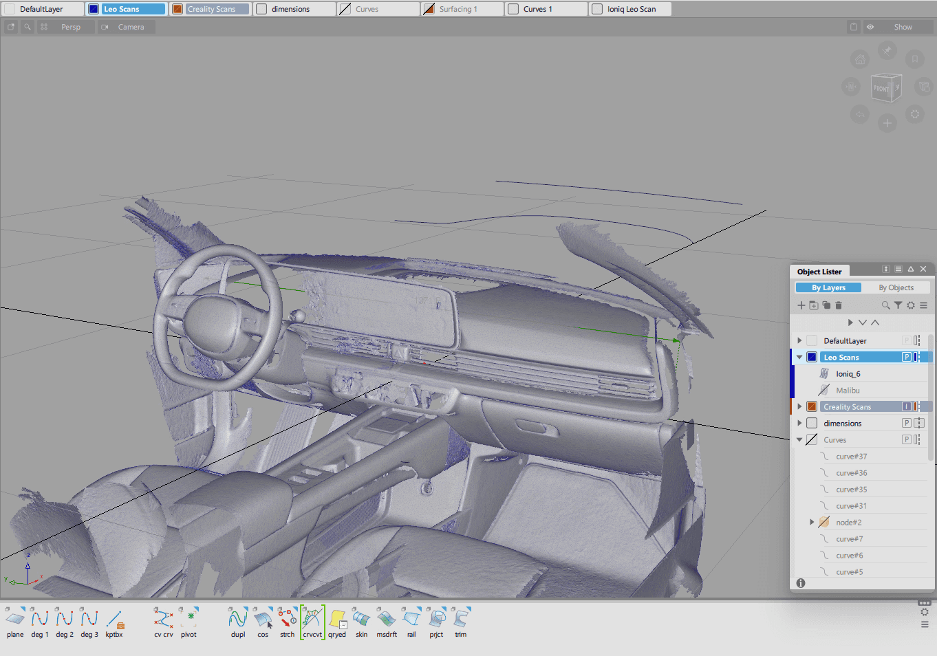
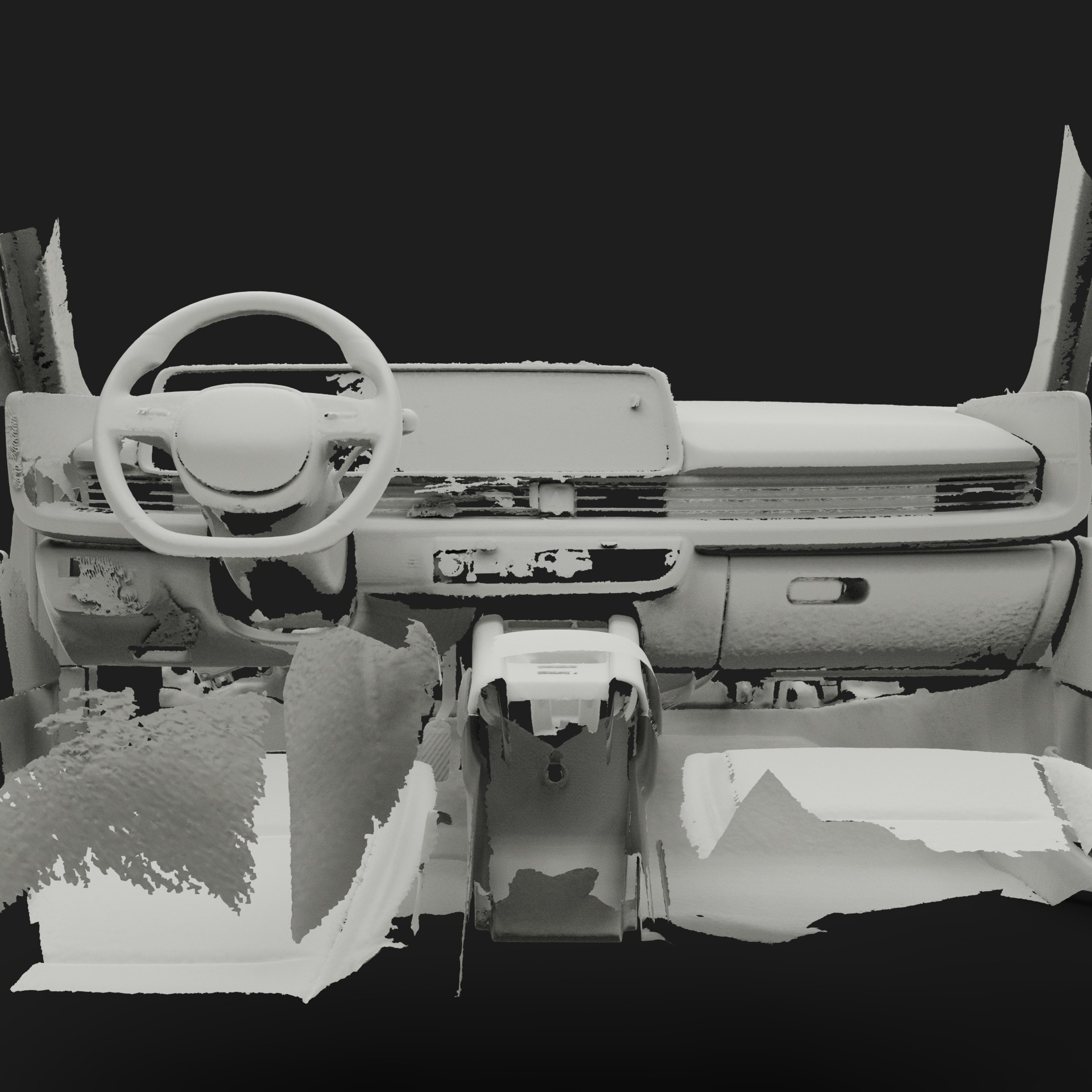
We first scanned the interior of an Ioniq 6 using an Artec Leo 3D scanner. This shows the raw output of this scan.
They initially oriented on the basic structure of the homepage and highlight the intended function of each element.
Here I drew five different versions of how structure of information on a homepage might look like. Then I reviewed all the versions and combined them in the refined one.
The goal was to explore different ideas with wireframes.

More "clear" version of wireframes in a digital form. Also all the important pages are added
in it.
On this step I used the Figma design tool to create digital wireframes of all the pages. Then I bonded all of them into the clear and smooth structure.
The goal is to show how all the pages and things interact with each other.

This is an examination of users and their needs, which adds realistic context to the design process.
First I conducted unmoderated usability studies with a few participants: they had to answer different questions about the app and share their observations while using the initial low-fi prototype. After getting the data, I analyzed it and synthesized the information obtained. Finally, I found themes and came up with several insights.
The goal was to identify pain points that the user experiences with the app designs so the issues can be fixed before the final product launches.
In the beginning, before choosing a city and theater, it would be great to look through the whole app and learn everything about it.
There are no movie search - it's necessary to add it on the movies list page.
If user wants to change his account, he should be able to log out or delete it completely.
The clear version :
Refinement focused on validating alignment and improving fidelity across the physical and digital dashboard system.
It's a structured scheme that outlines the pages and content hierarchy of the app.
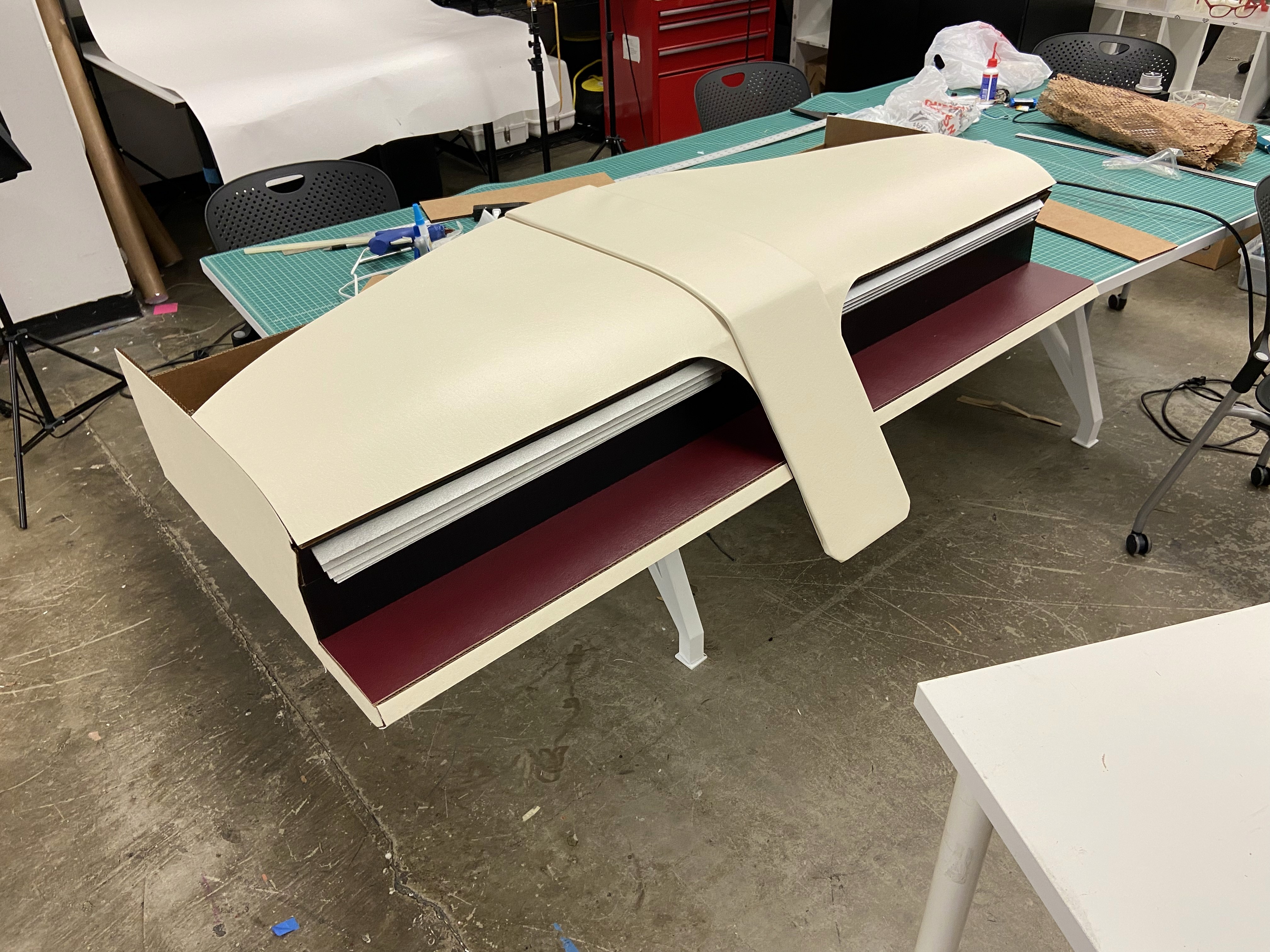
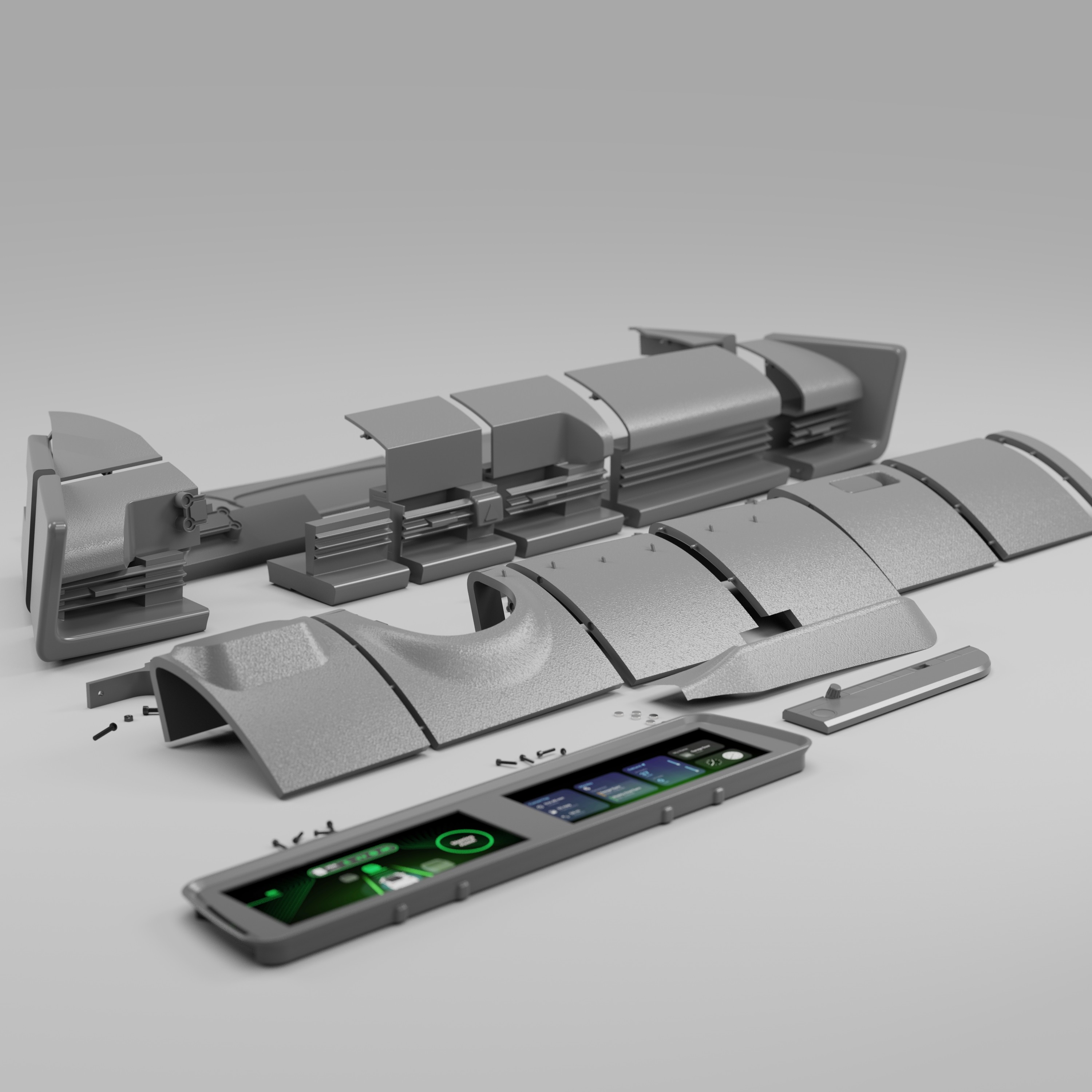
With the dashboard surfaces finalized in Alias, the next step was preparing the model for 3D printing. To accomplish this, we transitioned the design into Fusion 360, where we added material thickness, converted surfaces into solids, and introduced breakpoints to segment the dashboard based on the Formlabs Form 4L printer bed dimensions (13.9 x 7.7 x 13.8 inches).
It's a structured scheme that outlines the pages and content hierarchy of the app.
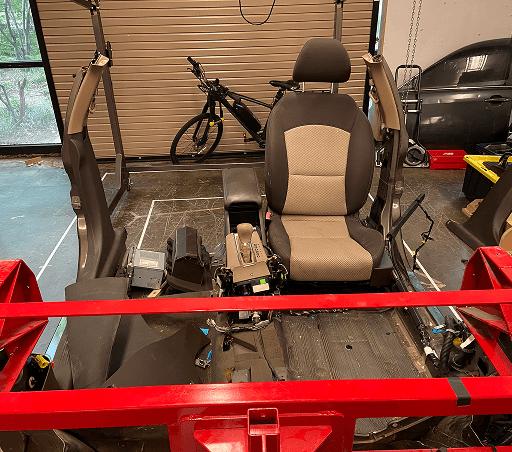
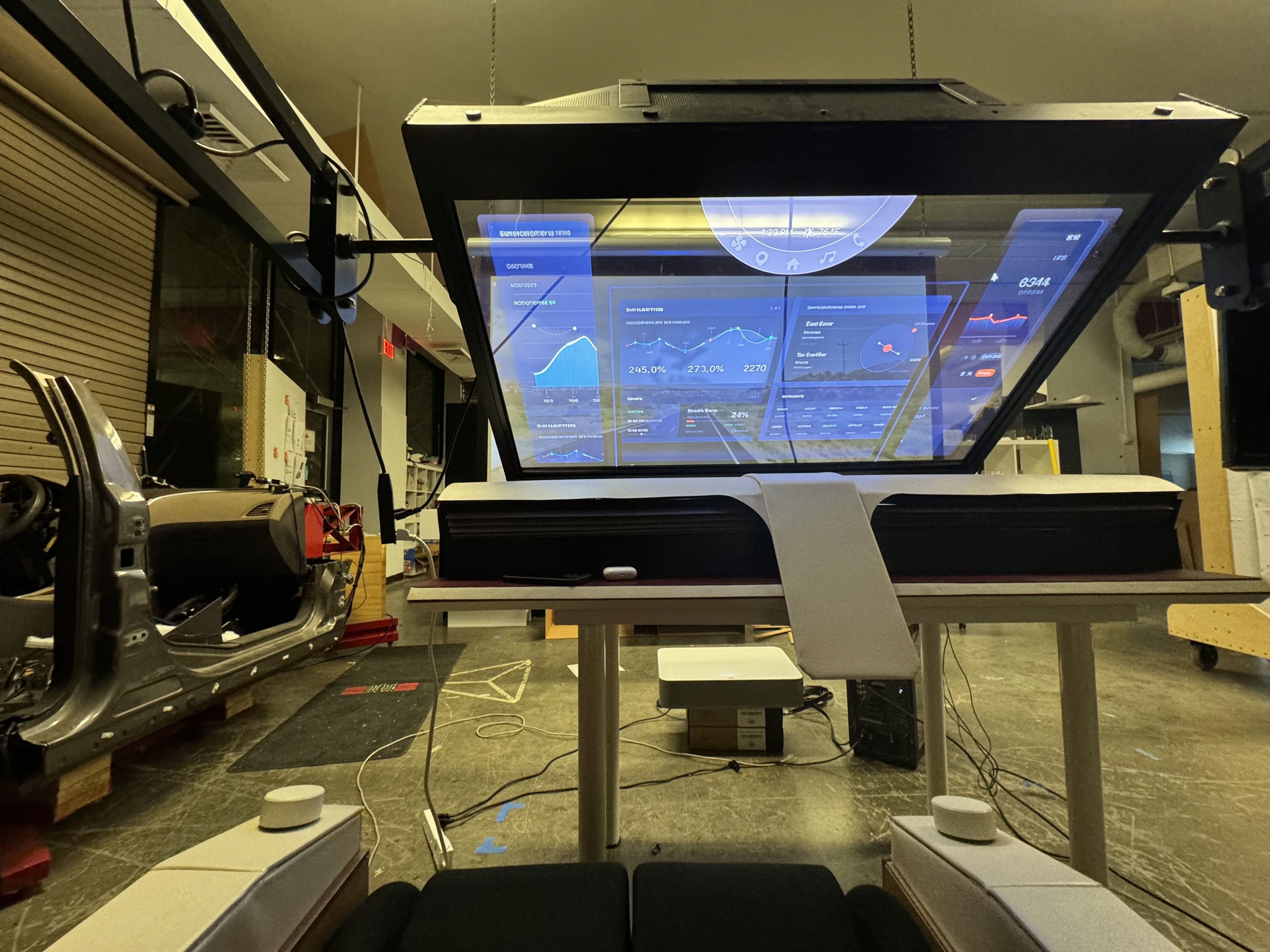
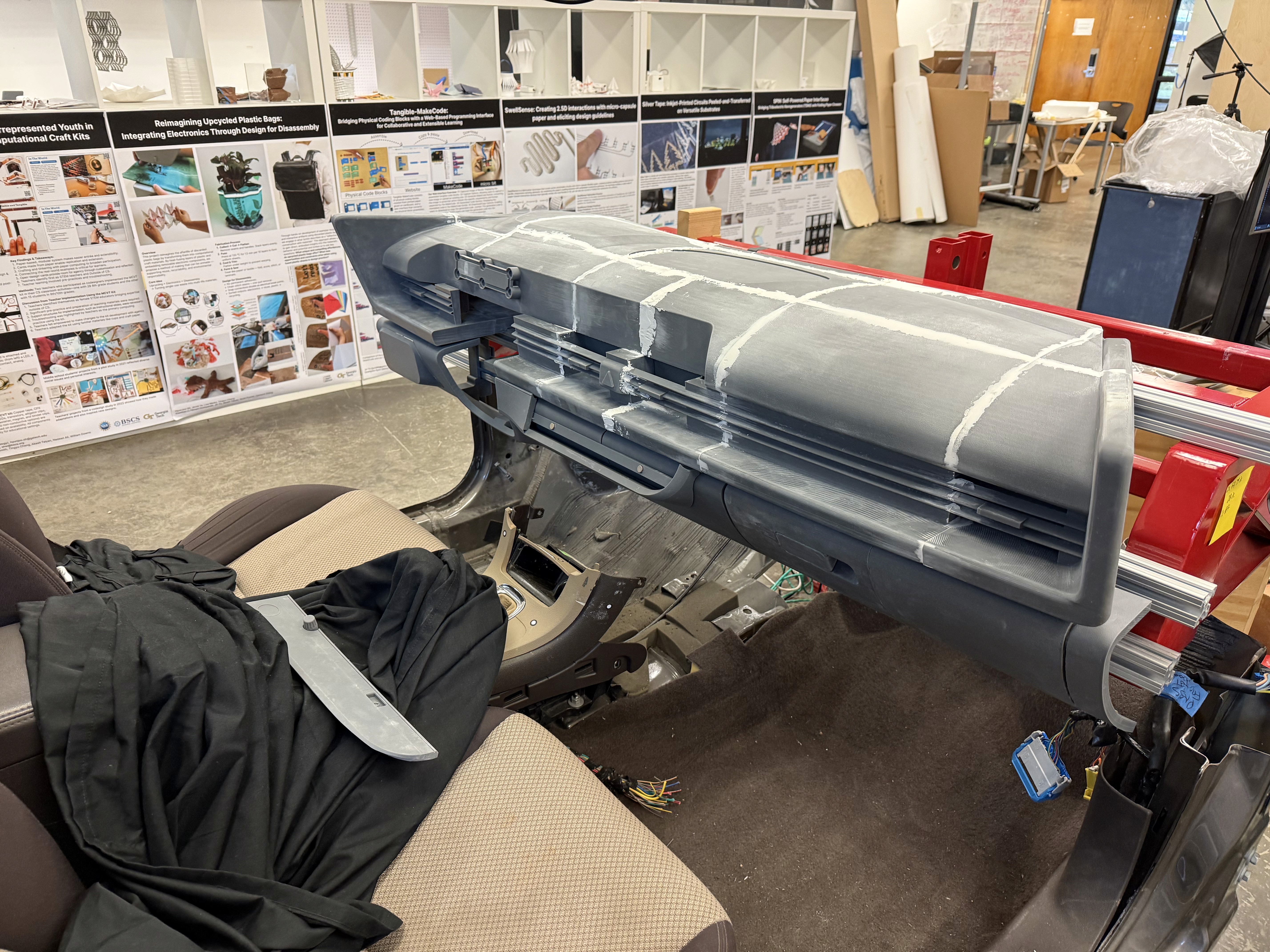
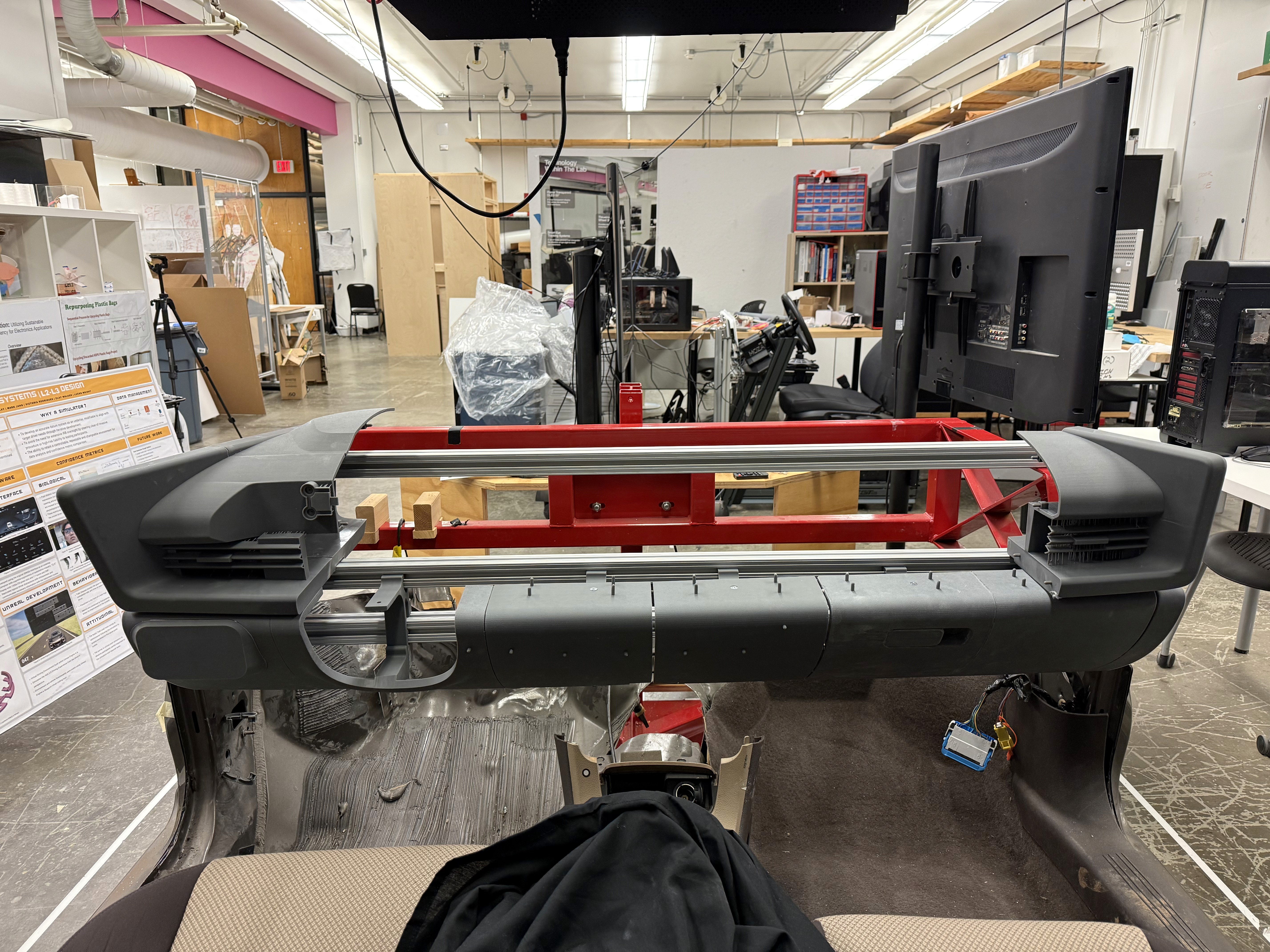
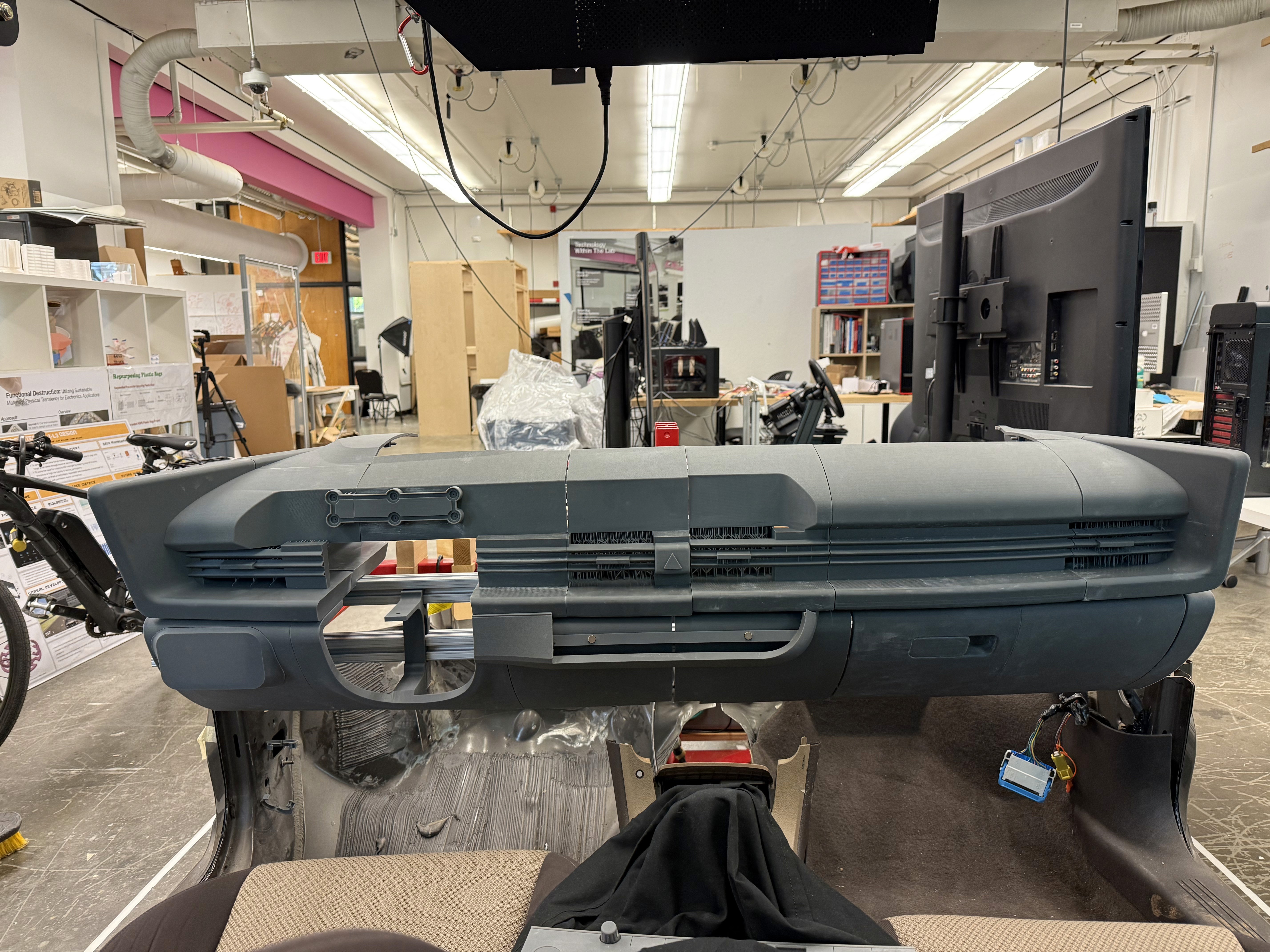
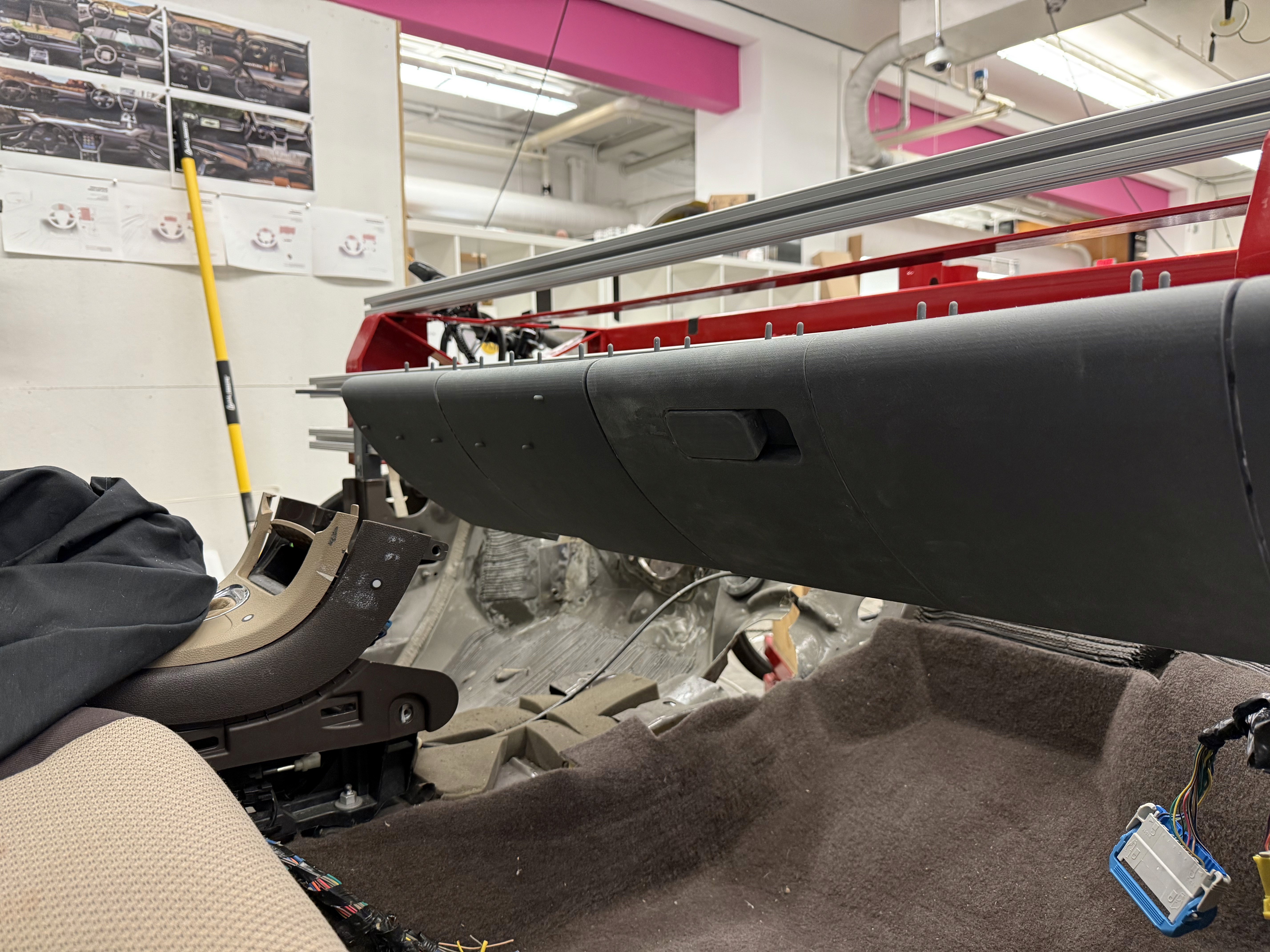
After all parts on the top half of the dash were attached together, light spackle was used to fill the seams created where parts met. This meant that now the top of the dash was one full piece. The model now fits in the lab’s buck as a 1:1 representation of a 2023 Hyundai Ioniq 6 dashboard.
These are a high fidelity design that represents a final product
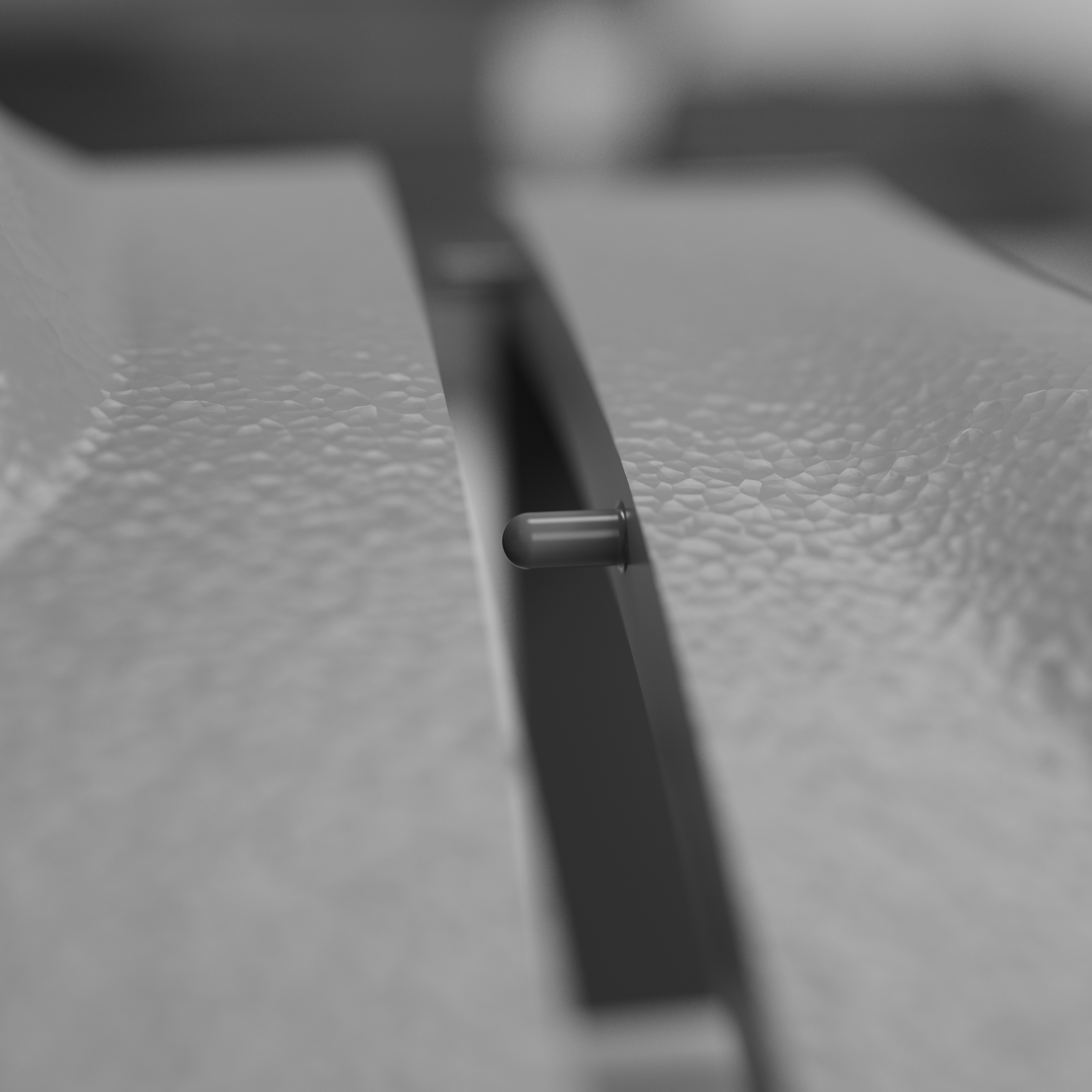
Joinery between parts was designed into the CAD to ensure proper alignment when piecing together the final model. Certain areas, such as the underside of the dashboard, included recessed magnets to allow the parts to be disassembled and not permanently fixed as one large piece.
Assembling the model after printing out all the parts was simple. A lot of time and effort went into planning the B side of the parts so that slotting and gluing the parts together was as smooth as possible.
We were able to determine three zone of legibility when testing text elements on the HUD. From here we started creating an information hierarchy based on these zones to identify what should be displayed where.
When testing, users reported eye fatigue when there were large blocks of bright colors on the HUD. We pivoted to muted/ transparent elements in later designs.
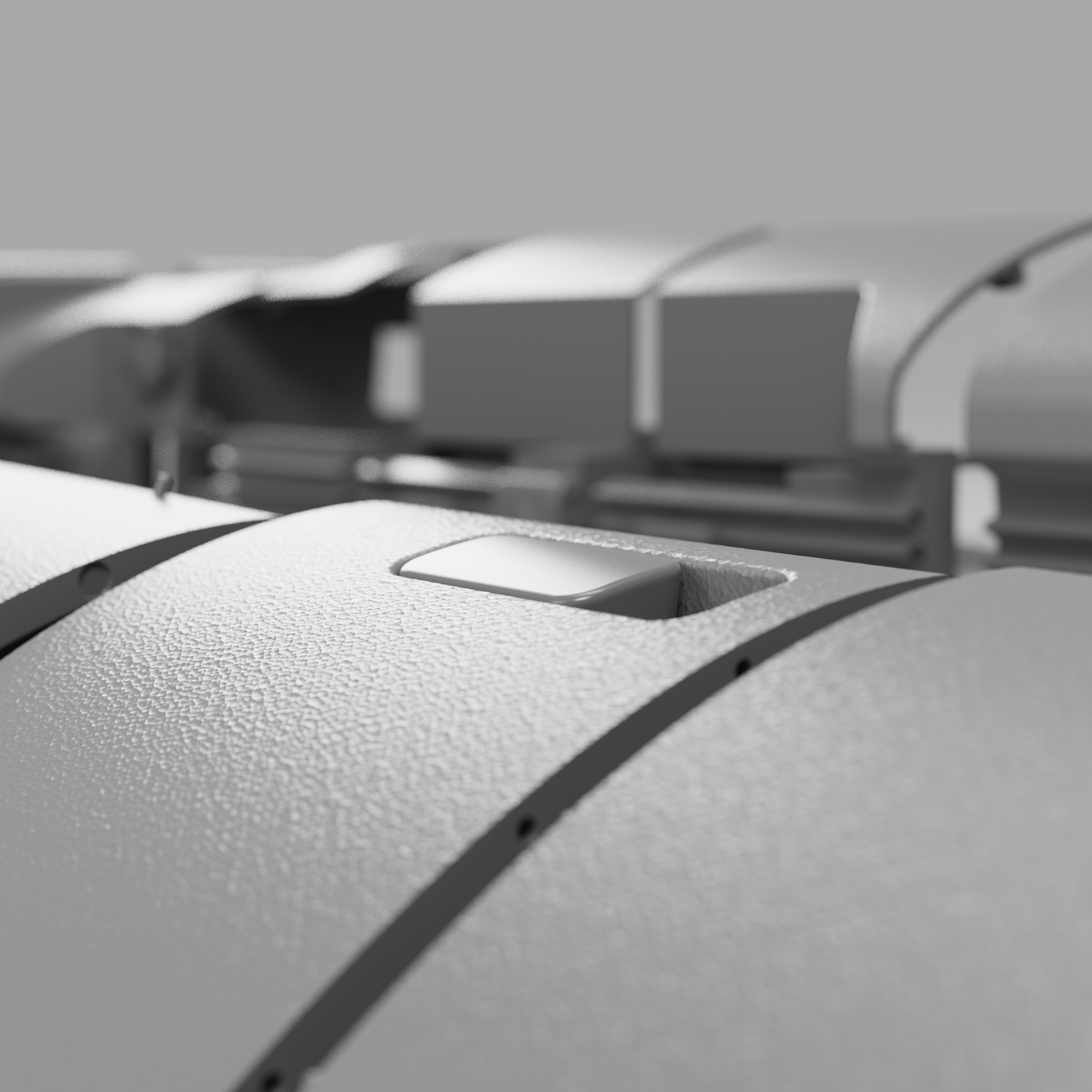
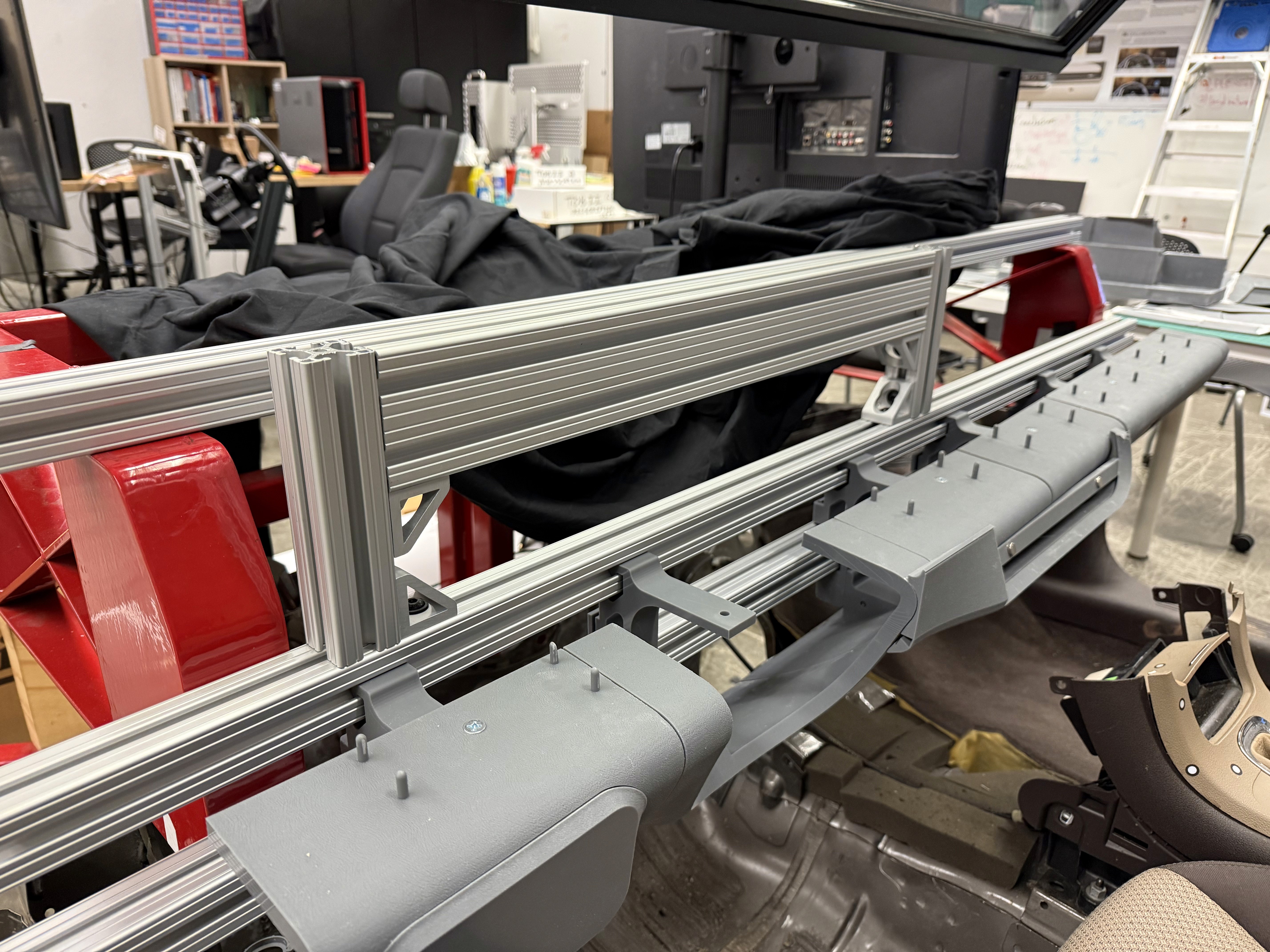
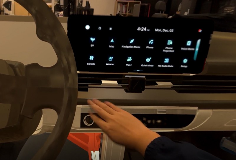
We also tested another version of this mixed reality setup by mounting only the instrument panel displays instead of the entire top half of the dashboard. Having just the instrument panel physically built on the top half of the model reduces the immersion of the entire dashboard, but if the user only needs to test the IP, this setup makes it convenient to switch in and out larger or smaller bezels/ displays for rapid IP prototyping.
We were able to determine three zone of legibility when testing text elements on the HUD. From here we started creating an information hierarchy based on these zones to identify what should be displayed where.
When testing, users reported eye fatigue when there were large blocks of bright colors on the HUD. We pivoted to muted/ transparent elements in later designs.
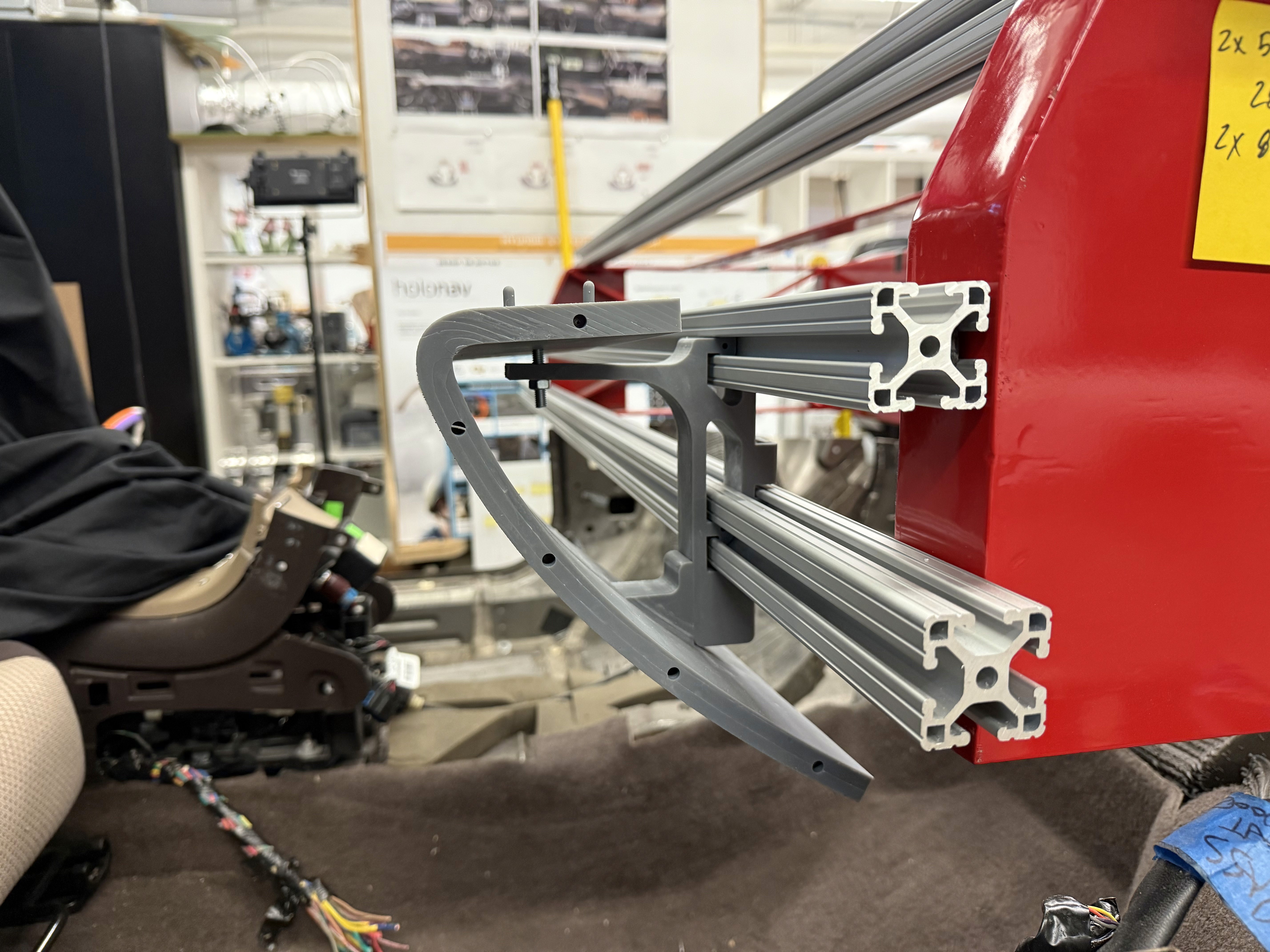
Custom brackets were designed to slot into the 80/20 frame and also provide multiple connecting points to the dashboard pieces to hold them exactly where they should be relative to the driver. Completing the bottom half of the dashboard first made it easier to stack the top half on slots or pegs making the top of the dash easily removable for polishing/ refining.
These are a high fidelity design that represents a final product
I created all the app pages mockups, incorporating the right design elements such as typography, color, and iconography. I also included captivating and visually appealing images, and developed all the necessary components and elements.
The goal was to demonstrate the final Voo's app in as much detail as possible.


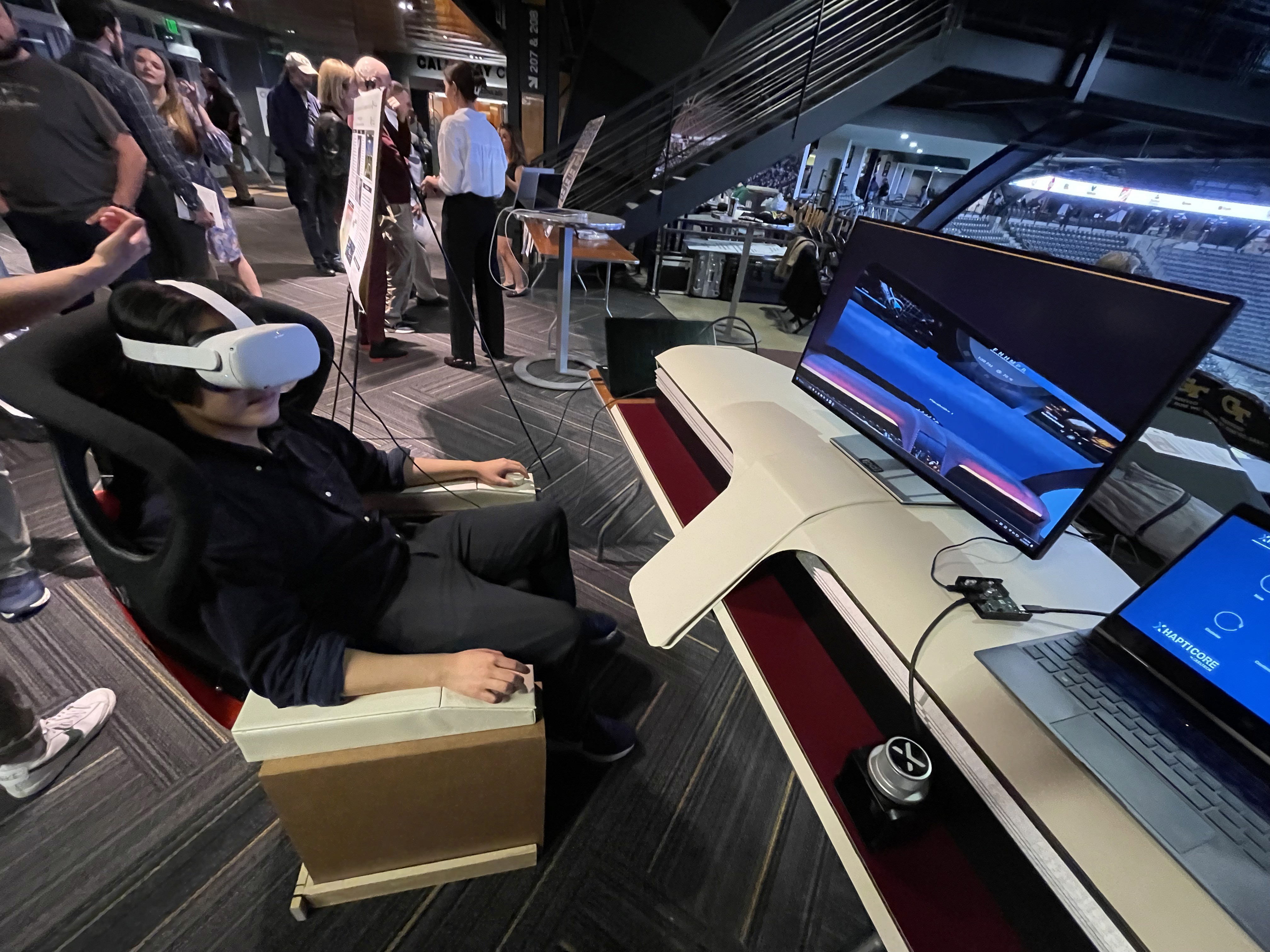
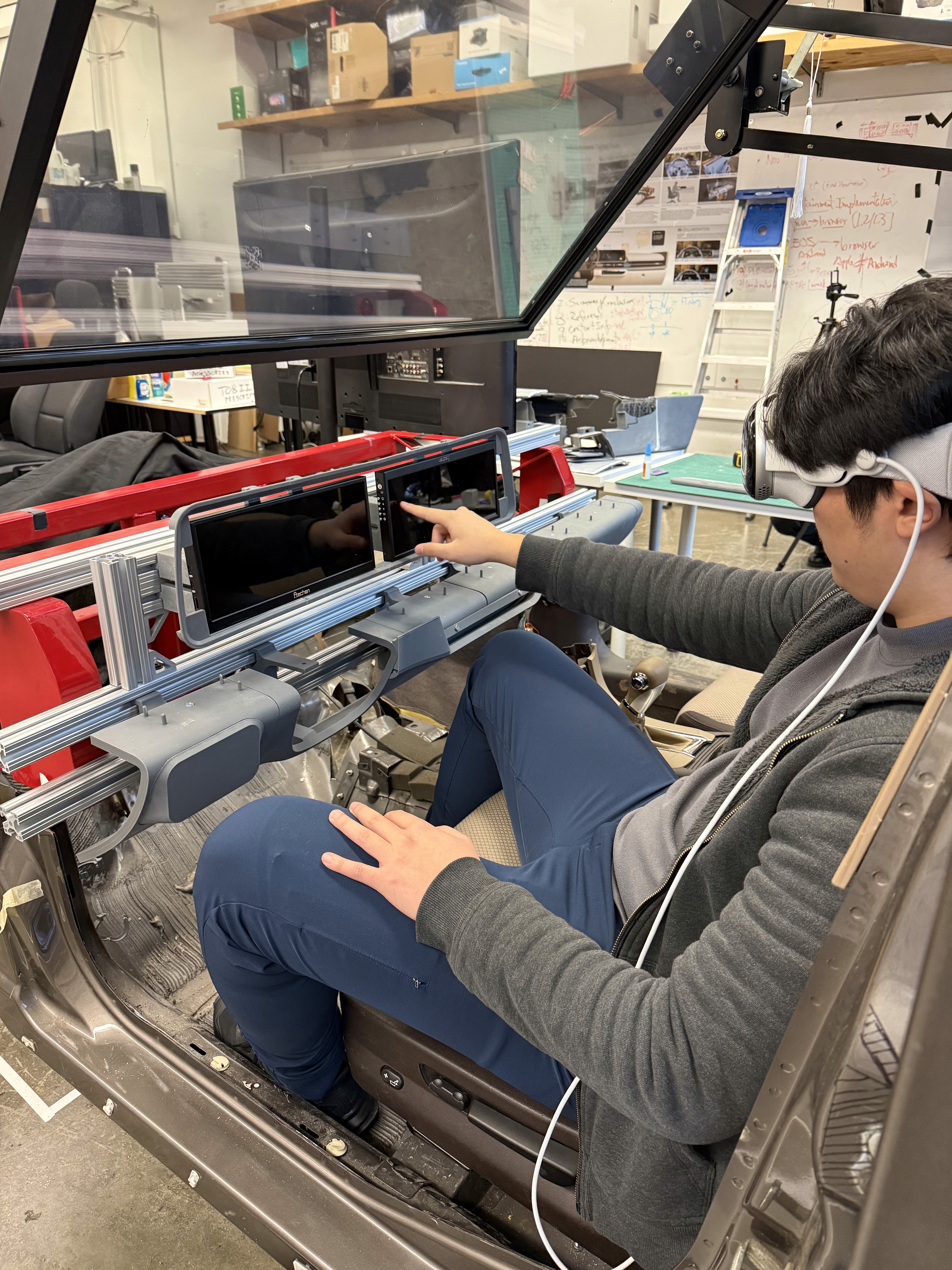
A virtual model can be imported and placed within the scene, with interactive controls used to manipulate and precisely position objects. These controls are still being expanded, and we are actively exploring different methods for interacting with the 3D model.
It's the detailed, interactive version of designs that closely match the look and feel of the final product.
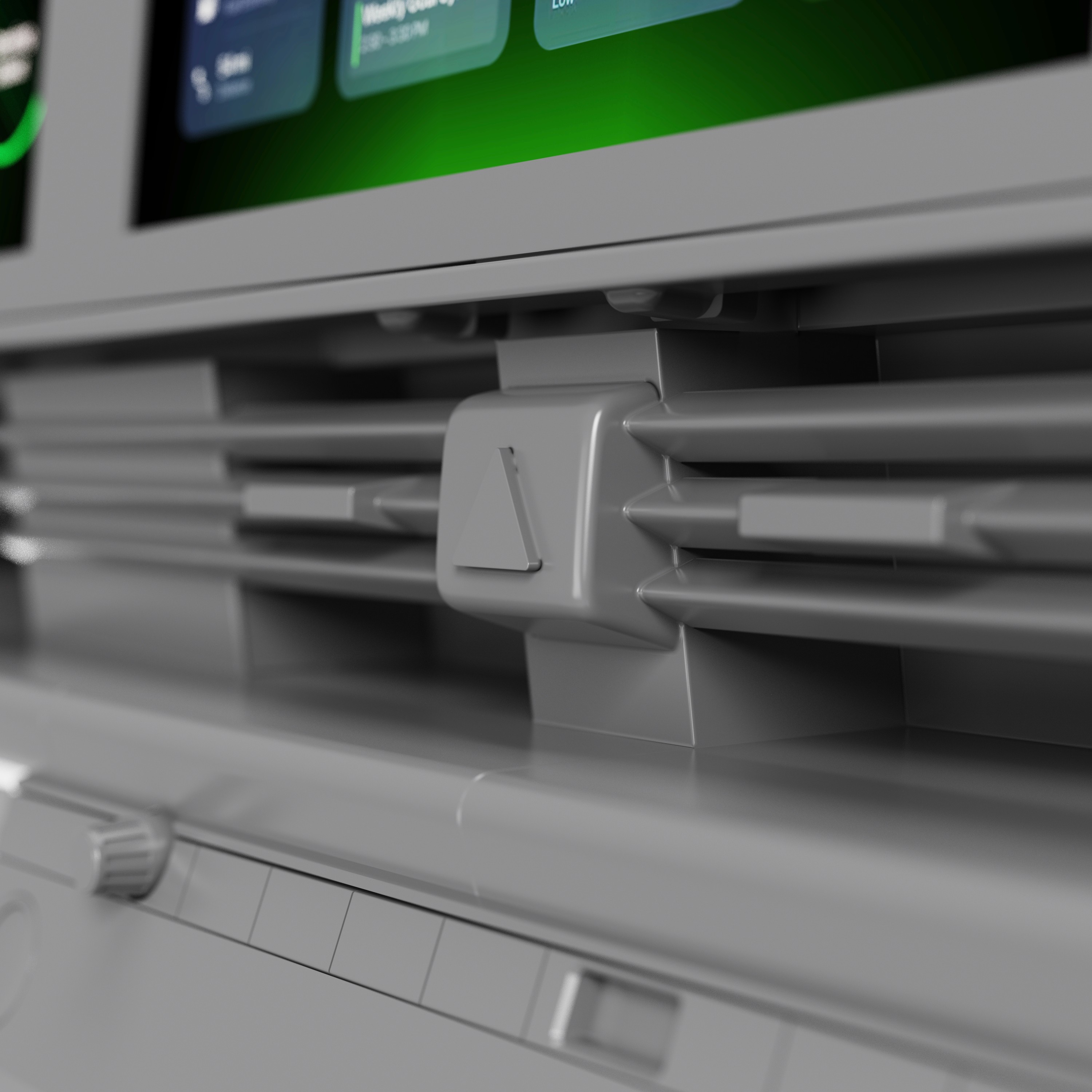
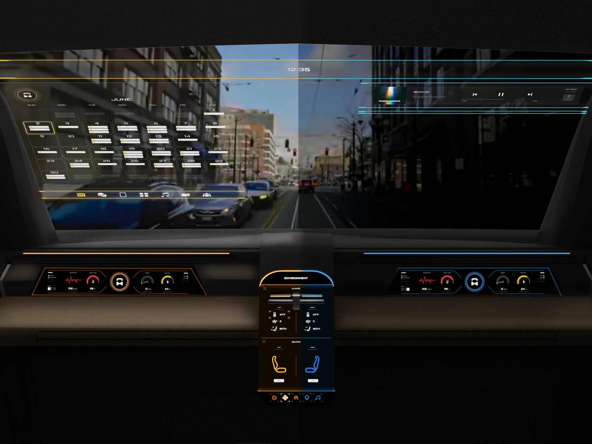
The center stack display and auxiliary displays carry most of the information related to the vehicle itself. They work in tandem with the HUD since the information being displayed on the HUD will either be work or social/ entertainment related.
All of these screens were fully built out in Figma.
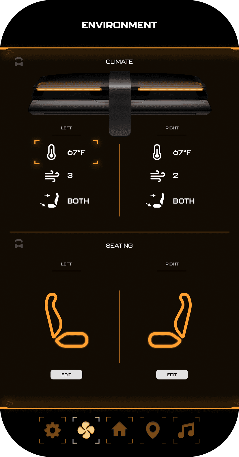
HUD and UI Settings
Environment Settings
Home (General Vehicle Settings)
Map Settings
Multimedia Settings
It's the detailed, interactive version of designs that closely match the look and feel of the final product.
I turned my mockups into a prototype that's ready for testing, using gestures and motion, which can help enrich the user experience and increase the usability of the app.

City and cinema theater selection
Movies slideshow
List of movies + search option
Separate movie page, adding to favourites
Show selection: date and time, hall and seats
Adding selected seats
Calendar with results filtering
Menu and its sections
The project schematically :
The final outcome is a high fidelity physical and digital dashboard system designed to support immersive evaluation of infotainment concepts in context. This platform enables more informed collaboration and decision making during development.
It's a structured scheme that outlines the pages and content hierarchy of the app.
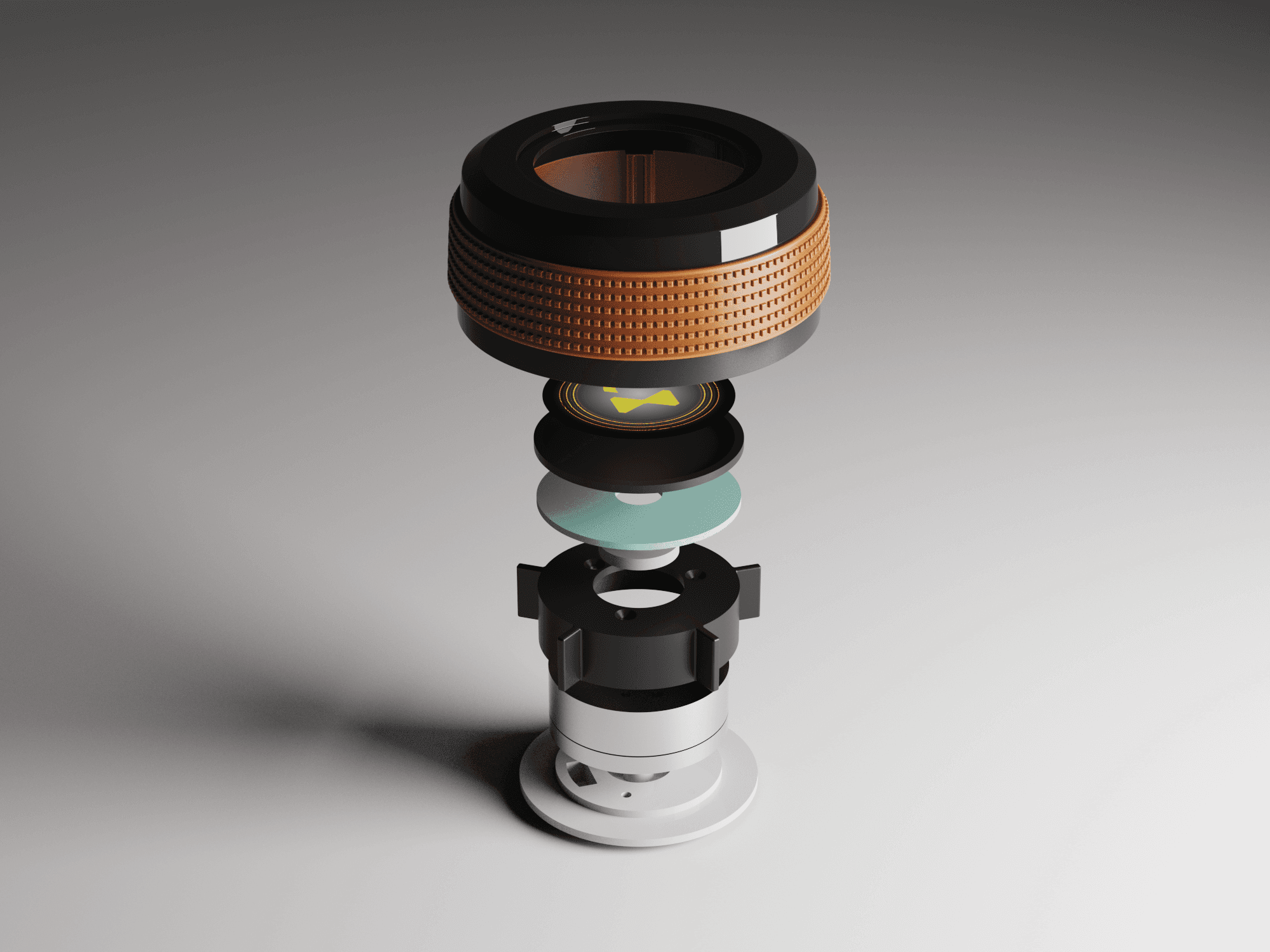
The new and improved haptic knob was built completely in-house and allowed us to customize the force feedback of the knob based on certain scenarios. This means as a user steps through the UI experience, the knob can be programmed to feel different at each step of the UI.
It's a structured scheme that outlines the pages and content hierarchy of the app.
The final HUD has work (orange) and rest (blue) modes to account for whether the user is actively or passively engaging with the UI. This split perspective shows a difference in information density between the two different modes on the HUD
The value of combining physical and digital assets to improve HMI development workflows is very underrated.
The implications of this research work have the potential to significantly improve the development of interior HMI, particularly Infotainment and display UI design and development.
This project deepened my understanding of how accuracy, constraints, and build quality directly affect the usefulness of design tools in a real development environment. I also gained experience bridging industrial design, HMI, and simulation workflows to support cross-disciplinary collaboration.
Future work would focus on expanding the system’s flexibility and evaluating its effectiveness across a wider range of development scenarios.
Explore additional modular components to support different vehicle architectures and display configurations
Investigate further integration of interaction concepts and evaluation tools within the mixed reality environment
Client
HATCI
Year
2025
Tag
Automotive
Duration
12 months
The project itself :
This project focused on creating a high-fidelity physical and digital dashboard environment to support future infotainment and HMI development workflows. By rebuilding a scanned production interior into an accurate digital twin and pairing it with a physical simulator, the system enables immersive, spatially correct evaluation of interface concepts in context.
Current HMI development workflows are fragmented across tools, teams, and platforms, leading to inefficiencies, misalignment, and siloed decision-making. There is a need for a unified, spatially accurate system that supports real-time collaboration and consistent evaluation across design and development disciplines.
The goal was to establish a shared physical and digital reference environment that improves accuracy, collaboration, and iteration speed during infotainment development. The system prioritizes fidelity, alignment to production vehicle geometry, and seamless integration between physical hardware and virtual evaluation.
An HMI-focused industrial designer, responsible for creating the physical and digital dashboard models used to support immersive evaluation and collaboration.
Interior scanning and data preparation
Autodesk Alias surfacing
Part engineering for 3D printing and prototyping
Driving simulator integration
iterating on designs,
making high-fidelity prototype
All about the user :
Research for this project focused on understanding inefficiencies within current infotainment development workflows and the limitations of existing evaluation methods. Rather than studying end users, the work examined how designers and developers interact with tools, data, and physical vehicle context during interface development.
Infotainment concepts are often reviewed without accurate physical context, leading to late-stage rework
Disconnected tools and workflows slow collaboration between designers, developers, and engineers
Limited immersive evaluation makes it difficult to assess spatial relationships, reach, and visibility early in development
A slight majority of surveyors would like to rest in a driverless car, but getting additional work done was a close second.
Visibility to the road is important to surveyors, so the HUD should not clutter their view.
Commute time often feels underutilized or disconnected from passengers’ goals
User personas were created to represent distinct Gen-Z passenger behaviors and expectations within a fully autonomous vehicle. These personas helped guide experience decisions by balancing productivity-focused and rest-focused use cases throughout the interior and HMI system.
At the start of our research, we listed out possible stakeholders and mapped them out based on their importance and influence to the project and relative to themselves. We made sure to note where the vulnerable populations would be, but since this project is so closely tied with the experience on the interior of the vehicle, we stayed focused on just the driver and our sponsor.
Existing infotainment development workflows are spread across disconnected tools and disciplines, creating friction during iteration and review. Interface concepts are often evaluated without accurate physical context, making it difficult to assess spatial relationships, reach, and visibility early in the process. As a result, feedback cycles slow down and misalignment between teams can persist until later stages of development.
A spatially accurate reference environment to evaluate layout, scale, and visual hierarchy in context
Clear alignment between digital interface behavior and physical hardware constraints
After figuring out our user group, we created a survey for Gen-Z commuters to help draw out insights that might lead to design opportunities. This survey was equipped with two different types of questions:
Current driving questions
Future thinking, Level 5 questions
51% of Americans ages 18-29 say they would ride in a driverless vehicle if they had the opportunity. So, now we can narrow our user group further to Gen-Z commuters.
Establish a shared physical and digital dashboard reference to support cross-disciplinary collaboration
Enable earlier evaluation of infotainment concepts within accurate spatial context
Reduce iteration time by minimizing translation loss between design, development, and testing
It is the series of experiences Carlos has as he achieve a specific goal. It was built on the his experience.
We compared the typical journey and actions performed for three different modes of transportation and even pointed out some pain points for each. A personal car requires the user’s attention for the entirety of getting from point A to B, and is even required to do a good bit of multitasking at times. However, this is their personal vehicle and is private to them. An uber and bus are similar in that the user has no driving tasks to worry about, but it is no longer a personalized experience; they are in a public space.
A fully autonomous vehicle can give you the best of both worlds. You can have your own personal space while the car does all the driving for you.
The question then becomes: What do you do with the time you spend riding in this vehicle?
In the beginning, before choosing a city and theater, it would be great to look through the whole app and learn everything about it.
There are no movie search - it's necessary to add it on the movies list page.
If user wants to change his account, he should be able to log out or delete it completely.
This is an examination of users and their needs, which adds realistic context to the design process.
First I conducted unmoderated usability studies with a few participants: they had to answer different questions about the app and share their observations while using the initial low-fi prototype. After getting the data, I analyzed it and synthesized the information obtained. Finally, I found themes and came up with several insights.
The goal was to identify pain points that the user experiences with the app designs so the issues can be fixed before the final product launches.
A slight majority of surveyors would like to rest in a driverless car, but getting additional work done was a close second.
Visibility to the road is important to surveyors, so the HUD should not clutter their view.
If user wants to change his account, he should be able to log out or delete it completely.
It is the series of experiences Carlos has as he achieve a specific goal. It was built on the his experience.
For Hyundai designers and developers, this infotainment platform provides a mixed-reality environment for evaluating interface concepts in context. It reduces translation loss between disciplines by supporting immersive, context-aware collaboration during early development.
A fully autonomous vehicle can give you the best of both worlds. You can have your own personal space while the car does all the driving for you.
The question then becomes: What do you do with the time you spend riding in this vehicle?
Accurate alignment between physical and digital environments was critical to the success of this system. Scan data required careful reconstruction to preserve production vehicle proportions while meeting fabrication and simulator constraints. Considerations such as driver eye point, seating position, reach zones, and mounting tolerances informed how the digital model was engineered and how physical components were integrated, reinforcing the need for a tightly coupled physical and digital reference.
I developed a user journey map of Carlos's experience with the app to highlight potential pain points and identify areas for improvement.
Choose a good movie in a cinema theatre nearby and select seats in an app in a fast and clear way
The project schematically :
Concept development focused on translating workflow insights into a high-fidelity physical and digital dashboard environment. This phase emphasized accuracy, alignment, and build feasibility through interior scanning, digital reconstruction, and preparation for physical prototyping within a simulator context.
These are a high fidelity design that represents a final product
At the start of the project, the team identified the 2023 Hyundai Ioniq 6 at the target platform to test this mixed reality experience.
We were able to determine three zone of legibility when testing text elements on the HUD. From here we started creating an information hierarchy based on these zones to identify what should be displayed where.
When testing, users reported eye fatigue when there were large blocks of bright colors on the HUD. We pivoted to muted/ transparent elements in later designs.
We have captured the exact measurements of the 80/20 frame and recreated it in 3D to allow us to build on top of this model with any future dashboards we wish to construct on the buck. This sketch overlay shows how the Ioniq 6 interior will theoretically be built via 3D prints and assembled to fit on the existing buck.
After capturing the interior data of the Ioniq 6 with the Artec Leo 3D scanner, this mesh data became the digital reference that the team would use for the dashboard and all surrounding geometry to work from. The scan captured accurate proportions and spatial relationships, giving us the baseline needed for downstream modeling.
These are a high fidelity design that represents a final product
To provide a realistic mounting environment, we repurposed the existing 80/20 buck from our previous Chevy Malibu driving simulator. We started by detaching the main dashboard body from the floorboard. Next, we cleaned up any wiring, connectors, or any small components still in the way. The final result is a clean frame with space to attach custom dashboard components.
After placing the 3D scan into Autodesk Alias, we using the point data of the scan to guide the resurfacing of the Ioniq 6 interior. This shows the rebuilt surfaces in Alias.
The virtual development environment was created to support the design, testing, and evaluation of spatial interfaces while maintaining alignment with a physical interior dash model. This environment enables the simultaneous use of 3D content, interactive screens, and external development tools, allowing rapid iteration and comparison across platforms. By combining virtual and physical elements, the system serves as a mixed-reality testbed for evaluating usability, interaction methods, and system behavior in an automotive HMI context across different user groups.
The series of hand-drawing frames that visually describe and explore a user's experience with a product.
I began with drawing storyboards to focus on just the most important parts of a user’s experience with the app. It's a story that was told through the panels, revealed it two different way
Big picture storyboard, which focuses on the user experience. It's about how people will use the Voo's app during their day and it will be useful.
Close-up storyboard focuses on the app instead of on the user experiencing that product. Shows what happens on each screen of the app.
These are a high fidelity design that represents a final product
It's a structured scheme that outlines the pages and content hierarchy of the app.
It's a structured scheme that outlines the pages and content hierarchy of the app.
Next step: creating the application map. My goal here was to make strategic information architecture decisions that would improve overall app navigation. The structure I chose was designed to make things simple and easy.
It's a structured scheme that outlines the pages and content hierarchy of the app.
We first scanned the interior of an Ioniq 6 using an Artec Leo 3D scanner. This shows the raw output of this scan.
They initially oriented on the basic structure of the homepage and highlight the intended function of each element.
Here I drew five different versions of how structure of information on a homepage might look like. Then I reviewed all the versions and combined them in the refined one.
The goal was to explore different ideas with wireframes.
More "clear" version of wireframes in a digital form. Also all the important pages are added
in it.
On this step I used the Figma design tool to create digital wireframes of all the pages. Then I bonded all of them into the clear and smooth structure.
The goal is to show how all the pages and things interact with each other.
This is an examination of users and their needs, which adds realistic context to the design process.
First I conducted unmoderated usability studies with a few participants: they had to answer different questions about the app and share their observations while using the initial low-fi prototype. After getting the data, I analyzed it and synthesized the information obtained. Finally, I found themes and came up with several insights.
The goal was to identify pain points that the user experiences with the app designs so the issues can be fixed before the final product launches.
In the beginning, before choosing a city and theater, it would be great to look through the whole app and learn everything about it.
There are no movie search - it's necessary to add it on the movies list page.
If user wants to change his account, he should be able to log out or delete it completely.
The clear version :
Refinement focused on validating alignment and improving fidelity across the physical and digital dashboard system.
It's a structured scheme that outlines the pages and content hierarchy of the app.
With the dashboard surfaces finalized in Alias, the next step was preparing the model for 3D printing. To accomplish this, we transitioned the design into Fusion 360, where we added material thickness, converted surfaces into solids, and introduced breakpoints to segment the dashboard based on the Formlabs Form 4L printer bed dimensions (13.9 x 7.7 x 13.8 inches).
It's a structured scheme that outlines the pages and content hierarchy of the app.
After all parts on the top half of the dash were attached together, light spackle was used to fill the seams created where parts met. This meant that now the top of the dash was one full piece. The model now fits in the lab’s buck as a 1:1 representation of a 2023 Hyundai Ioniq 6 dashboard.
These are a high fidelity design that represents a final product
Joinery between parts was designed into the CAD to ensure proper alignment when piecing together the final model. Certain areas, such as the underside of the dashboard, included recessed magnets to allow the parts to be disassembled and not permanently fixed as one large piece.
Assembling the model after printing out all the parts was simple. A lot of time and effort went into planning the B side of the parts so that slotting and gluing the parts together was as smooth as possible.
We were able to determine three zone of legibility when testing text elements on the HUD. From here we started creating an information hierarchy based on these zones to identify what should be displayed where.
We also tested another version of this mixed reality setup by mounting only the instrument panel displays instead of the entire top half of the dashboard. Having just the instrument panel physically built on the top half of the model reduces the immersion of the entire dashboard, but if the user only needs to test the IP, this setup makes it convenient to switch in and out larger or smaller bezels/ displays for rapid IP prototyping.
We were able to determine three zone of legibility when testing text elements on the HUD. From here we started creating an information hierarchy based on these zones to identify what should be displayed where.
Custom brackets were designed to slot into the 80/20 frame and also provide multiple connecting points to the dashboard pieces to hold them exactly where they should be relative to the driver. Completing the bottom half of the dashboard first made it easier to stack the top half on slots or pegs making the top of the dash easily removable for polishing/ refining.
These are a high fidelity design that represents a final product
I created all the app pages mockups, incorporating the right design elements such as typography, color, and iconography. I also included captivating and visually appealing images, and developed all the necessary components and elements.
The goal was to demonstrate the final Voo's app in as much detail as possible.
A virtual model can be imported and placed within the scene, with interactive controls used to manipulate and precisely position objects. These controls are still being expanded, and we are actively exploring different methods for interacting with the 3D model.
It's the detailed, interactive version of designs that closely match the look and feel of the final product.
I turned my mockups into a prototype that's ready for testing, using gestures and motion, which can help enrich the user experience and increase the usability of the app.
City and cinema theater selection
Movies slideshow
List of movies + search option
Separate movie page, adding to favourites
Show selection: date and time, hall and seats
Adding selected seats
Calendar with results filtering
Menu and its sections
It's the detailed, interactive version of designs that closely match the look and feel of the final product.
The center stack display and auxiliary displays carry most of the information related to the vehicle itself. They work in tandem with the HUD since the information being displayed on the HUD will either be work or social/ entertainment related.
All of these screens were fully built out in Figma.
HUD and UI Settings
Environment Settings
Home (General Vehicle Settings)
Map Settings
Multimedia Settings
The project schematically :
The final outcome is a high fidelity physical and digital dashboard system designed to support immersive evaluation of infotainment concepts in context. This platform enables more informed collaboration and decision making during development.
It's a structured scheme that outlines the pages and content hierarchy of the app.
The new and improved haptic knob was built completely in-house and allowed us to customize the force feedback of the knob based on certain scenarios. This means as a user steps through the UI experience, the knob can be programmed to feel different at each step of the UI.
The value of combining physical and digital assets to improve HMI development workflows is very underrated.
The implications of this research work have the potential to significantly improve the development of interior HMI, particularly Infotainment and display UI design and development.
This project deepened my understanding of how accuracy, constraints, and build quality directly affect the usefulness of design tools in a real development environment. I also gained experience bridging industrial design, HMI, and simulation workflows to support cross-disciplinary collaboration.
Future work would focus on expanding the system’s flexibility and evaluating its effectiveness across a wider range of development scenarios.
Explore additional modular components to support different vehicle architectures and display configurations
Investigate further integration of interaction concepts and evaluation tools within the mixed reality environment
Client
HATCI
Year
2025
Tag
Automotive
Duration
12 months
This project focused on creating a high-fidelity physical and digital dashboard environment to support future infotainment and HMI development workflows. By rebuilding a scanned production interior into an accurate digital twin and pairing it with a physical simulator, the system enables immersive, spatially correct evaluation of interface concepts in context.
Current HMI development workflows are fragmented across tools, teams, and platforms, leading to inefficiencies, misalignment, and siloed decision-making. There is a need for a unified, spatially accurate system that supports real-time collaboration and consistent evaluation across design and development disciplines.
The goal was to establish a shared physical and digital reference environment that improves accuracy, collaboration, and iteration speed during infotainment development. The system prioritizes fidelity, alignment to production vehicle geometry, and seamless integration between physical hardware and virtual evaluation.
An HMI-focused industrial designer, responsible for creating the physical and digital dashboard models used to support immersive evaluation and collaboration.
Interior scanning and data preparation
Autodesk Alias surfacing
Part engineering for 3D printing and prototyping
Driving simulator integration
Research for this project focused on understanding inefficiencies within current infotainment development workflows and the limitations of existing evaluation methods. Rather than studying end users, the work examined how designers and developers interact with tools, data, and physical vehicle context during interface development.
Infotainment concepts are often reviewed without accurate physical context, leading to late-stage rework
Disconnected tools and workflows slow collaboration between designers, developers, and engineers
Limited immersive evaluation makes it difficult to assess spatial relationships, reach, and visibility early in development
Existing infotainment development workflows are spread across disconnected tools and disciplines, creating friction during iteration and review. Interface concepts are often evaluated without accurate physical context, making it difficult to assess spatial relationships, reach, and visibility early in the process. As a result, feedback cycles slow down and misalignment between teams can persist until later stages of development.
A spatially accurate reference environment to evaluate layout, scale, and visual hierarchy in context
Clear alignment between digital interface behavior and physical hardware constraints
Accurate alignment between physical and digital environments was critical to the success of this system. Scan data required careful reconstruction to preserve production vehicle proportions while meeting fabrication and simulator constraints. Considerations such as driver eye point, seating position, reach zones, and mounting tolerances informed how the digital model was engineered and how physical components were integrated, reinforcing the need for a tightly coupled physical and digital reference.
Establish a shared physical and digital dashboard reference to support cross-disciplinary collaboration
Enable earlier evaluation of infotainment concepts within accurate spatial context
Reduce iteration time by minimizing translation loss between design, development, and testing
For Hyundai designers and developers, this infotainment platform provides a mixed-reality environment for evaluating interface concepts in context. It reduces translation loss between disciplines by supporting immersive, context-aware collaboration during early development.
Concept development focused on translating workflow insights into a high-fidelity physical and digital dashboard environment. This phase emphasized accuracy, alignment, and build feasibility through interior scanning, digital reconstruction, and preparation for physical prototyping within a simulator context.
At the start of the project, the team identified the 2023 Hyundai Ioniq 6 at the target platform to test this mixed reality experience.
We first scanned the interior of an Ioniq 6 using an Artec Leo 3D scanner. This shows the raw output of this scan.
After capturing the interior data of the Ioniq 6 with the Artec Leo 3D scanner, this mesh data became the digital reference that the team would use for the dashboard and all surrounding geometry to work from. The scan captured accurate proportions and spatial relationships, giving us the baseline needed for downstream modeling.
To provide a realistic mounting environment, we repurposed the existing 80/20 buck from our previous Chevy Malibu driving simulator. We started by detaching the main dashboard body from the floorboard. Next, we cleaned up any wiring, connectors, or any small components still in the way. The final result is a clean frame with space to attach custom dashboard components.
We have captured the exact measurements of the 80/20 frame and recreated it in 3D to allow us to build on top of this model with any future dashboards we wish to construct on the buck. This sketch overlay shows how the Ioniq 6 interior will theoretically be built via 3D prints and assembled to fit on the existing buck.
After placing the 3D scan into Autodesk Alias, we using the point data of the scan to guide the resurfacing of the Ioniq 6 interior. This shows the rebuilt surfaces in Alias.
The virtual development environment was created to support the design, testing, and evaluation of spatial interfaces while maintaining alignment with a physical interior dash model. This environment enables the simultaneous use of 3D content, interactive screens, and external development tools, allowing rapid iteration and comparison across platforms. By combining virtual and physical elements, the system serves as a mixed-reality testbed for evaluating usability, interaction methods, and system behavior in an automotive HMI context across different user groups.
Refinement focused on validating alignment and improving fidelity across the physical and digital dashboard system.
With the dashboard surfaces finalized in Alias, the next step was preparing the model for 3D printing. To accomplish this, we transitioned the design into Fusion 360, where we added material thickness, converted surfaces into solids, and introduced breakpoints to segment the dashboard based on the Formlabs Form 4L printer bed dimensions (13.9 x 7.7 x 13.8 inches).
Joinery between parts was designed into the CAD to ensure proper alignment when piecing together the final model. Certain areas, such as the underside of the dashboard, included recessed magnets to allow the parts to be disassembled and not permanently fixed as one large piece.
Custom brackets were designed to slot into the 80/20 frame and also provide multiple connecting points to the dashboard pieces to hold them exactly where they should be relative to the driver. Completing the bottom half of the dashboard first made it easier to stack the top half on slots or pegs making the top of the dash easily removable for polishing/ refining.
Assembling the model after printing out all the parts was simple. A lot of time and effort went into planning the B side of the parts so that slotting and gluing the parts together was as smooth as possible.
After all parts on the top half of the dash were attached together, light spackle was used to fill any imperfections in the parts. The model now fits in the lab’s buck as a 1:1 representation of a 2023 Hyundai Ioniq 6 dashboard.

We also tested another version of this mixed reality setup by mounting only the instrument panel displays instead of the entire top half of the dashboard. Having just the instrument panel physically built on the top half of the model reduces the immersion of the entire dashboard, but if the user only needs to test the IP, this setup makes it convenient to switch in and out larger or smaller bezels/ displays for rapid IP prototyping.
A virtual model can be imported and placed within the scene, with interactive controls used to manipulate and precisely position objects. These controls are still being expanded, and we are actively exploring different methods for interacting with the 3D model.
The final outcome is a high fidelity physical and digital dashboard system designed to support immersive evaluation of infotainment concepts in context. This platform enables more informed collaboration and decision making during development.
The value of combining physical and digital assets to improve HMI development workflows is very underrated.
The implications of this research work have the potential to significantly improve the development of interior HMI, particularly Infotainment and display UI design and development.
This project deepened my understanding of how accuracy, constraints, and build quality directly affect the usefulness of design tools in a real development environment. I also gained experience bridging industrial design, HMI, and simulation workflows to support cross-disciplinary collaboration.
Future work would focus on expanding the system’s flexibility and evaluating its effectiveness across a wider range of development scenarios.
Explore additional modular components to support different vehicle architectures and display configurations
Investigate further integration of interaction concepts and evaluation tools within the mixed reality environment