
Level 5 HMI
Concept
Client
General Motors
Year
2024
Tag
Automotive + UX
Duration
12 months


Client
General Motors
Year
2024
Tag
Automotive + UX
Duration
12 months


The project itself :
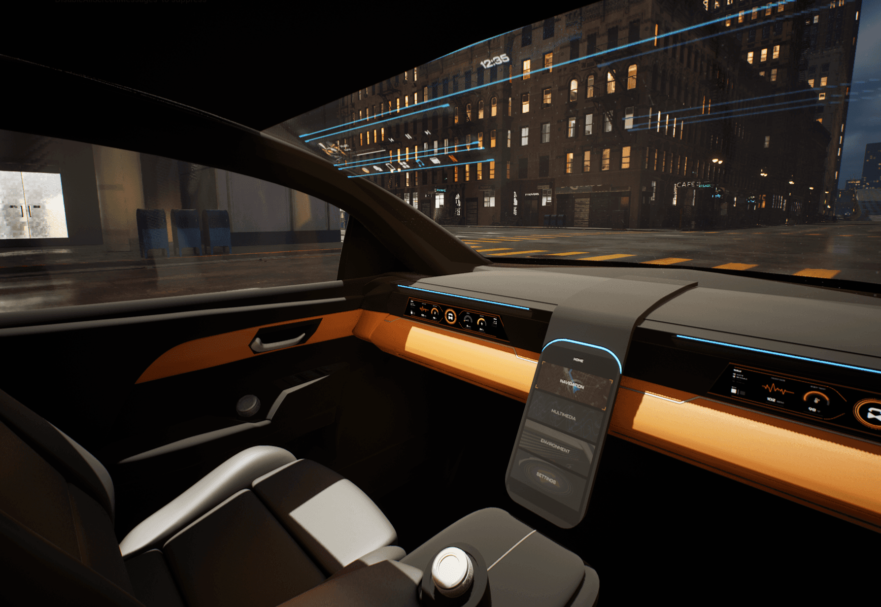
This project explores an advanced cockpit for a fully autonomous (Level 5) vehicle interior designed around Gen-Z passengers. The concept centers on an adaptive HMI system that enables seamless transitions between work-focused and rest-focused activities through interactive displays and haptic controls.
As vehicles move toward full autonomy, interior experiences remain constrained by driver-centric layouts and limited passenger control. Existing HMI systems do not adequately support productivity, personalization, or meaningful engagement during autonomous travel.
The goal of this project was to design a comprehensive user interface for an interior experience withing a fully autonomous (Level 5) vehicle. Additionally, we had to focus these in-cabin interactions between a head-up display, two programmable haptic knobs, and a redesigned dashboard.
Interior and experience designer, contributing to concept development, HMI strategy, and visual storytelling for vehicle interior.
User research, interviews, and surveys
Interior concept development
Sketching, CAD modeling, rendering
UI design and animations
iterating on designs,
making high-fidelity prototype
All about the user :
Research focused on understanding how Gen-Z passengers might use time inside a fully autonomous vehicle when driving is no longer required. Insights emphasized the need for flexibility, intuitive control, and experiences that support both productivity and rest within the same journey.
Current vehicle interiors remain driver-centric, limiting meaningful passenger engagement.
Existing HMI systems lack adaptability for different activities and mental states.
Commute time often feels underutilized or disconnected from passengers’ goals
Enable seamless transitions between work and rest activities
Provide passengers with intuitive, real-time control over information and environment
Use multi-sensory feedback to reinforce awareness, comfort, and confidence
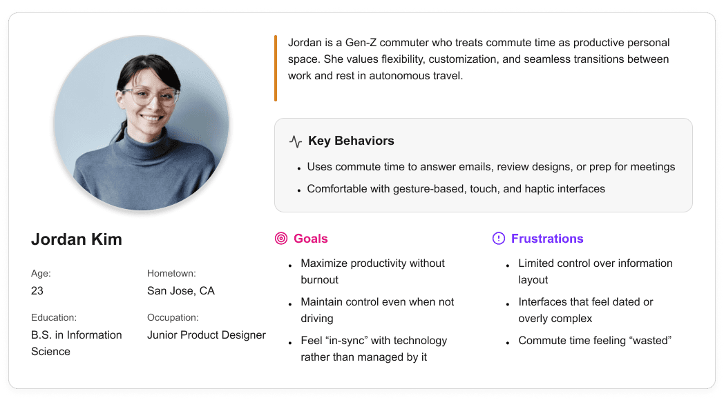
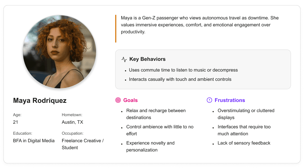
User personas were created to represent distinct Gen-Z passenger behaviors and expectations within a fully autonomous vehicle. These personas helped guide experience decisions by balancing productivity-focused and rest-focused use cases throughout the interior and HMI system.

It is the series of experiences Carlos has as he achieve a specific goal. It was built on the his experience.
I developed a user journey map of Carlos's experience with the app to highlight potential pain points and identify areas for improvement.
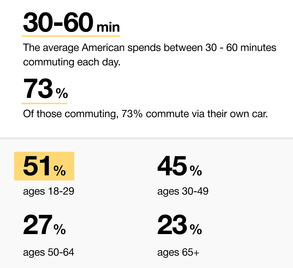
When we look at the most common reasons people are in their vehicles, commuting to and from work is one of the most popular. While there are others, we decided to pursue this use case because we believe most people would wish to spend this time doing other things.
51% of Americans ages 18-29 say they would ride in a driverless vehicle if they had the opportunity. So, now we can narrow our user group further to Gen-Z commuters.
It is the series of experiences Carlos has as he achieve a specific goal. It was built on the his experience.
I developed a user journey map of Carlos's experience with the app to highlight potential pain points and identify areas for improvement.
After figuring out our user group, we created a survey for Gen-Z commuters to help draw out insights that might lead to design opportunities. This survey was equipped with two different types of questions:
Current driving questions
Future thinking, Level 5 questions
It is the series of experiences Carlos has as he achieve a specific goal. It was built on the his experience.
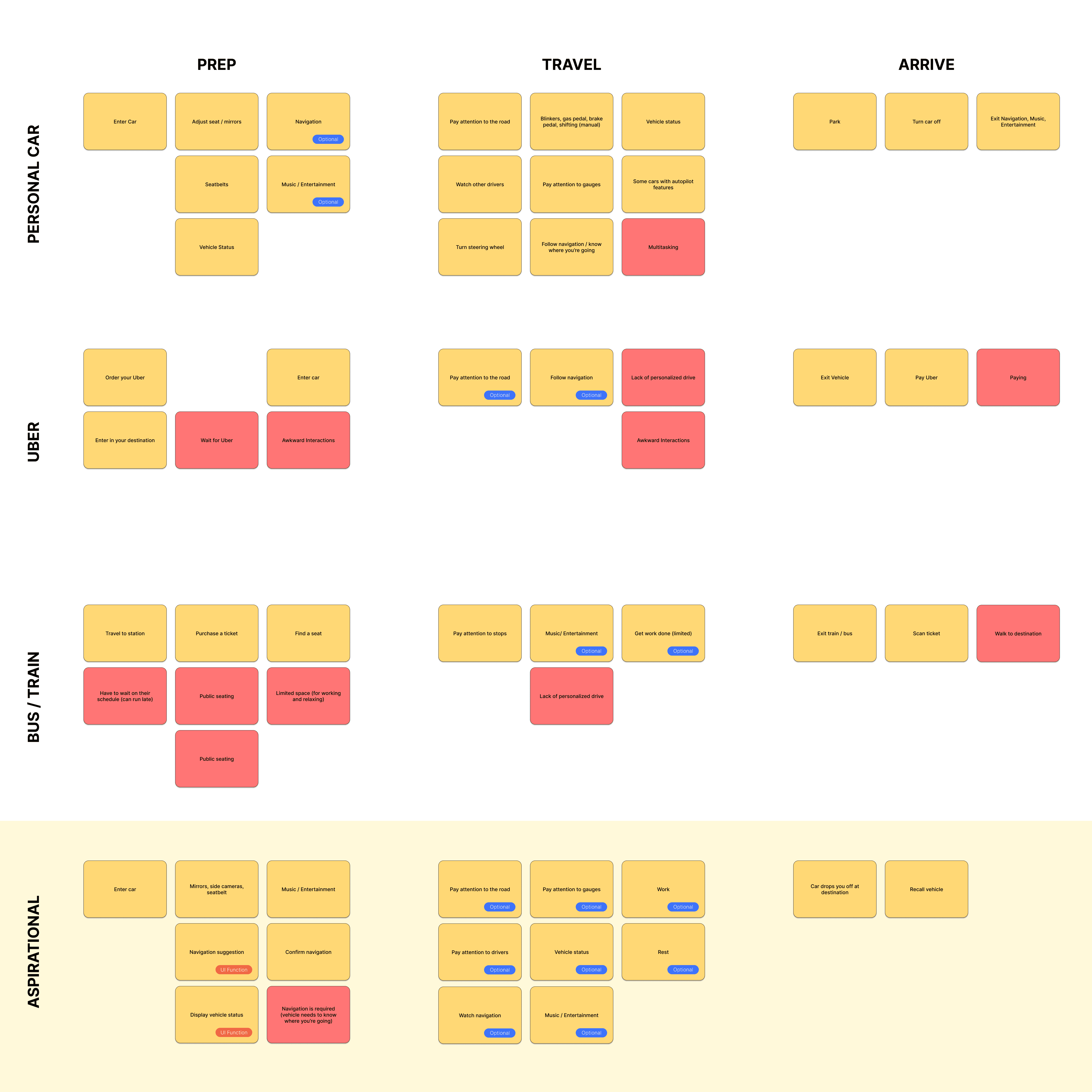
We compared the typical journey and actions performed for three different modes of transportation and even pointed out some pain points for each. A personal car requires the user’s attention for the entirety of getting from point A to B, and is even required to do a good bit of multitasking at times. However, this is their personal vehicle and is private to them. An uber and bus are similar in that the user has no driving tasks to worry about, but it is no longer a personalized experience; they are in a public space.
A fully autonomous vehicle can give you the best of both worlds. You can have your own personal space while the car does all the driving for you.
The question then becomes: What do you do with the time you spend riding in this vehicle?
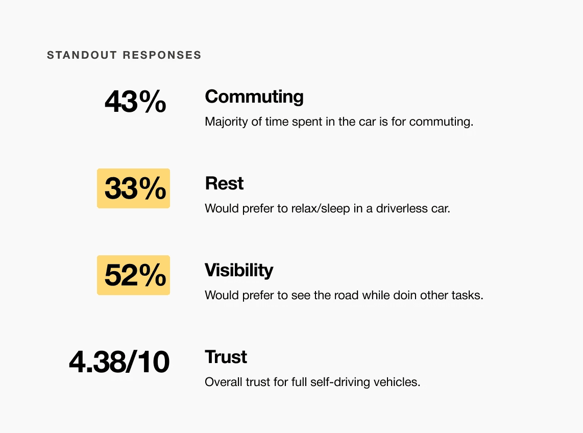
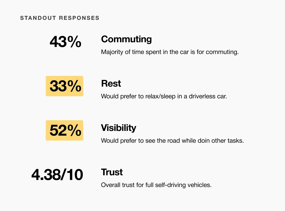
A slight majority of surveyors would like to rest in a driverless car, but getting additional work done was a close second.
Visibility to the road is important to surveyors, so the HUD should not clutter their view.
Commute time often feels underutilized or disconnected from passengers’ goals
It is the series of experiences Carlos has as he achieve a specific goal. It was built on the his experience.
For Gen-Z commuters, our HMI system offers real-time interactive display and haptic feedback controls while providing both work and rest activities. It enhances the visual experience and control options for passengers in a fully autonomous vehicle.
Choose a good movie in a cinema theatre nearby and select seats in an app in a fast and clear way

It is the series of experiences Carlos has as he achieve a specific goal. It was built on the his experience.
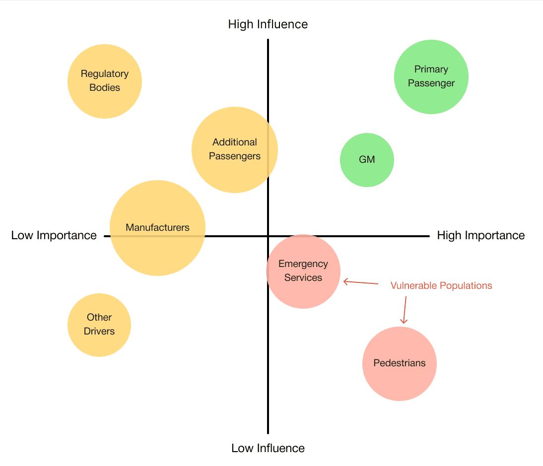
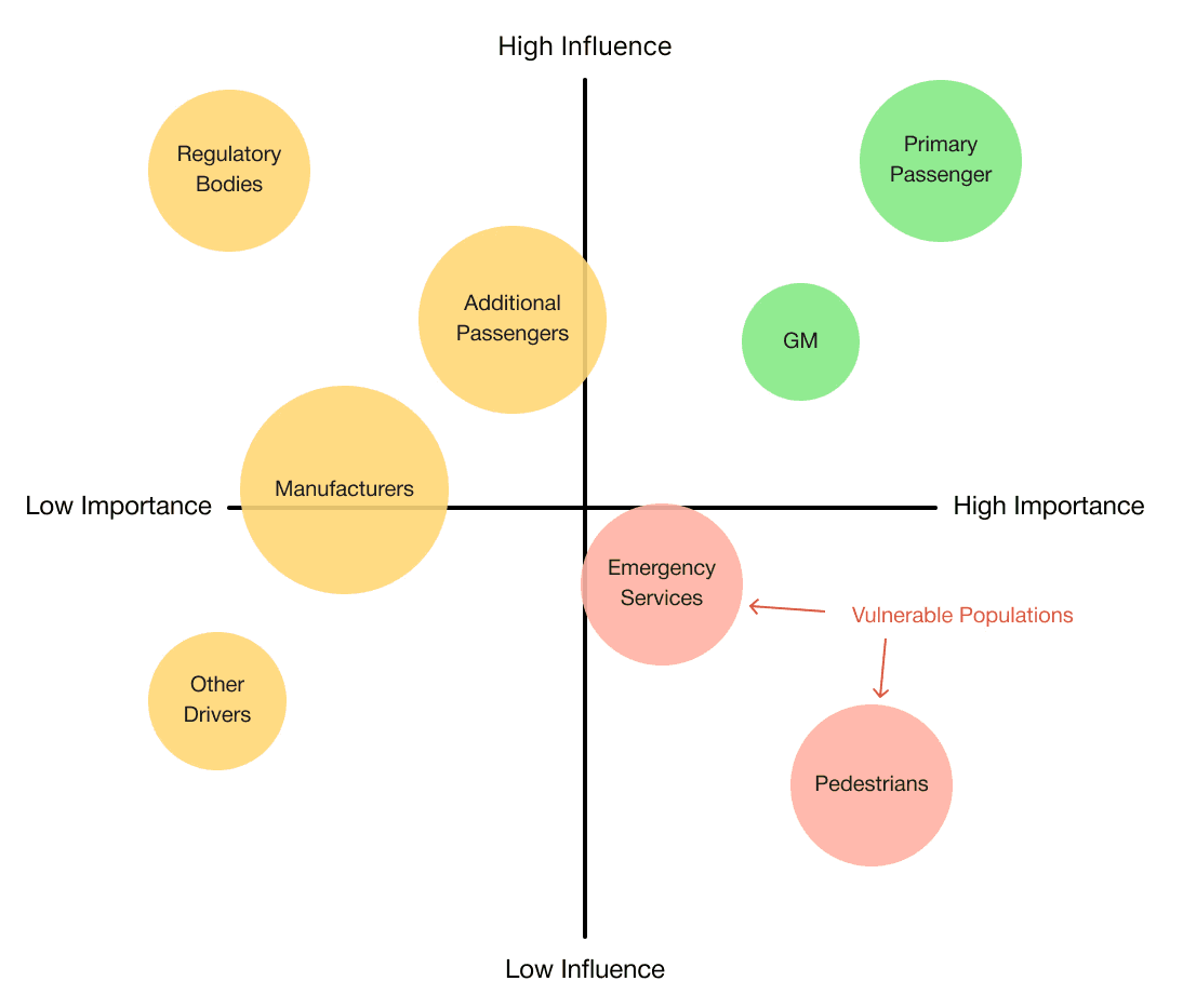
At the start of our research, we listed out possible stakeholders and mapped them out based on their importance and influence to the project and relative to themselves. We made sure to note where the vulnerable populations would be, but since this project is so closely tied with the experience on the interior of the vehicle, we stayed focused on just the driver and our sponsor.
Choose a good movie in a cinema theatre nearby and select seats in an app in a fast and clear way
The project schematically :
Concept development explored how a fully autonomous interior could adapt to different passenger activities and states throughout a journey. Early ideation, spatial studies, and interaction concepts were used to translate research insights into interior layouts and HMI behaviors. Initial testing and iteration helped refine key ideas before moving into higher-fidelity refinement.
The series of hand-drawing frames that visually describe and explore a user's experience with a product.
I began with drawing storyboards to focus on just the most important parts of a user’s experience with the app. It's a story that was told through the panels, revealed it two different way

Big picture storyboard, which focuses on the user experience. It's about how people will use the Voo's app during their day and it will be useful.

Close-up storyboard focuses on the app instead of on the user experiencing that product. Shows what happens on each screen of the app.
We were able to determine three zone of legibility when testing text elements on the HUD. From here we started creating an information hierarchy based on these zones to identify what should be displayed where.
When testing, users reported eye fatigue when there were large blocks of bright colors on the HUD. We pivoted to muted/ transparent elements in later designs.
We were able to determine three zones of legibility when testing text elements on the HUD. From here we started creating an information hierarchy based on these zones to identify what should be displayed where.
When testing, users reported eye fatigue when there were large blocks of bright colors on the HUD. We pivoted to muted/ transparent elements in later designs.

These are a high fidelity design that represents a final product
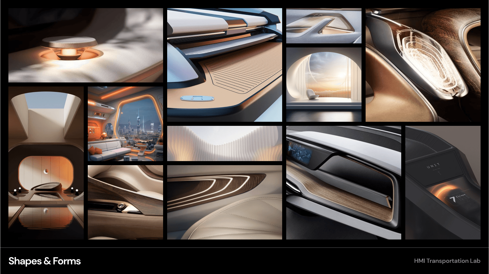
Moodboards were used to establish a retro-futuristic aesthetic blended with a sense of tranquil luxury. This visual direction helped guide material choices, lighting tone, and the overall emotional character of the interior.


It's a structured scheme that outlines the pages and content hierarchy of the app.
Next step: creating the application map. My goal here was to make strategic information architecture decisions that would improve overall app navigation. The structure I chose was designed to make things simple and easy.
These are a high fidelity design that represents a final product
Initial CAD models were developed in Fusion 360 to establish overall proportions and spatial relationships. These early mockups helped validate sizing and layout decisions ahead of physical prototyping.
These are a high fidelity design that represents a final product
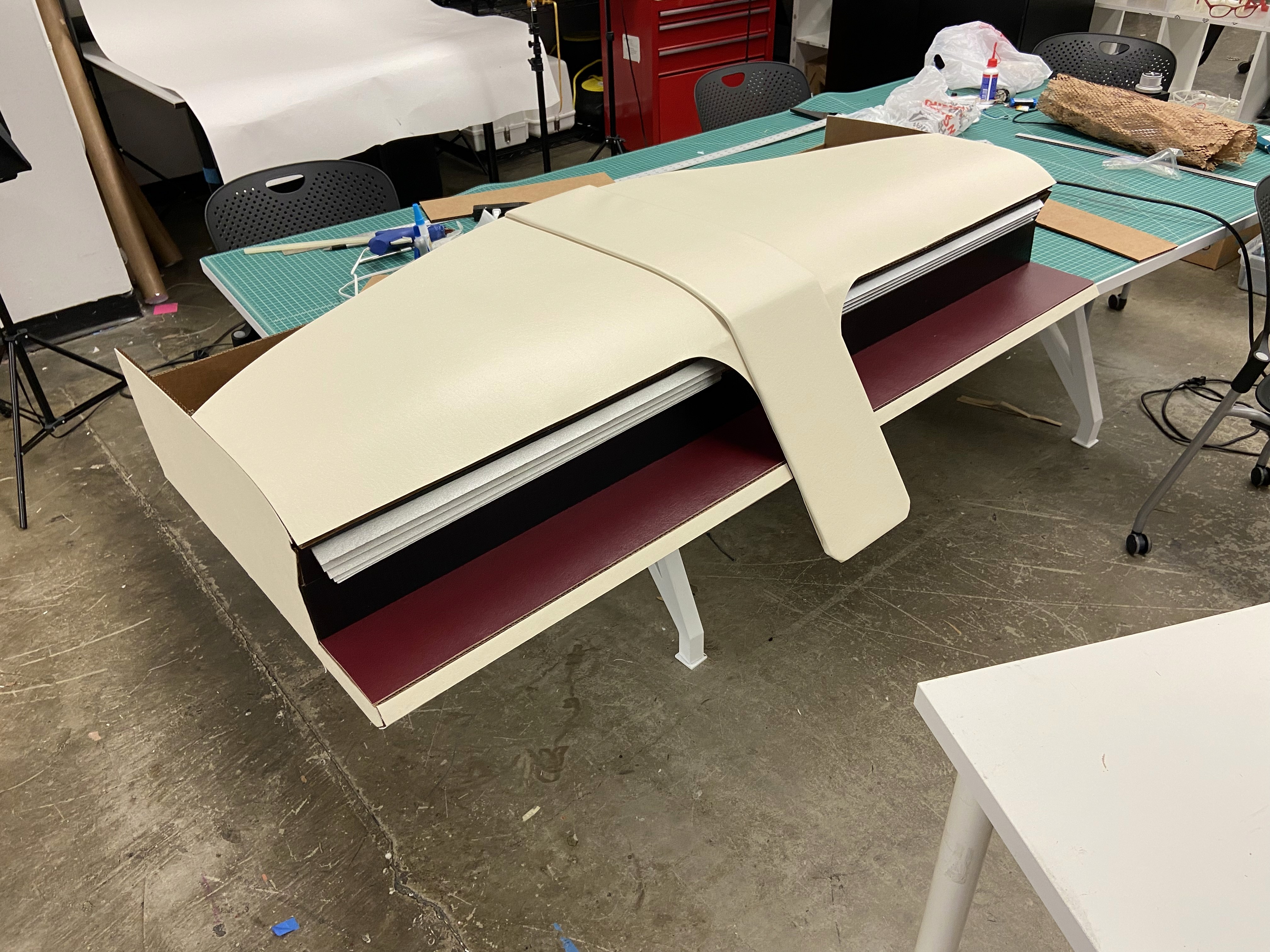
A 1:1 physical mockup was built to validate dashboard proportions and component integration. The model combined a HUD, basic rotary controls, and a corresponding virtual environment to simulate real-world use.
It's a structured scheme that outlines the pages and content hierarchy of the app.
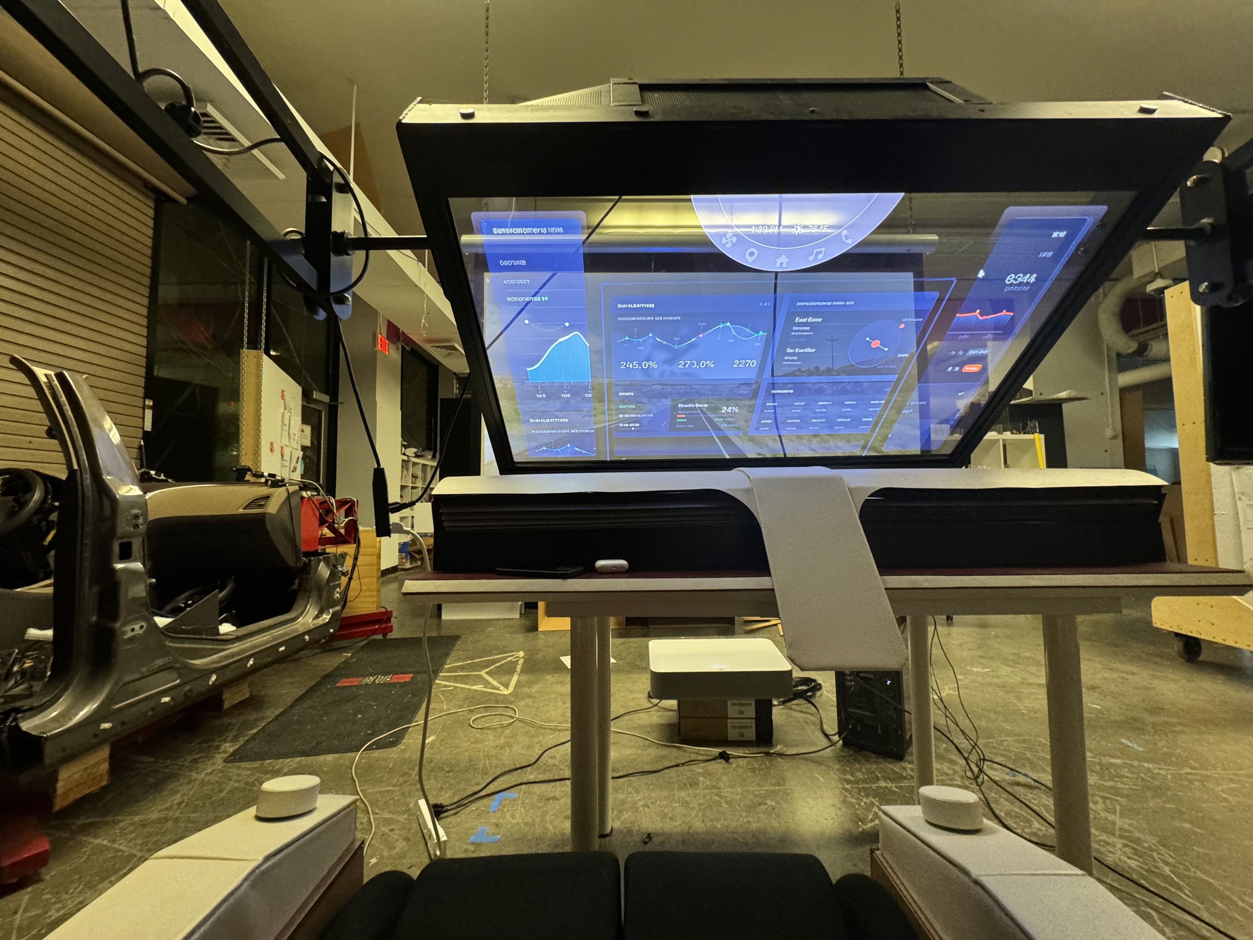
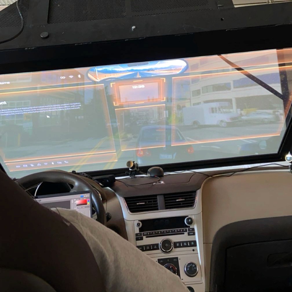
HUD concepts were evaluated in context using a transparent OLED display within a simulated driving environment. This setup allowed visibility, hierarchy, and legibility of text-based interactions to be assessed during representative passenger scenarios.
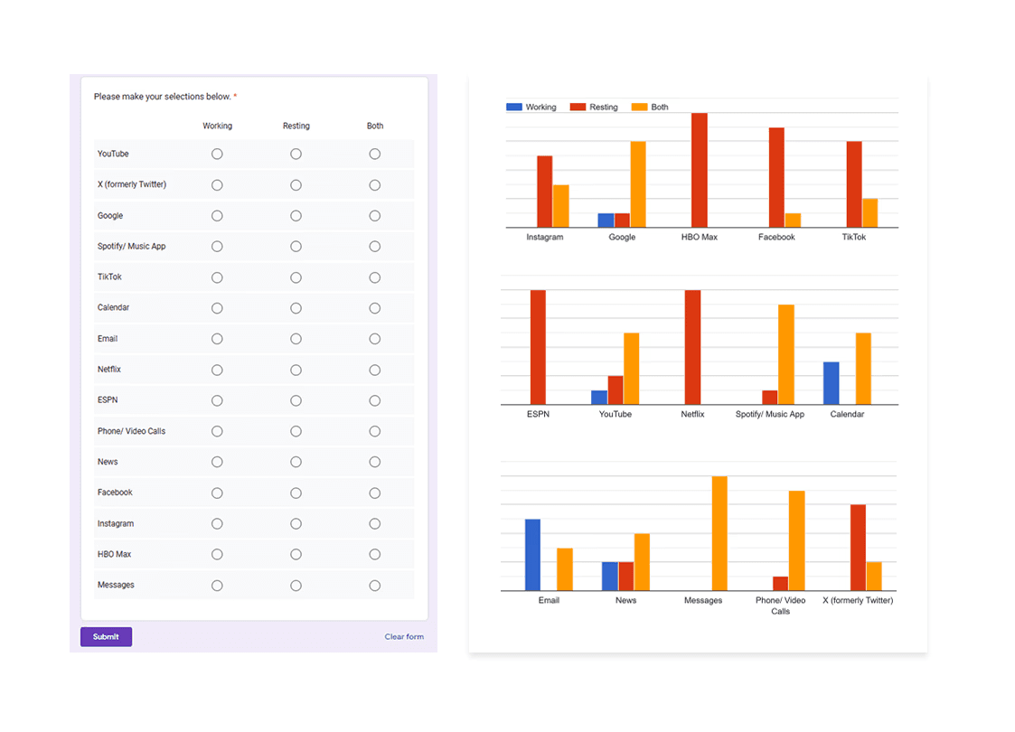
Apps like your calendar and email lean heavily into the realm of work.
Almost all social media leans into the rest category.
It's a structured scheme that outlines the pages and content hierarchy of the app.
From our earlier insight:
”A slight majority of surveyors would like to rest in a driverless car, but getting additional work done was a close second.”
We created another survey to help understand what apps or activities a user would consider work, rest, or both. Interestingly enough, there were some responses that leaned heavily in one direction and some that were very contested.
It's a structured scheme that outlines the pages and content hierarchy of the app.
Next step: creating the application map. My goal here was to make strategic information architecture decisions that would improve overall app navigation. The structure I chose was designed to make things simple and easy.

It's a structured scheme that outlines the pages and content hierarchy of the app.
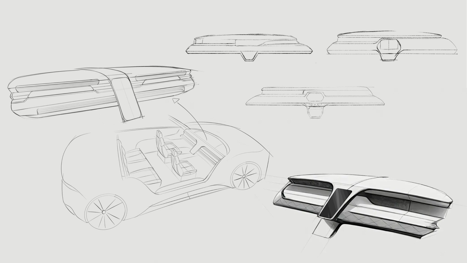
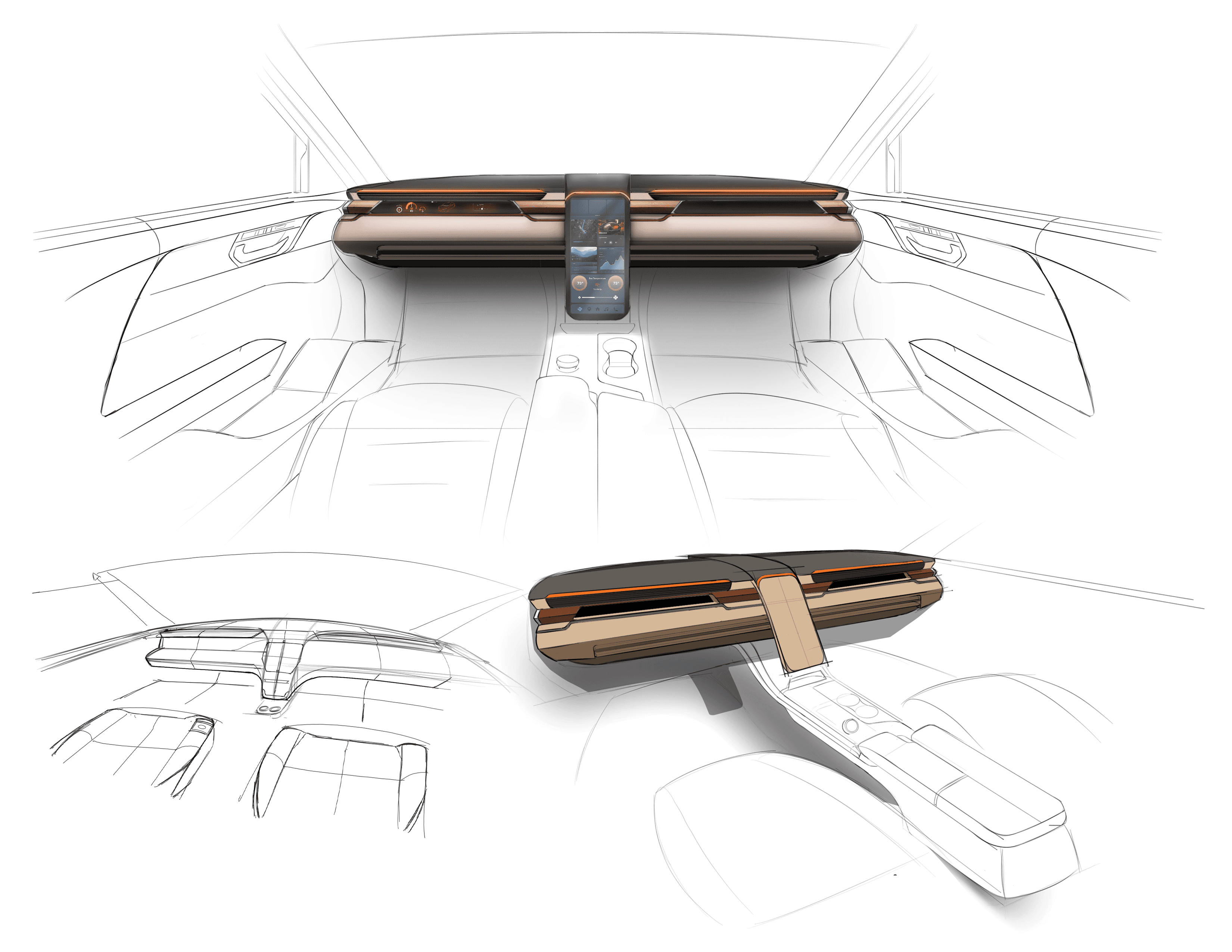
Initial sketches explored early dashboard form and layout ideas for a fully autonomous interior. This phase focused on testing proportions, visual hierarchy, and how information could be integrated without traditional driver constraints.
They initially oriented on the basic structure of the homepage and highlight the intended function of each element.
Here I drew five different versions of how structure of information on a homepage might look like. Then I reviewed all the versions and combined them in the refined one.
The goal was to explore different ideas with wireframes.

More "clear" version of wireframes in a digital form. Also all the important pages are added
in it.
On this step I used the Figma design tool to create digital wireframes of all the pages. Then I bonded all of them into the clear and smooth structure.
The goal is to show how all the pages and things interact with each other.

This is an examination of users and their needs, which adds realistic context to the design process.
First I conducted unmoderated usability studies with a few participants: they had to answer different questions about the app and share their observations while using the initial low-fi prototype. After getting the data, I analyzed it and synthesized the information obtained. Finally, I found themes and came up with several insights.
The goal was to identify pain points that the user experiences with the app designs so the issues can be fixed before the final product launches.
In the beginning, before choosing a city and theater, it would be great to look through the whole app and learn everything about it.
There are no movie search - it's necessary to add it on the movies list page.
If user wants to change his account, he should be able to log out or delete it completely.
The clear version :
The refinement phase focused on improving clarity, usability, and coherence across the interior and HMI system. Mid and high fidelity prototypes were used to evaluate interaction flow, visual hierarchy, and feedback mechanisms. Design decisions were iterated to strengthen the overall experience while maintaining a cohesive, passenger-first concept.
It's a structured scheme that outlines the pages and content hierarchy of the app.
Minor updates were made to the dashboard’s overall form and design; CMF changes based on the original moodboards were incorporated. However, we did refine the rest of the interior, which included integrating the knobs in a more seamless fashion. In person testing revealed relative discomfort having to rotate the knobs with your arm on a flat surface.
It's a structured scheme that outlines the pages and content hierarchy of the app.
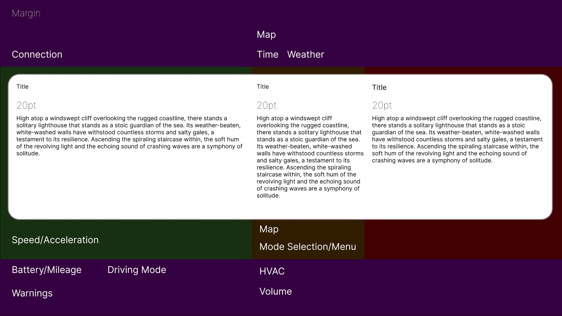
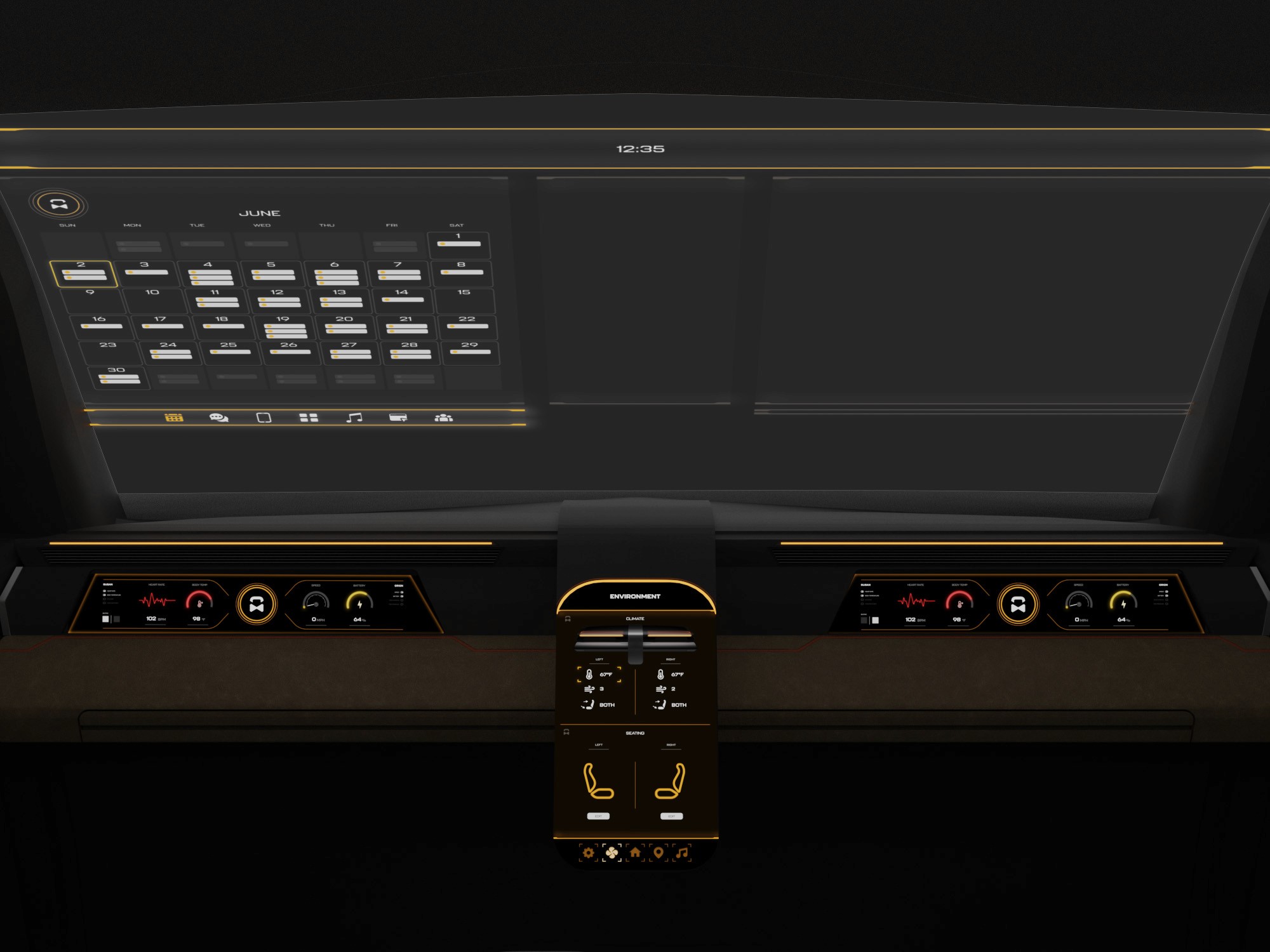
The information layout demonstrates how content is organized across multiple displays and the HUD for clarity and balance.
These are a high fidelity design that represents a final product
At this stage, the interior model was rebuilt in Blender to increase fidelity and enable more realistic HUD exploration. Updated geometry, materials, and completed door panels provided a more realistic spatial context
We were able to determine three zone of legibility when testing text elements on the HUD. From here we started creating an information hierarchy based on these zones to identify what should be displayed where.
When testing, users reported eye fatigue when there were large blocks of bright colors on the HUD. We pivoted to muted/ transparent elements in later designs.
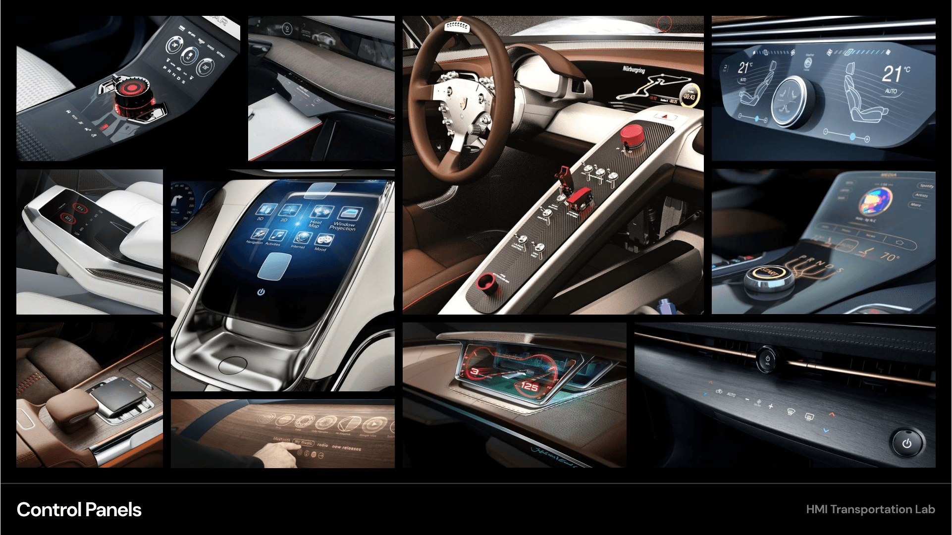
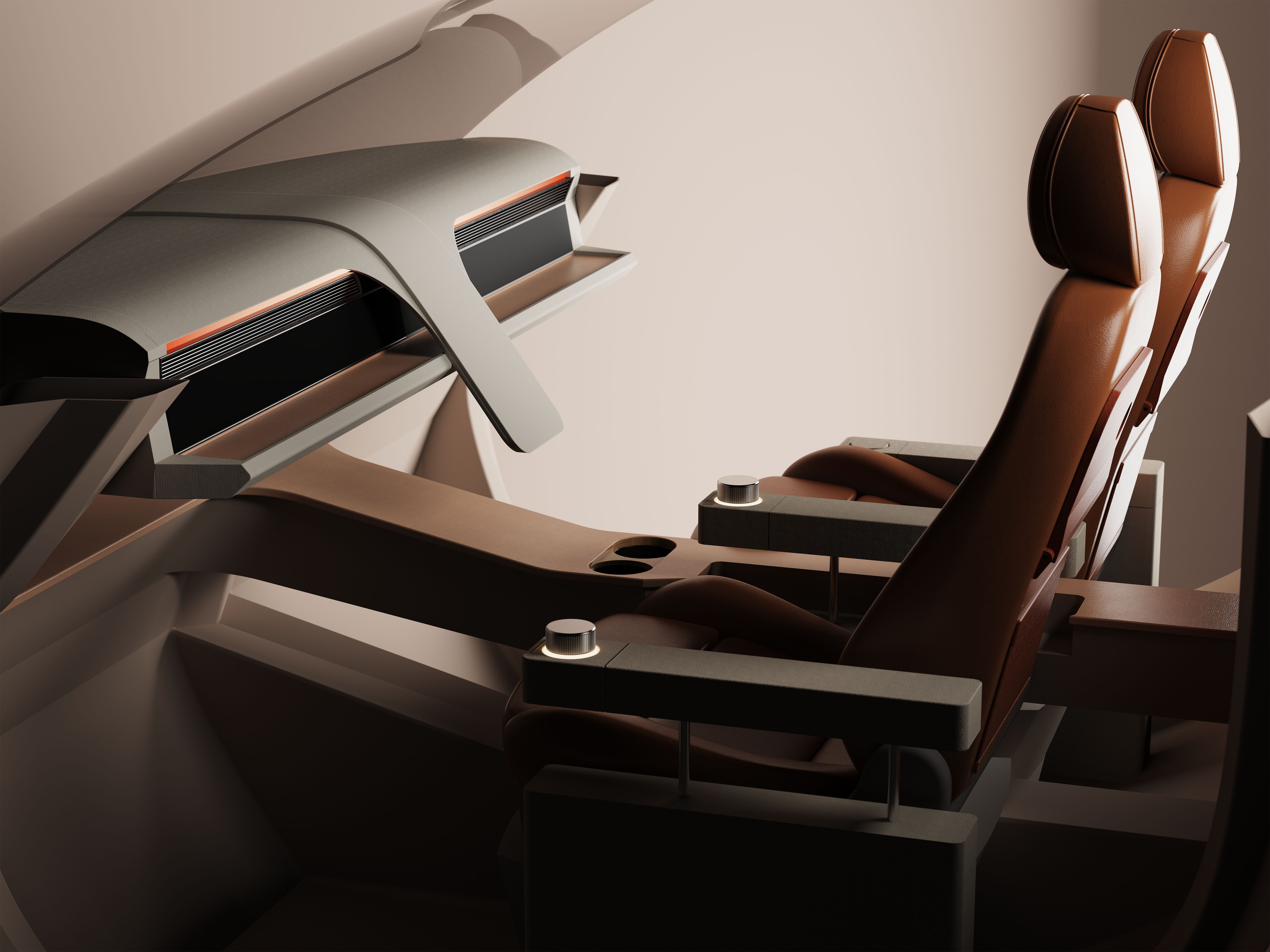
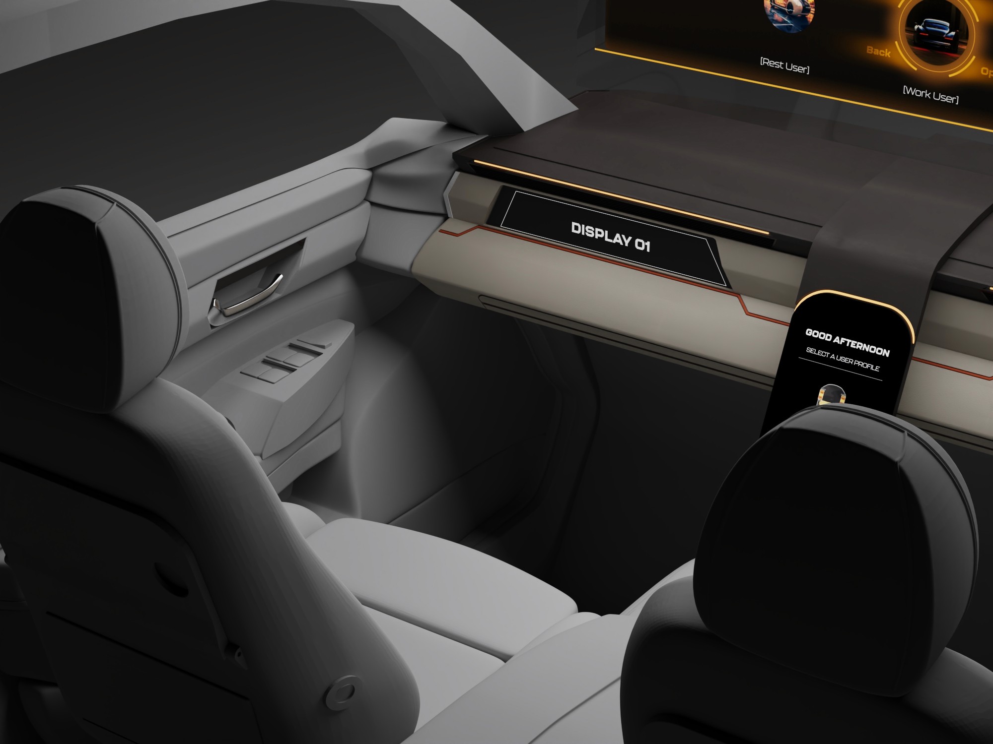
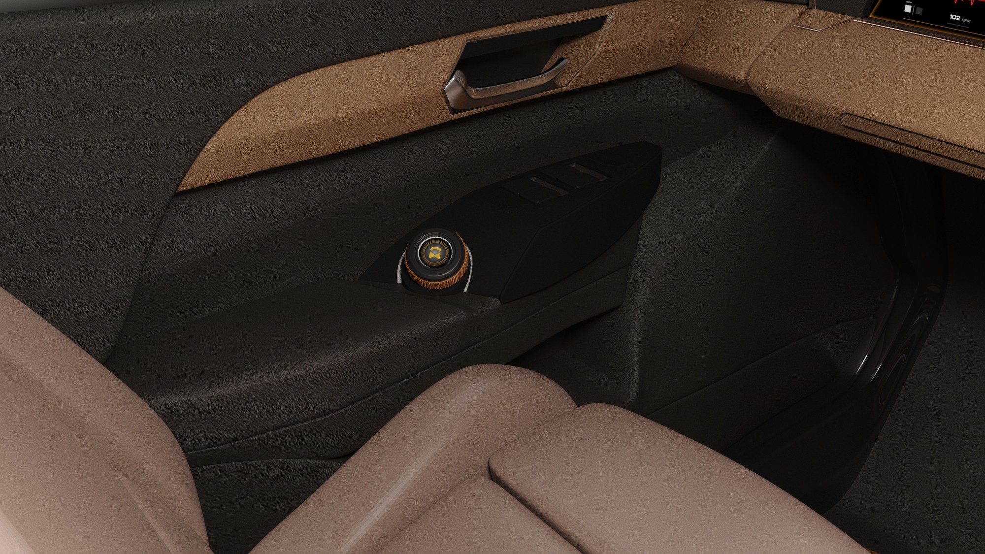
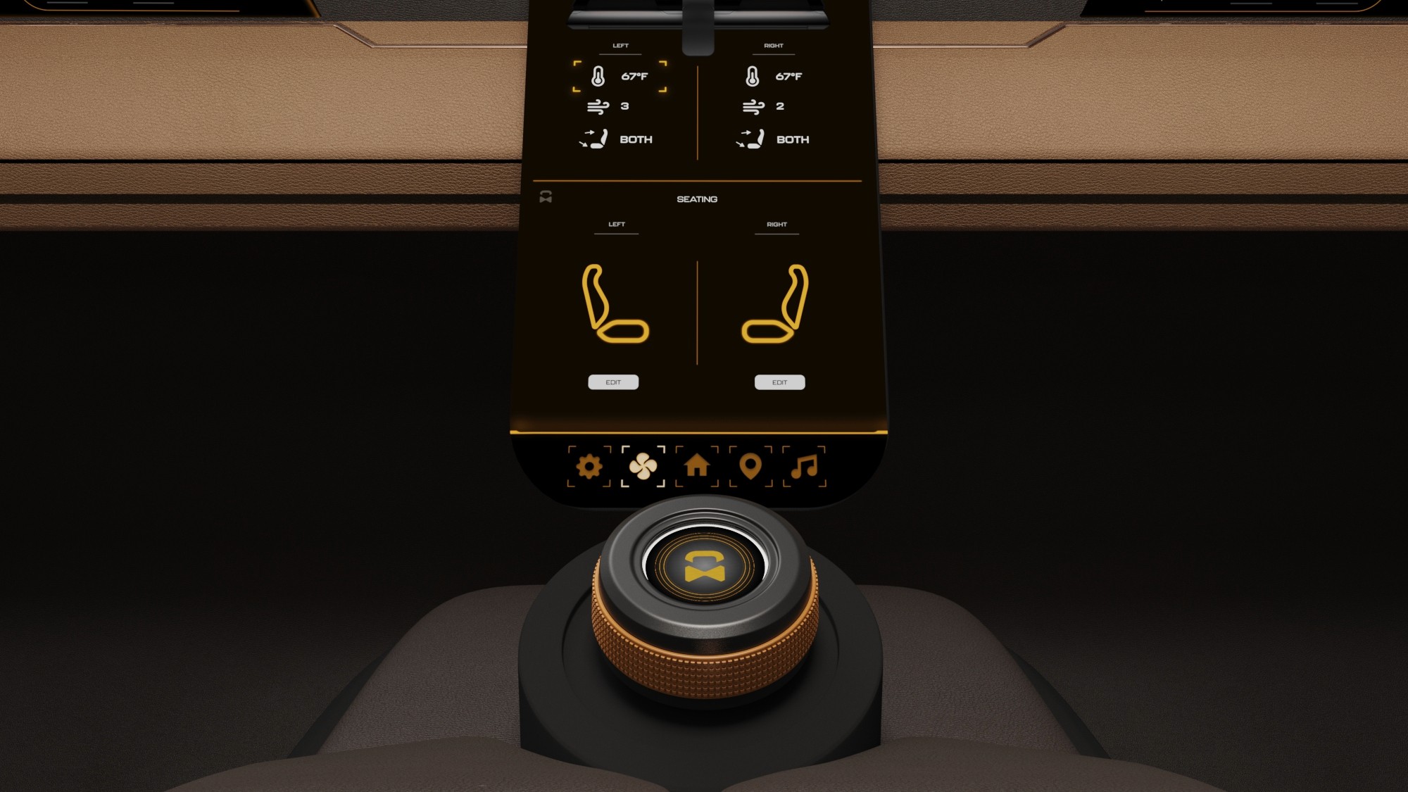
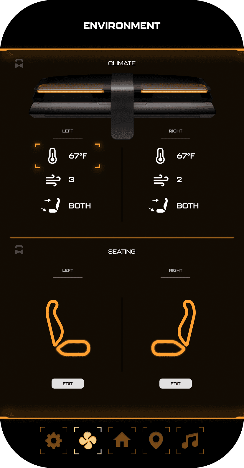
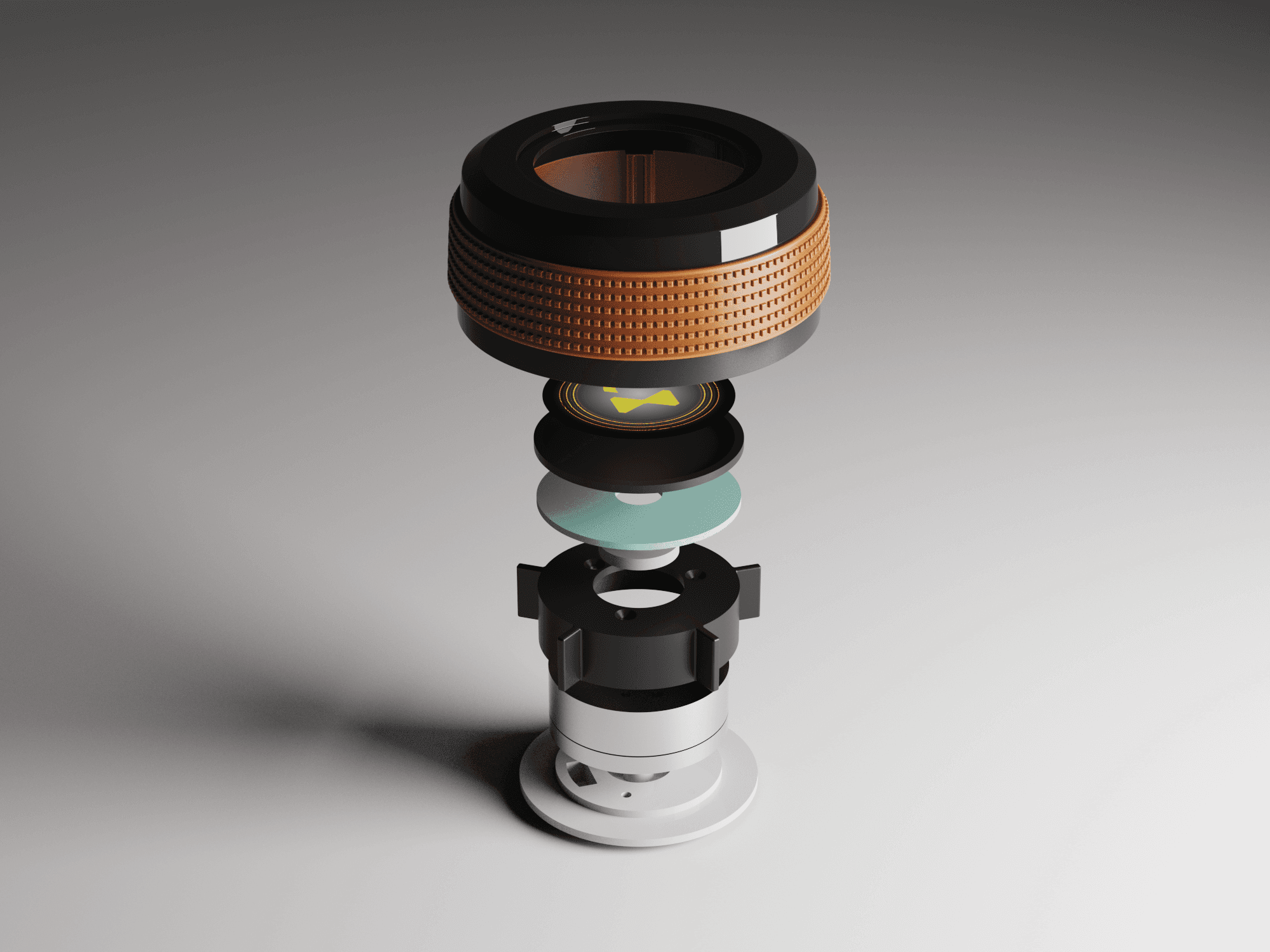
Haptic control knobs were designed to provide intuitive, tactile access to the HMI system. A door-mounted knob enables quick actions on the HUD, while a center console knob controls primary system functions, allowing passengers to navigate the interface without relying solely on touch.
We were able to determine three zone of legibility when testing text elements on the HUD. From here we started creating an information hierarchy based on these zones to identify what should be displayed where.
When testing, users reported eye fatigue when there were large blocks of bright colors on the HUD. We pivoted to muted/ transparent elements in later designs.
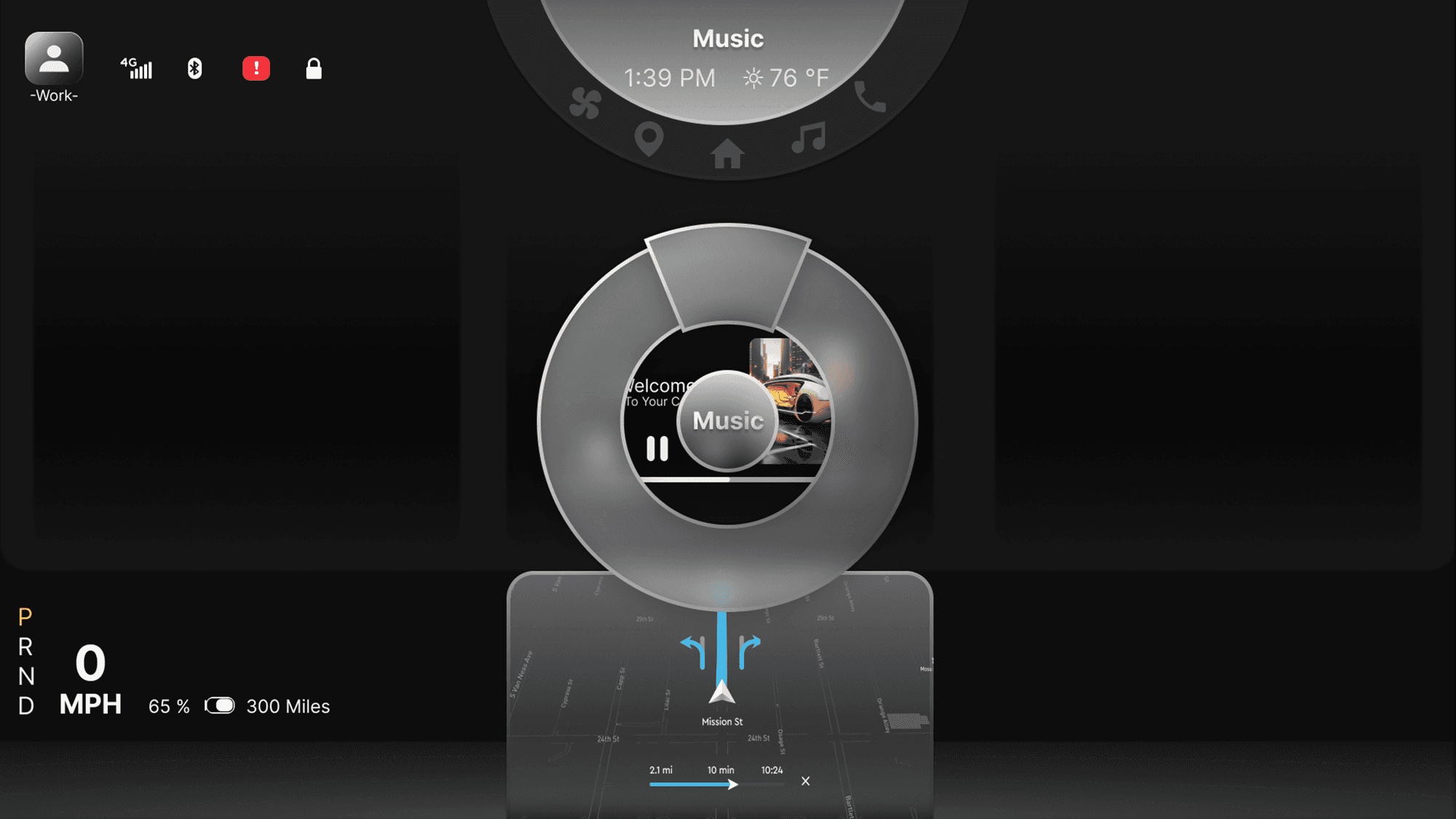
Sample HUD animations were created to explore motion, transitions, and visual feedback within the display system. These studies helped communicate how information appears, updates, and responds during use.


It's a structured scheme that outlines the pages and content hierarchy of the app.
Pop-up interactions were designed to provide momentary awareness and feedback on the HUD while maintaining a calm visual environment.

These are a high fidelity design that represents a final product
I created all the app pages mockups, incorporating the right design elements such as typography, color, and iconography. I also included captivating and visually appealing images, and developed all the necessary components and elements.
The goal was to demonstrate the final Voo's app in as much detail as possible.


It's the detailed, interactive version of designs that closely match the look and feel of the final product.
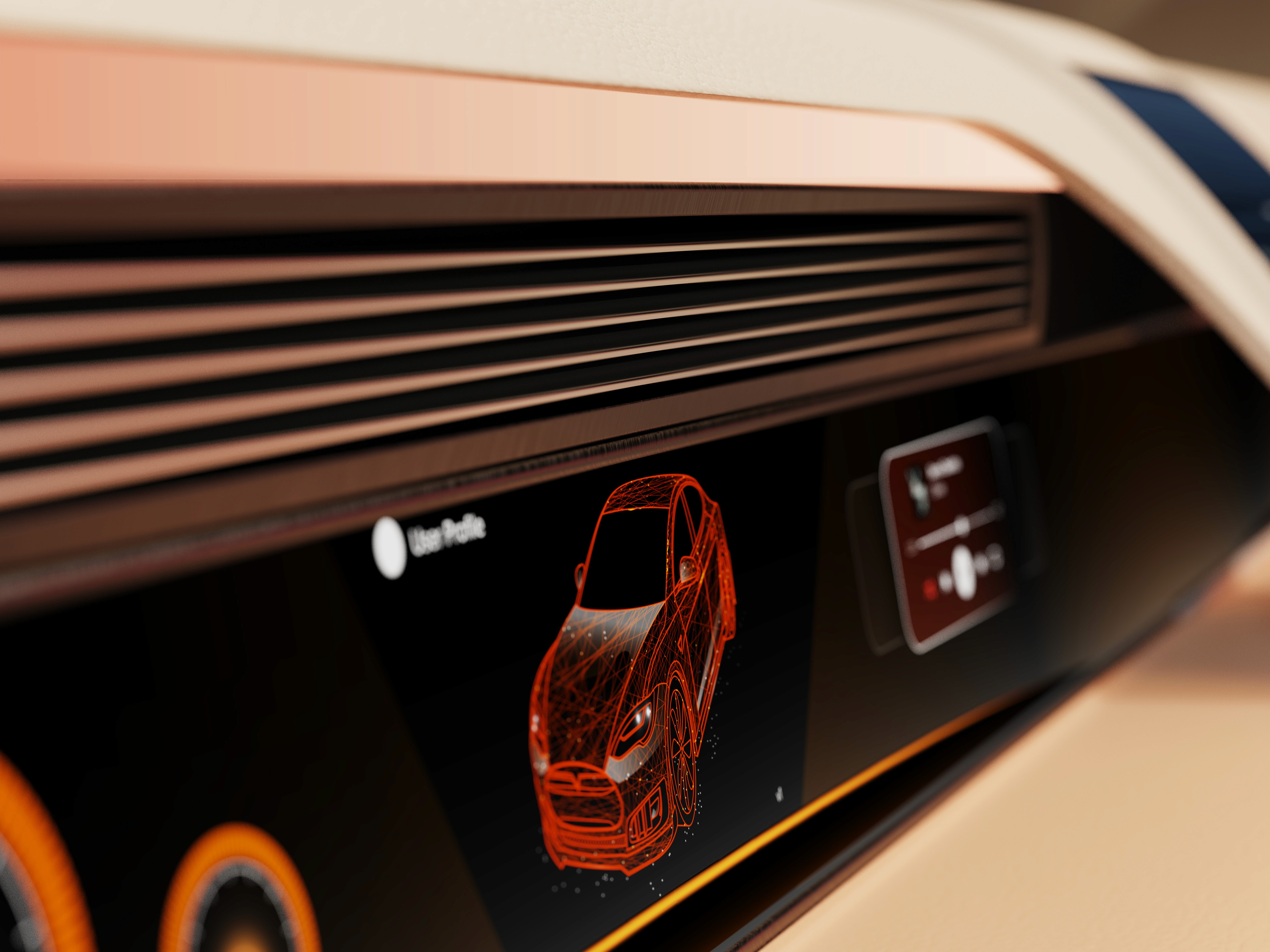
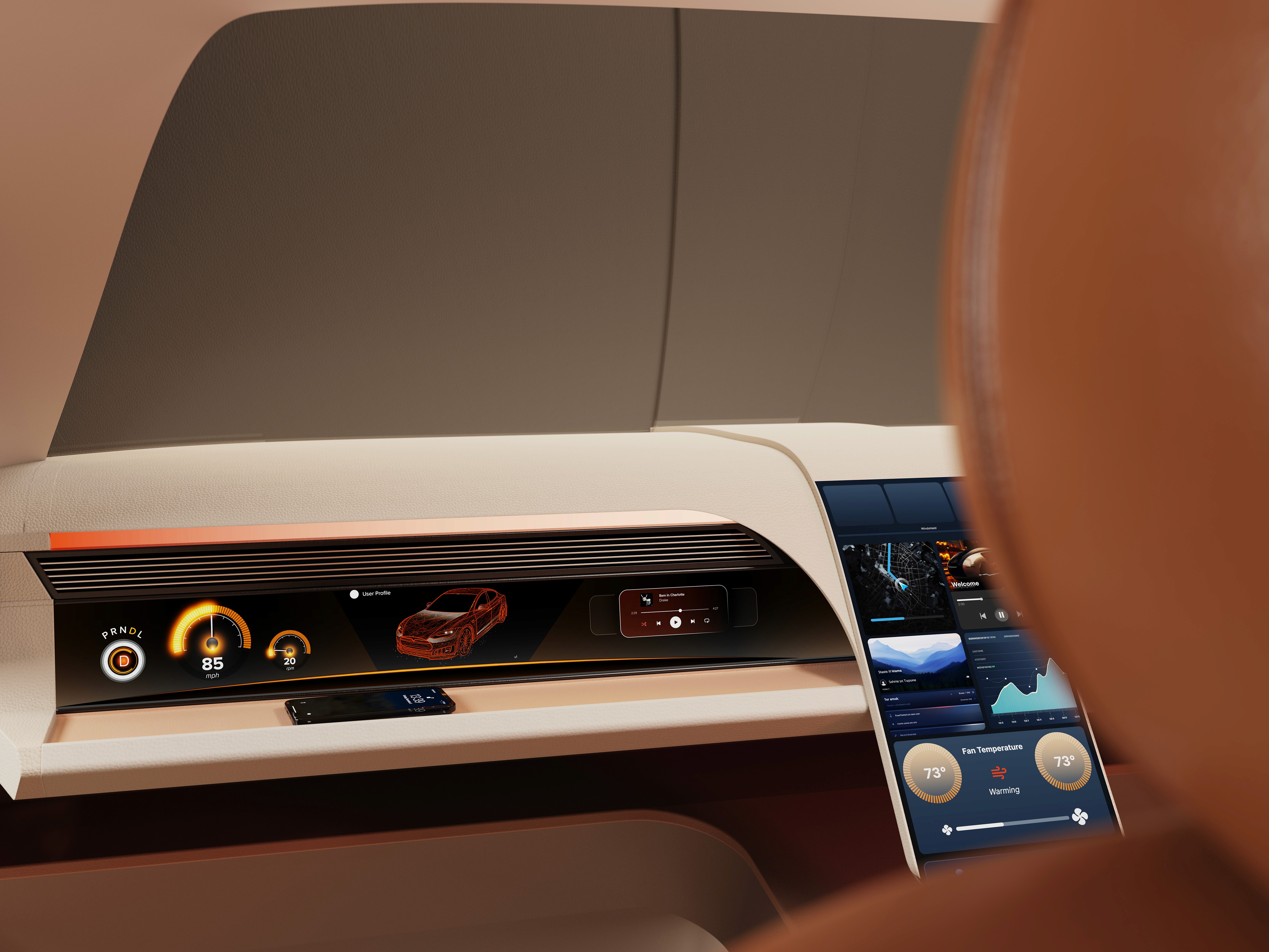
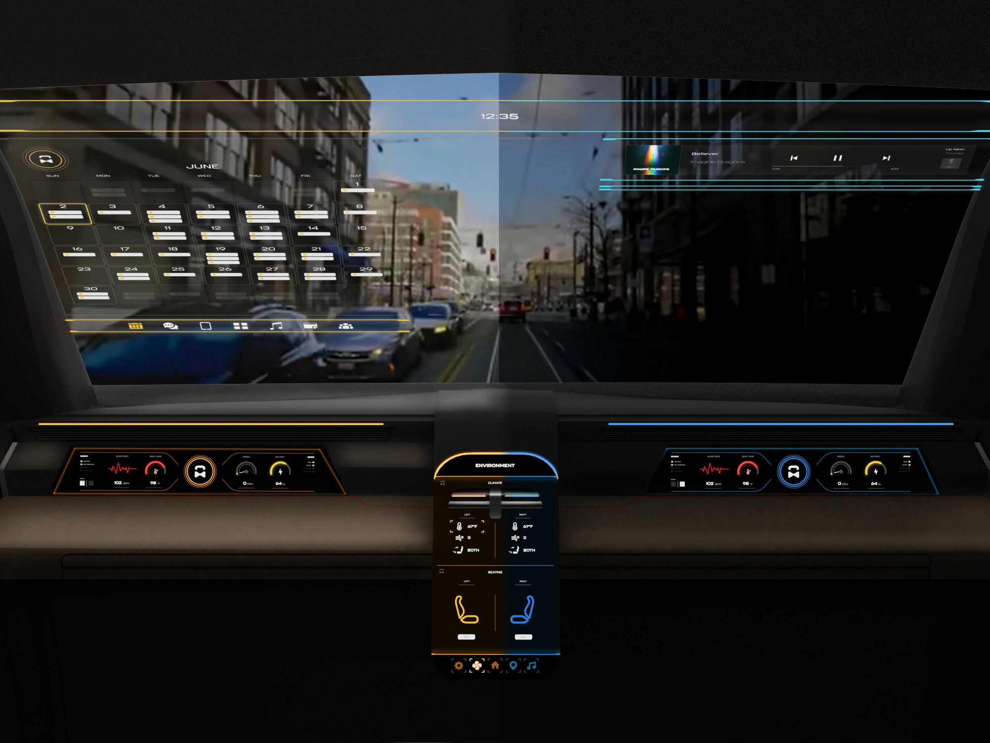
The center stack display and auxiliary displays carry most of the information related to the vehicle itself. They work in tandem with the HUD since the information being displayed on the HUD will either be work or social/ entertainment related.
All of these screens were fully built out in Figma.
HUD and UI Settings
Environment Settings
Home (General Vehicle Settings)
Map Settings
Multimedia Settings
It's the detailed, interactive version of designs that closely match the look and feel of the final product.
I turned my mockups into a prototype that's ready for testing, using gestures and motion, which can help enrich the user experience and increase the usability of the app.

City and cinema theater selection
Movies slideshow
List of movies + search option
Separate movie page, adding to favourites
Show selection: date and time, hall and seats
Adding selected seats
Calendar with results filtering
Menu and its sections
The project schematically :
The final design delivers a future-focused autonomous interior that redefines how passengers engage with time in transit. By combining interactive displays, haptic feedback, and adaptable interior elements, the concept demonstrates how autonomy can unlock more intentional and personalized in-vehicle experiences.
It's a structured scheme that outlines the pages and content hierarchy of the app.
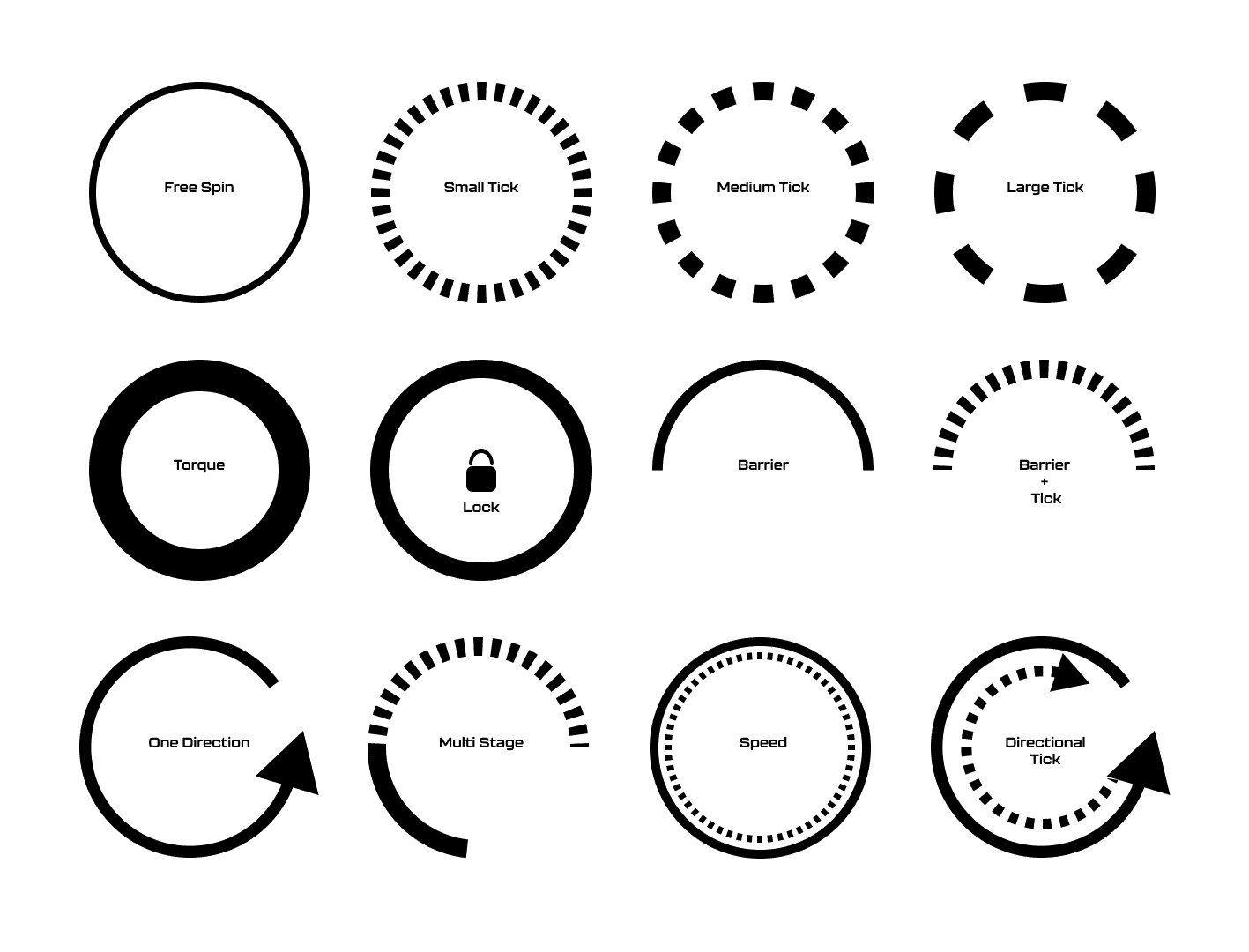
The new and improved haptic knob was built completely in-house and allowed us to customize the force feedback of the knob based on certain scenarios. This means as a user steps through the UI experience, the knob can be programmed to feel different at each step of the UI.
It's a structured scheme that outlines the pages and content hierarchy of the app.
The ability to program the knob has allowed us to create a distinct tactile hierarchy which compliments what the user is seeing visually as well. Examples of different “feels” we can give the knob, shown below.
It's a structured scheme that outlines the pages and content hierarchy of the app.
The final HUD has work (orange) and rest (blue) modes to account for whether the user is actively or passively engaging with the UI. This split perspective shows a difference in information density between the two different modes on the HUD
We were able to determine three zone of legibility when testing text elements on the HUD. From here we started creating an information hierarchy based on these zones to identify what should be displayed where.
When testing, users reported eye fatigue when there were large blocks of bright colors on the HUD. We pivoted to muted/ transparent elements in later designs.
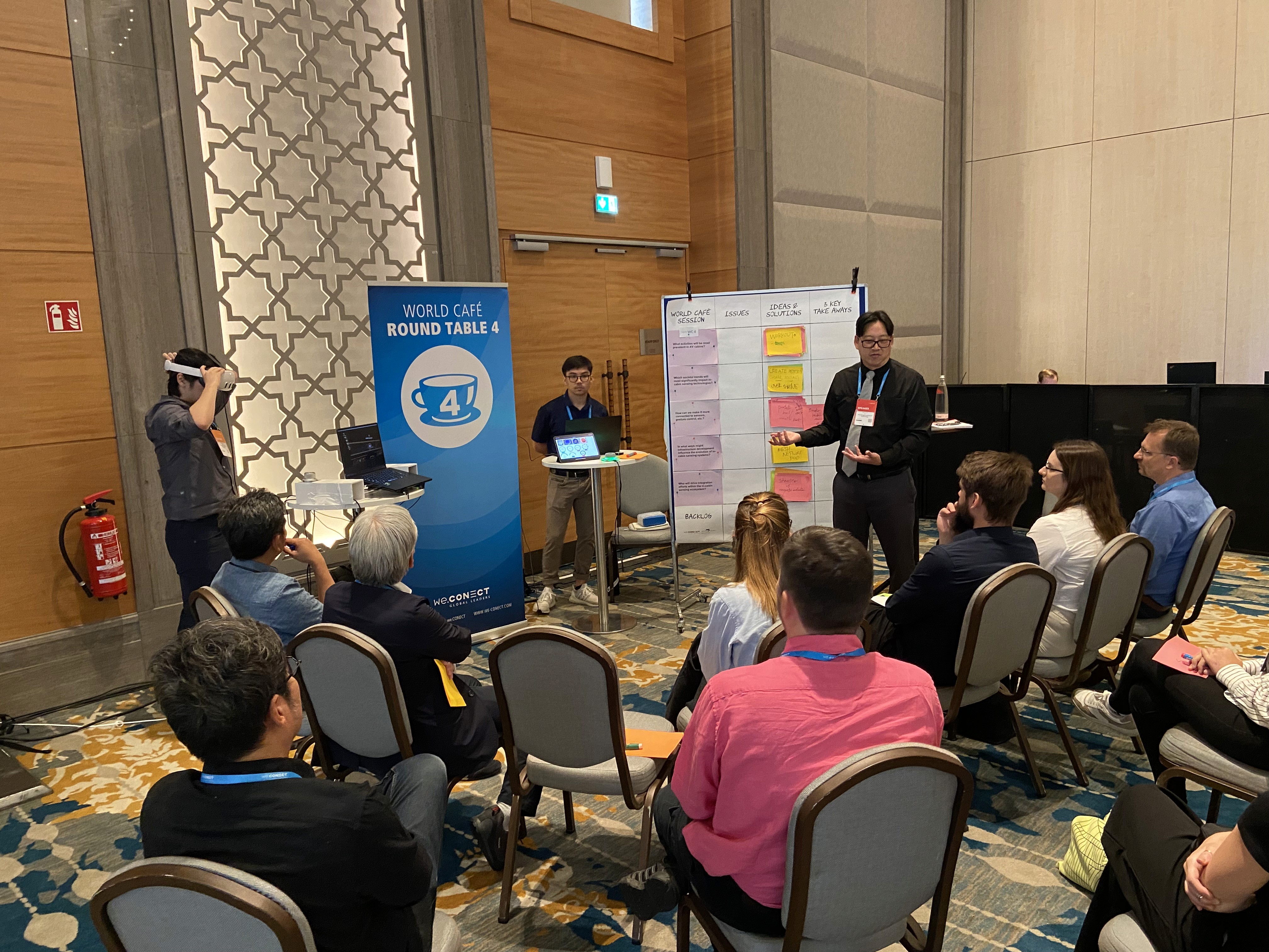
Car.HMI Europe 2024
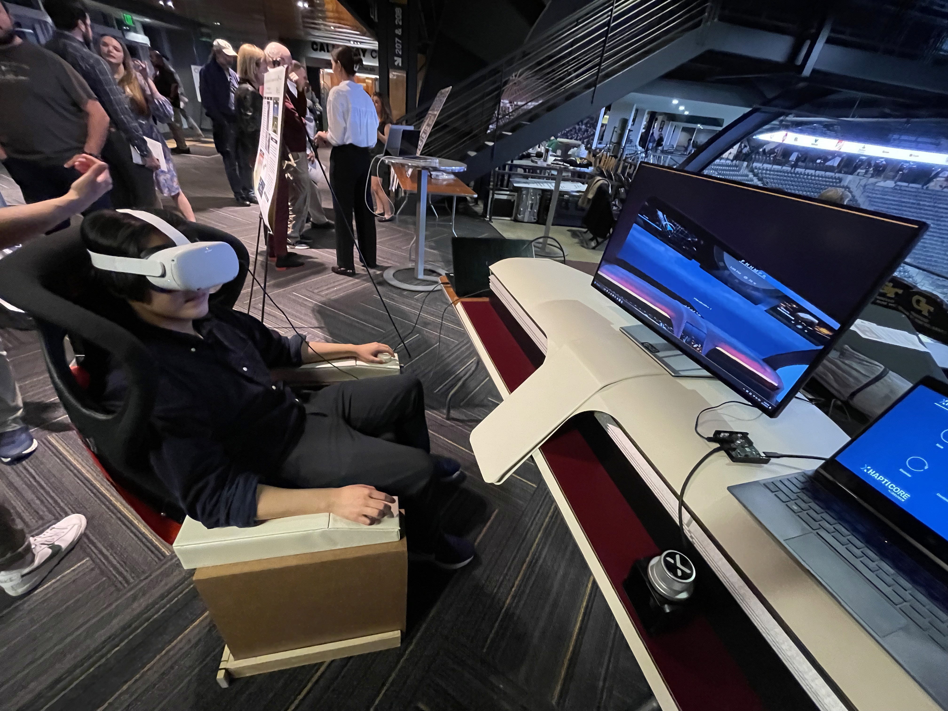
At the Berlin conference, our team presented this project as an advanced cockpit for a Level 5 HMI system using VR, Unreal Engine 5, and programmable haptic knobs.
Car.HMI USA 2024
At the Michigan conference, we made minor updates to the project, mainly focusing on improving the haptic knobs and their overall functionality.
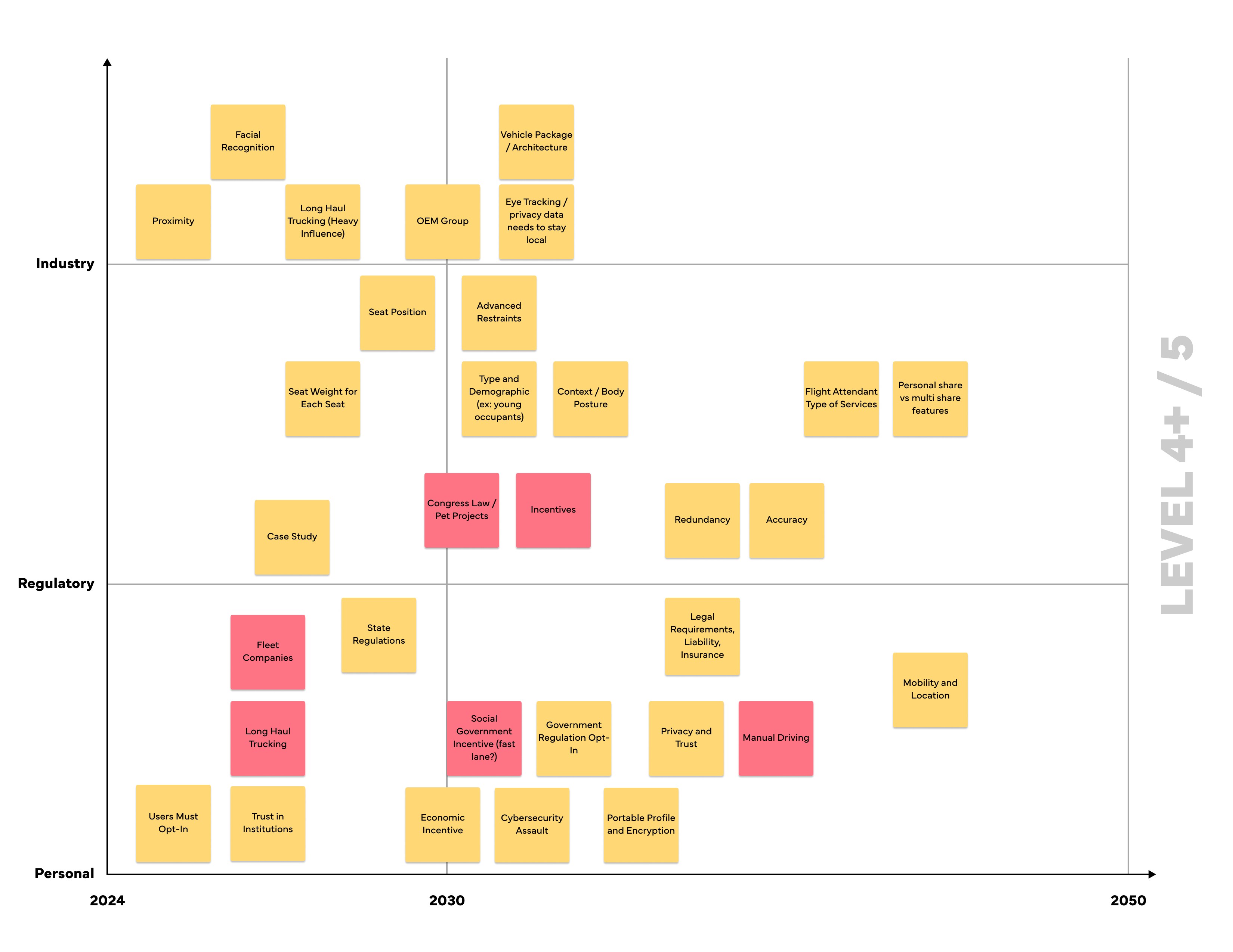
During the team’s time at these conferences, we held several discussion sessions with automotive professionals from around the world. We centered these discussions around future mobility, our Level 5 concept, and more. Originally, we thought 2035 would be a safe bet for speculating this moonshot concept, but after discussing with several groups at the conferences, our speculation began rolling out closer to 2050.
Fully autonomous interiors require experience-driven design that adapts to different passenger needs rather than fixed, driver-centric assumptions.
The concept positions the vehicle interior as a flexible passenger environment enabled by adaptive HMI and spatial design. It illustrates how autonomy can shift in-vehicle experiences toward greater personalization and engagement.
This project strengthened my ability to design around future-facing constraints while grounding decisions in believable user needs and scenarios. I also gained experience translating abstract autonomy concepts into tangible interior and interaction systems.
Future iterations would focus on validating the experience through deeper scenario testing and technical feasibility exploration.
Explore refined interaction flows and transitions between work and rest modes
Investigate physical prototyping and system integration to assess viability
Client
General Motors
Year
2024
Tag
Automotive + UX
Duration
12 months
The project itself :
This project explores an advanced cockpit for a fully autonomous (Level 5) vehicle interior designed around Gen-Z passengers. The concept centers on an adaptive HMI system that enables seamless transitions between work-focused and rest-focused activities through interactive displays and haptic controls.
As vehicles move toward full autonomy, interior experiences remain constrained by driver-centric layouts and limited passenger control. Existing HMI systems do not adequately support productivity, personalization, or meaningful engagement during autonomous travel.
The goal of this project was to design a comprehensive user interface for an interior experience withing a fully autonomous (Level 5) vehicle. Additionally, we had to focus these in-cabin interactions between a head-up display, two programmable haptic knobs, and a redesigned dashboard.
Interior and experience designer, contributing to concept development, HMI strategy, and visual storytelling for vehicle interior.
User research, interviews, and surveys
Interior concept development
Sketching, CAD modeling, rendering
UI design and animations
iterating on designs,
making high-fidelity prototype
All about the user :
Research focused on understanding how Gen-Z passengers might use time inside a fully autonomous vehicle when driving is no longer required. Insights emphasized the need for flexibility, intuitive control, and experiences that support both productivity and rest within the same journey.
Current vehicle interiors remain driver-centric, limiting meaningful passenger engagement.
Existing HMI systems lack adaptability for different activities and mental states.
Commute time often feels underutilized or disconnected from passengers’ goals
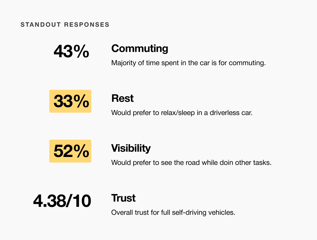
A slight majority of surveyors would like to rest in a driverless car, but getting additional work done was a close second.
Visibility to the road is important to surveyors, so the HUD should not clutter their view.
Commute time often feels underutilized or disconnected from passengers’ goals
User personas were created to represent distinct Gen-Z passenger behaviors and expectations within a fully autonomous vehicle. These personas helped guide experience decisions by balancing productivity-focused and rest-focused use cases throughout the interior and HMI system.
At the start of our research, we listed out possible stakeholders and mapped them out based on their importance and influence to the project and relative to themselves. We made sure to note where the vulnerable populations would be, but since this project is so closely tied with the experience on the interior of the vehicle, we stayed focused on just the driver and our sponsor.
I developed a user journey map of Carlos's experience with the app to highlight potential pain points and identify areas for improvement.
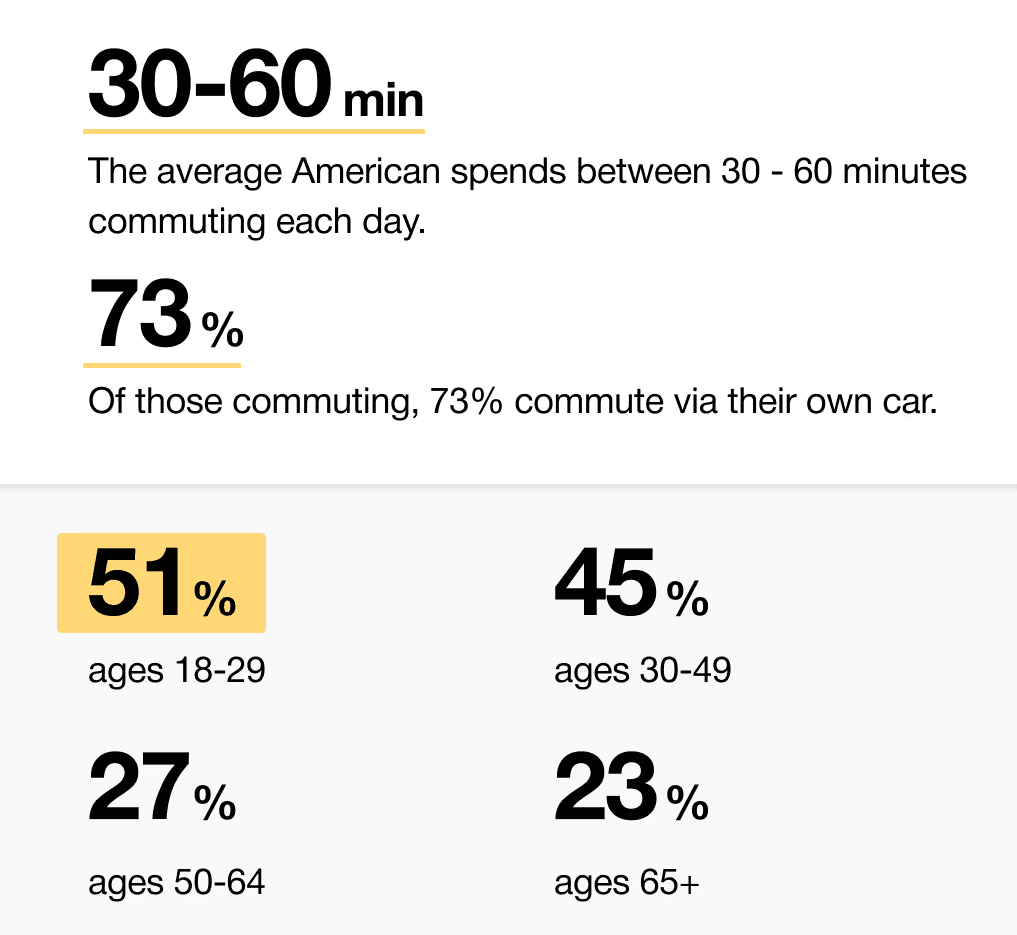
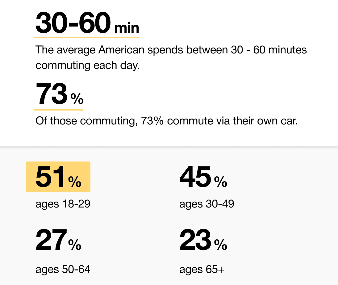
When we look at the most common reasons people are in their vehicles, commuting to and from work is one of the most popular. While there are others, we decided to pursue this use case because we believe most people would wish to spend this time doing other things.
51% of Americans ages 18-29 say they would ride in a driverless vehicle if they had the opportunity. So, now we can narrow our user group further to Gen-Z commuters.
After figuring out our user group, we created a survey for Gen-Z commuters to help draw out insights that might lead to design opportunities. This survey was equipped with two different types of questions:
Current driving questions
Future thinking, Level 5 questions
51% of Americans ages 18-29 say they would ride in a driverless vehicle if they had the opportunity. So, now we can narrow our user group further to Gen-Z commuters.
Enable seamless transitions between work and rest activities
Provide passengers with intuitive, real-time control over information and environment
Use multi-sensory feedback to reinforce awareness, comfort, and confidence
It is the series of experiences Carlos has as he achieve a specific goal. It was built on the his experience.
We compared the typical journey and actions performed for three different modes of transportation and even pointed out some pain points for each. A personal car requires the user’s attention for the entirety of getting from point A to B, and is even required to do a good bit of multitasking at times. However, this is their personal vehicle and is private to them. An uber and bus are similar in that the user has no driving tasks to worry about, but it is no longer a personalized experience; they are in a public space.
A fully autonomous vehicle can give you the best of both worlds. You can have your own personal space while the car does all the driving for you.
The question then becomes: What do you do with the time you spend riding in this vehicle?
In the beginning, before choosing a city and theater, it would be great to look through the whole app and learn everything about it.
There are no movie search - it's necessary to add it on the movies list page.
If user wants to change his account, he should be able to log out or delete it completely.
This is an examination of users and their needs, which adds realistic context to the design process.
First I conducted unmoderated usability studies with a few participants: they had to answer different questions about the app and share their observations while using the initial low-fi prototype. After getting the data, I analyzed it and synthesized the information obtained. Finally, I found themes and came up with several insights.
The goal was to identify pain points that the user experiences with the app designs so the issues can be fixed before the final product launches.
A slight majority of surveyors would like to rest in a driverless car, but getting additional work done was a close second.
Visibility to the road is important to surveyors, so the HUD should not clutter their view.
If user wants to change his account, he should be able to log out or delete it completely.
It is the series of experiences Carlos has as he achieve a specific goal. It was built on the his experience.
For Gen-Z commuters, our HMI system offers real-time interactive display and haptic feedback controls while providing both work and rest activities. It enhances the visual experience and control options for passengers in a fully autonomous vehicle.
A fully autonomous vehicle can give you the best of both worlds. You can have your own personal space while the car does all the driving for you.
The question then becomes: What do you do with the time you spend riding in this vehicle?
At the start of our research, we listed out possible stakeholders and mapped them out based on their importance and influence to the project and relative to themselves. We made sure to note where the vulnerable populations would be, but since this project is so closely tied with the experience on the interior of the vehicle, we stayed focused on just the driver and our sponsor.
I developed a user journey map of Carlos's experience with the app to highlight potential pain points and identify areas for improvement.
Choose a good movie in a cinema theatre nearby and select seats in an app in a fast and clear way
The project schematically :
Concept development explored how a fully autonomous interior could adapt to different passenger activities and states throughout a journey. Early ideation, spatial studies, and interaction concepts were used to translate research insights into interior layouts and HMI behaviors. Initial testing and iteration helped refine key ideas before moving into higher-fidelity refinement.
These are a high fidelity design that represents a final product
Moodboards were used to establish a retro-futuristic aesthetic blended with a sense of tranquil luxury. This visual direction helped guide material choices, lighting tone, and the overall emotional character of the interior.
We were able to determine three zone of legibility when testing text elements on the HUD. From here we started creating an information hierarchy based on these zones to identify what should be displayed where.
When testing, users reported eye fatigue when there were large blocks of bright colors on the HUD. We pivoted to muted/ transparent elements in later designs.
We were able to determine three zones of legibility when testing text elements on the HUD. From here we started creating an information hierarchy based on these zones to identify what should be displayed where.
When testing, users reported eye fatigue when there were large blocks of bright colors on the HUD. We pivoted to muted/ transparent elements in later designs.
It's a structured scheme that outlines the pages and content hierarchy of the app.
Next step: creating the application map. My goal here was to make strategic information architecture decisions that would improve overall app navigation. The structure I chose was designed to make things simple and easy.
These are a high fidelity design that represents a final product
Initial CAD models were developed in Fusion 360 to establish overall proportions and spatial relationships. These early mockups helped validate sizing and layout decisions ahead of physical prototyping.
The series of hand-drawing frames that visually describe and explore a user's experience with a product.
I began with drawing storyboards to focus on just the most important parts of a user’s experience with the app. It's a story that was told through the panels, revealed it two different way
Big picture storyboard, which focuses on the user experience. It's about how people will use the Voo's app during their day and it will be useful.
Close-up storyboard focuses on the app instead of on the user experiencing that product. Shows what happens on each screen of the app.
These are a high fidelity design that represents a final product
A 1:1 physical mockup was built to validate dashboard proportions and component integration. The model combined a HUD, basic rotary controls, and a corresponding virtual environment to simulate real-world use.
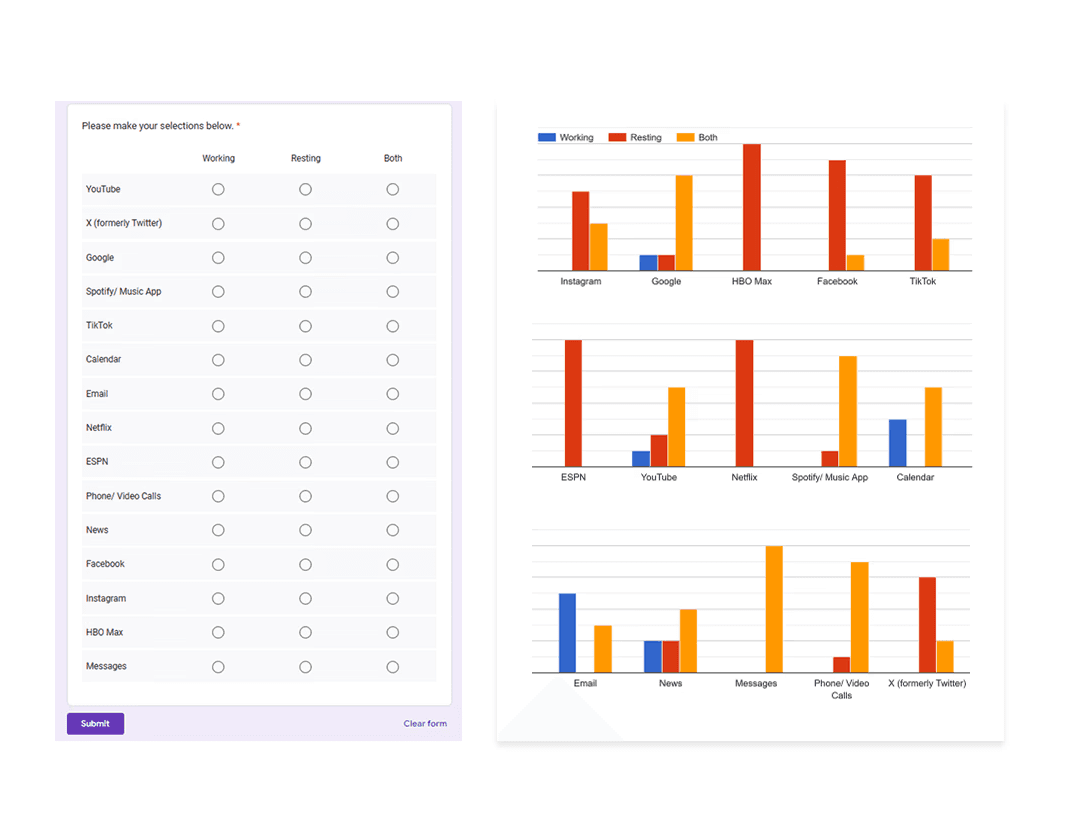
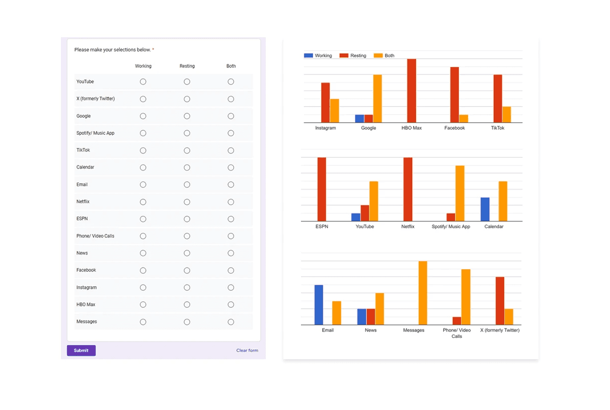
Apps like your calendar and email lean heavily into the realm of work.
Almost all social media leans into the rest category.
It's a structured scheme that outlines the pages and content hierarchy of the app.
HUD concepts were evaluated in context using a transparent OLED display within a simulated driving environment. This setup allowed visibility, hierarchy, and legibility of text-based interactions to be assessed during representative passenger scenarios.
It's a structured scheme that outlines the pages and content hierarchy of the app.
From our earlier insight:
”A slight majority of surveyors would like to rest in a driverless car, but getting additional work done was a close second.”
We created another survey to help understand what apps or activities a user would consider work, rest, or both. Interestingly enough, there were some responses that leaned heavily in one direction and some that were very contested.
It's a structured scheme that outlines the pages and content hierarchy of the app.
Next step: creating the application map. My goal here was to make strategic information architecture decisions that would improve overall app navigation. The structure I chose was designed to make things simple and easy.
It's a structured scheme that outlines the pages and content hierarchy of the app.
Initial sketches explored early dashboard form and layout ideas for a fully autonomous interior. This phase focused on testing proportions, visual hierarchy, and how information could be integrated without traditional driver constraints.
They initially oriented on the basic structure of the homepage and highlight the intended function of each element.
Here I drew five different versions of how structure of information on a homepage might look like. Then I reviewed all the versions and combined them in the refined one.
The goal was to explore different ideas with wireframes.
More "clear" version of wireframes in a digital form. Also all the important pages are added
in it.
On this step I used the Figma design tool to create digital wireframes of all the pages. Then I bonded all of them into the clear and smooth structure.
The goal is to show how all the pages and things interact with each other.
This is an examination of users and their needs, which adds realistic context to the design process.
First I conducted unmoderated usability studies with a few participants: they had to answer different questions about the app and share their observations while using the initial low-fi prototype. After getting the data, I analyzed it and synthesized the information obtained. Finally, I found themes and came up with several insights.
The goal was to identify pain points that the user experiences with the app designs so the issues can be fixed before the final product launches.
In the beginning, before choosing a city and theater, it would be great to look through the whole app and learn everything about it.
There are no movie search - it's necessary to add it on the movies list page.
If user wants to change his account, he should be able to log out or delete it completely.
The clear version :
The refinement phase focused on improving clarity, usability, and coherence across the interior and HMI system. Mid and high fidelity prototypes were used to evaluate interaction flow, visual hierarchy, and feedback mechanisms. Design decisions were iterated to strengthen the overall experience while maintaining a cohesive, passenger-first concept.
It's a structured scheme that outlines the pages and content hierarchy of the app.
Minor updates were made to the dashboard’s overall form and design; CMF changes based on the original moodboards were incorporated. However, we did refine the rest of the interior, which included integrating the knobs in a more seamless fashion. In person testing revealed relative discomfort having to rotate the knobs with your arm on a flat surface.
It's a structured scheme that outlines the pages and content hierarchy of the app.
The information layout demonstrates how content is organized across multiple displays and the HUD for clarity and balance.
These are a high fidelity design that represents a final product
At this stage, the interior model was rebuilt in Blender to increase fidelity and enable more realistic HUD exploration. Updated geometry, materials, and completed door panels provided a more realistic spatial context
We were able to determine three zone of legibility when testing text elements on the HUD. From here we started creating an information hierarchy based on these zones to identify what should be displayed where.
Haptic control knobs were designed to provide intuitive, tactile access to the HMI system. A door-mounted knob enables quick actions on the HUD, while a center console knob controls primary system functions, allowing passengers to navigate the interface without relying solely on touch.
We were able to determine three zone of legibility when testing text elements on the HUD. From here we started creating an information hierarchy based on these zones to identify what should be displayed where.
Sample HUD animations were created to explore motion, transitions, and visual feedback within the display system. These studies helped communicate how information appears, updates, and responds during use.
It's a structured scheme that outlines the pages and content hierarchy of the app.
Pop-up interactions were designed to provide momentary awareness and feedback on the HUD while maintaining a calm visual environment.
These are a high fidelity design that represents a final product
I created all the app pages mockups, incorporating the right design elements such as typography, color, and iconography. I also included captivating and visually appealing images, and developed all the necessary components and elements.
The goal was to demonstrate the final Voo's app in as much detail as possible.
It's the detailed, interactive version of designs that closely match the look and feel of the final product.
I turned my mockups into a prototype that's ready for testing, using gestures and motion, which can help enrich the user experience and increase the usability of the app.
City and cinema theater selection
Movies slideshow
List of movies + search option
Separate movie page, adding to favourites
Show selection: date and time, hall and seats
Adding selected seats
Calendar with results filtering
Menu and its sections
It's the detailed, interactive version of designs that closely match the look and feel of the final product.
The center stack display and auxiliary displays carry most of the information related to the vehicle itself. They work in tandem with the HUD since the information being displayed on the HUD will either be work or social/ entertainment related.
All of these screens were fully built out in Figma.
HUD and UI Settings
Environment Settings
Home (General Vehicle Settings)
Map Settings
Multimedia Settings
The project schematically :
The final design delivers a future-focused autonomous interior that redefines how passengers engage with time in transit. By combining interactive displays, haptic feedback, and adaptable interior elements, the concept demonstrates how autonomy can unlock more intentional and personalized in-vehicle experiences.
It's a structured scheme that outlines the pages and content hierarchy of the app.
The new and improved haptic knob was built completely in-house and allowed us to customize the force feedback of the knob based on certain scenarios. This means as a user steps through the UI experience, the knob can be programmed to feel different at each step of the UI.
It's a structured scheme that outlines the pages and content hierarchy of the app.
The ability to program the knob has allowed us to create a distinct tactile hierarchy which compliments what the user is seeing visually as well. Examples of different “feels” we can give the knob, shown below.
It's a structured scheme that outlines the pages and content hierarchy of the app.
The final HUD has work (orange) and rest (blue) modes to account for whether the user is actively or passively engaging with the UI. This split perspective shows a difference in information density between the two different modes on the HUD
We were able to determine three zone of legibility when testing text elements on the HUD. From here we started creating an information hierarchy based on these zones to identify what should be displayed where.
Car.HMI Europe 2024
At the Berlin conference, our team presented this project as an advanced cockpit for a Level 5 HMI system using VR, Unreal Engine 5, and programmable haptic knobs.
Car.HMI USA 2024
At the Michigan conference, we made minor updates to the project, mainly focusing on improving the haptic knobs and their overall functionality.
During the team’s time at these conferences, we held several discussion sessions with automotive professionals from around the world. We centered these discussions around future mobility, our Level 5 concept, and more. Originally, we thought 2035 would be a safe bet for speculating this moonshot concept, but after discussing with several groups at the conferences, our speculation began rolling out closer to 2050.
Fully autonomous interiors require experience-driven design that adapts to different passenger needs rather than fixed, driver-centric assumptions.
The concept positions the vehicle interior as a flexible passenger environment enabled by adaptive HMI and spatial design. It illustrates how autonomy can shift in-vehicle experiences toward greater personalization and engagement.
This project strengthened my ability to design around future-facing constraints while grounding decisions in believable user needs and scenarios. I also gained experience translating abstract autonomy concepts into tangible interior and interaction systems.
Future iterations would focus on validating the experience through deeper scenario testing and technical feasibility exploration.
Explore refined interaction flows and transitions between work and rest modes
Investigate physical prototyping and system integration to assess viability
Client
General Motors
Year
2024
Tag
Automotive + UX
Duration
12 months
This project explores an advanced cockpit for a fully autonomous (Level 5) vehicle interior designed around Gen-Z passengers. The concept centers on an adaptive HMI system that enables seamless transitions between work-focused and rest-focused activities through interactive displays and haptic controls.
As vehicles move toward full autonomy, interior experiences remain constrained by driver-centric layouts and limited passenger control. Existing HMI systems do not adequately support productivity, personalization, or meaningful engagement during autonomous travel.
The goal of this project was to design a comprehensive user interface for an interior experience withing a fully autonomous (Level 5) vehicle. Additionally, we had to focus these in-cabin interactions between a head-up display, two programmable haptic knobs, and a redesigned dashboard.
Interior and experience designer, contributing to concept development, HMI strategy, and visual storytelling for vehicle interior.
User research, interviews, and surveys
Interior concept development
Sketching, CAD modeling, rendering
UI design and animations
Research focused on understanding how Gen-Z passengers might use time inside a fully autonomous vehicle when driving is no longer required. Insights emphasized the need for flexibility, intuitive control, and experiences that support both productivity and rest within the same journey.
Current vehicle interiors remain driver-centric, limiting meaningful passenger engagement.
Existing HMI systems lack adaptability for different activities and mental states.
Commute time often feels underutilized or disconnected from passengers’ goals
At the start of our research, we listed out possible stakeholders and mapped them out based on their importance and influence to the project and relative to themselves. We made sure to note where the vulnerable populations would be, but since this project is so closely tied with the experience on the interior of the vehicle, we stayed focused on just the driver and our sponsor.

When we look at the most common reasons people are in their vehicles, commuting to and from work is one of the most popular. While there are others, we decided to pursue this use case because we believe most people would wish to spend this time doing other things.
51% of Americans ages 18-29 say they would ride in a driverless vehicle if they had the opportunity. So, now we can narrow our user group further to Gen-Z commuters.
After figuring out our user group, we created a survey for Gen-Z commuters to help draw out insights that might lead to design opportunities. This survey was equipped with two different types of questions:
Current driving questions
Future thinking, Level 5 questions
A slight majority of surveyors would like to rest in a driverless car, but getting additional work done was a close second.
Visibility to the road is important to surveyors, so the HUD should not clutter their view.
User personas were created to represent distinct Gen-Z passenger behaviors and expectations within a fully autonomous vehicle. These personas helped guide experience decisions by balancing productivity-focused and rest-focused use cases throughout the interior and HMI system.
We compared the typical journey and actions performed for three different modes of transportation and even pointed out some pain points for each. A personal car requires the user’s attention for the entirety of getting from point A to B, and is even required to do a good bit of multitasking at times. However, this is their personal vehicle and is private to them. An uber and bus are similar in that the user has no driving tasks to worry about, but it is no longer a personalized experience; they are in a public space.
A fully autonomous vehicle can give you the best of both worlds. You can have your own personal space while the car does all the driving for you.
The question then becomes: What do you do with the time you spend riding in this vehicle?
Enable seamless transitions between work and rest activities
Provide passengers with intuitive, real-time control over information and environment
Use multi-sensory feedback to reinforce awareness, comfort, and confidence
For Gen-Z commuters, our HMI system offers real-time interactive display and haptic feedback controls while providing both work and rest activities. It enhances the visual experience and control options for passengers in a fully autonomous vehicle.
Concept development explored how a fully autonomous interior could adapt to different passenger activities and states throughout a journey. Early ideation, spatial studies, and interaction concepts were used to translate research insights into interior layouts and HMI behaviors. Initial testing and iteration helped refine key ideas before moving into higher-fidelity refinement.
Moodboards were used to establish a retro-futuristic aesthetic blended with a sense of tranquil luxury. This visual direction helped guide material choices, lighting tone, and the overall emotional character of the interior.
Initial sketches explored early dashboard form and layout ideas for a fully autonomous interior. This phase focused on testing proportions, visual hierarchy, and how information could be integrated without traditional driver constraints.
Initial CAD models were developed in Fusion 360 to establish overall proportions and spatial relationships. These early mockups helped validate sizing and layout decisions ahead of physical prototyping.
A 1:1 physical mockup was built to validate dashboard proportions and component integration. The model combined a HUD, basic rotary controls, and a corresponding virtual environment to simulate real-world use.
We were able to determine three zones of legibility when testing text elements on the HUD. From here we started creating an information hierarchy based on these zones to identify what should be displayed where.
When testing, users reported eye fatigue when there were large blocks of bright colors on the HUD. We pivoted to muted/ transparent elements in later designs.
HUD concepts were evaluated in context using a transparent OLED display within a simulated driving environment. This setup allowed visibility, hierarchy, and legibility of text-based interactions to be assessed during representative passenger scenarios.
From our earlier insight:
”A slight majority of surveyors would like to rest in a driverless car, but getting additional work done was a close second.”
We created another survey to help understand what apps or activities a user would consider work, rest, or both. Interestingly enough, there were some responses that leaned heavily in one direction and some that were very contested.
Apps like your calendar and email lean heavily into the realm of work.
Almost all social media leans into the rest category.
The refinement phase focused on improving clarity, usability, and coherence across the interior and HMI system. Mid and high fidelity prototypes were used to evaluate interaction flow, visual hierarchy, and feedback mechanisms. Design decisions were iterated to strengthen the overall experience while maintaining a cohesive, passenger-first concept.
It's a structured scheme that outlines the pages and content hierarchy of the app.
Minor updates were made to the dashboard’s overall form and design; CMF changes based on the original moodboards were incorporated. However, we did refine the rest of the interior, which included integrating the knobs in a more seamless fashion. In person testing revealed relative discomfort having to rotate the knobs with your arm on a flat surface.
At this stage, the interior model was rebuilt in Blender to increase fidelity and enable more realistic HUD exploration. Updated geometry, materials, and completed door panels provided a more realistic spatial context
Sample HUD animations were created to explore motion, transitions, and visual feedback within the display system. These studies helped communicate how information appears, updates, and responds during use.
The information layout demonstrates how content is organized across multiple displays and the HUD for clarity and balance.
The center stack display and auxiliary displays carry most of the information related to the vehicle itself. They work in tandem with the HUD since the information being displayed on the HUD will either be work or social/ entertainment related.
All of these screens were fully built out in Figma.
HUD and UI Settings
Environment Settings
Home (General Vehicle Settings)
Map Settings
Multimedia Settings
Pop-up interactions were designed to provide momentary awareness and feedback on the HUD while maintaining a calm visual environment.
Haptic control knobs were designed to provide intuitive, tactile access to the HMI system. A door-mounted knob enables quick actions on the HUD, while a center console knob controls primary system functions, allowing passengers to navigate the interface without relying solely on touch.
The final design delivers a future-focused autonomous interior that redefines how passengers engage with time in transit. By combining interactive displays, haptic feedback, and adaptable interior elements, the concept demonstrates how autonomy can unlock more intentional and personalized in-vehicle experiences.
The new and improved haptic knob was built completely in-house and allowed us to customize the force feedback of the knob based on certain scenarios. This means as a user steps through the UI experience, the knob can be programmed to feel different at each step of the UI.
The ability to program the knob has allowed us to create a distinct tactile hierarchy which compliments what the user is seeing visually as well. Examples of different “feels” we can give the knob, shown below.
The final HUD has work (orange) and rest (blue) modes to account for whether the user is actively or passively engaging with the UI. This split perspective shows a difference in information density between the two different modes on the HUD
Car.HMI Europe 2024
At the Berlin conference, our team presented this project as an advanced cockpit for a Level 5 HMI system using VR, Unreal Engine 5, and programmable haptic knobs.
Car.HMI USA 2024
At the Michigan conference, we made minor updates to the project, mainly focusing on improving the haptic knobs and their overall functionality.
During the team’s time at these conferences, we held several discussion sessions with automotive professionals from around the world. We centered these discussions around future mobility, our Level 5 concept, and more. Originally, we thought 2035 would be a safe bet for speculating this moonshot concept, but after discussing with several groups at the conferences, our speculation began rolling out closer to 2050.
Fully autonomous interiors require experience-driven design that adapts to different passenger needs rather than fixed, driver-centric assumptions.
The concept positions the vehicle interior as a flexible passenger environment enabled by adaptive HMI and spatial design. It illustrates how autonomy can shift in-vehicle experiences toward greater personalization and engagement.
This project strengthened my ability to design around future-facing constraints while grounding decisions in believable user needs and scenarios. I also gained experience translating abstract autonomy concepts into tangible interior and interaction systems.
Future iterations would focus on validating the experience through deeper scenario testing and technical feasibility exploration.
Explore refined interaction flows and transitions between work and rest modes
Investigate physical prototyping and system integration to assess viability